| Image |
Comment |
| 09/29/2002 08:58:00 PM |
|
| 09/29/2002 12:21:00 PM |
Toronto, Ontario...ehby zadoreComment: Creative shot! Very interesting. Apart from the nice tower I also like the motion blur of the train in this picture. It adds to the overall weird look of the photo. I guess you used a reflective surface to create this "warp" effect? If not, I really would like to know how you did it. -stephan |
 Photographer found comment helpful. Photographer found comment helpful. |
| 09/29/2002 12:27:00 PM |
The Round Corners of my Digital Worldby TimProComment: Are that the magnetic discs of a 5.25" floppy disk around the CDs? You still have those? You must have a really old computer ;-) The photo itself looks a bit busy. Also because of the distorted lighting and all the colours. -stephan |
| 09/23/2002 09:47:00 PM |
Stairway to Heavenby Frank BeckmanComment: I especially liked the telephone poles on the left and how they repeated the form of your main subject. In fact, I even would have liked to see more of them. Now, after your explanation, I also understand your intent of the negative space and I must say: well thought. Unconsciously both things (plants in the foreground and the telephone poles) did exactly what you described. I agree with the others who think the lighting is a bit dark. It looks like a bright sunny day but somehow there is not enough contrast. |
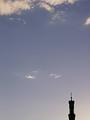
| 09/23/2002 09:23:00 AM |
Evening Prayerby stephanComment: As already described in the details the photo shows a mosque. So, no there is no cross ;-) I thought one could recognise this because of the crescent moon, the symbol of the islam. But it probably was too small. It was not possible to show more of the minaret because there were other buildings below, which would have made the photo even worse. But the mosque was not intended as the primary subject. The negative space had a meaning. I titled the photo "evening prayer". A prayer is when somebody talks to god. The sky/heaven is something what many people associate with god. So the sky was a metaphor for god and the mosque was only there to give a hint about that. Well, only 10 comments... I guess it was too farfetched and not really possible to understand without some explanation and just by looking at the photo. So everybody just saw a boring sky with a too short spire. I don't say that with the explanation the photo is necessarily less boring. I primarily submitted the photo because I liked the colour scale from the light yellow in the bottom right corner to the blue. Anyway, thanks to all for setting me straight ;-) I hope I'll do better photos in the future. |
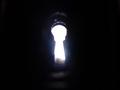
| 09/22/2002 11:36:00 AM |
Keyholeby shutterflyComment: The hole is quite a bit out of focus, which directs the eye to the distance. But the eye finds there nothing (only white overexposure). So I would either focus on the hole or put something interesting to see in the distance behind the hole. -stephan |
| 09/22/2002 11:27:00 AM |
|
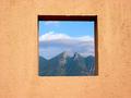
| 09/22/2002 11:30:00 AM |
Framedby lmhrComment: Wonderful example of use of framing as an compositional element. -stephan |
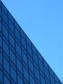
| 09/22/2002 02:01:00 PM |
Windowsby JakComment: Nice composition. The diagonals are very effective. I also like the colouring. I don't know if you were aware of it when submitting the photo but there was a very similar photo in the "Free Study" challenge: //www.dpchallenge.com/image.asp?IMAGE_ID=3254 I score your photo on it's own merits but I think the other one is even better because of the dramatic sky. Also your photo seems to have some problems with JPEG compression (artefacts). -stephan |
| 09/22/2002 11:58:00 AM |
Memento Moriby greenem2Comment: "Remember your death". Creative approach to the challenge. I like that. The face depicts the memento mori theme fine. The lighting is interesting. However it has a bit too much contrast for my taste. -stephan |
| Photographer found comment helpful. |
Home -
Challenges -
Community -
League -
Photos -
Cameras -
Lenses -
Learn -
Help -
Terms of Use -
Privacy -
Top ^
DPChallenge, and website content and design, Copyright © 2001-2025 Challenging Technologies, LLC.
All digital photo copyrights belong to the photographers and may not be used without permission.
Current Server Time: 08/14/2025 02:26:57 PM EDT.