DPChallenge: A Digital Photography Contest You are not logged in. (log in or register
 
Browse Settings
Currently viewing:
Registered Userstephan

Show comments:

Per page:

Order:

Comments:


Comments Made by stephan
Pages:   ... ... [53]
Showing 131 - 140 of ~528
Image Comment
Blue Bottle Curves
12/15/2002 09:45:02 AM
Blue Bottle Curves
by hokie

Comment:
Hello Scott, don't wonder why you get another critique. Your your photo was assigned to me in context of Critique Club. So here it goes:

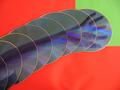
Composition: I don't think it's that hard to see that this is a naked woman seen through a bottle. Well, it could be something else than a bottle but that doesn't matter so much.
There are some speckles which I don't know where they come from. The photo would look cleaner without them but they don't distract so much that they would ruin the photo.
But what I find distracting is the upper right corner. There is too much stuff the viewer can't make out what it is. Especially the glare is too much because it's right in the middle of the black area. So I would have cropped it vertically from the right. Even if that means that you would have to crop more from the bottom or top (because you're already at 427 pixels width). In fact I think cropping more from the bottom would not harm the photo. The hand is nice and helps the viewer to recognise that it is a person standing behind the bottle, but the real point of interest is obviously her bosom (I mean not because of our primitive brains but because of the overall composition and lighting ;-)). This would also get you rid of some of the vast plain black area in the lower right corner. I have a differently cropped version which I could send you.

Lighting/Colours: This really is the best part of your photo. The way how you lit the body to accentuate her curves really shows that it was done by somebody who knows what he did. Great job!
I also love the blue colour here. I think the photo wouldn't work so good with any other colour.
I don't know how much postprocessing you did but a little bit less contrast would help to see more of the body skin and less of the plain black area.

Focus: It's a bit blurry and has a bit grain but in my opinion this works very good here. It adds to the mysterious and subtle/suggestive look.

Art: Creative! This is the kind of photo where I stop seeing technical difficulties and score it very high just because it has an unique style and a great appeal to me. Most of the times I can't really say why I like it, must be some subconsciousness thing ;-) You were very brave to submit such a photo to DPC because this kind doesn't score very high. Your (in my opinion way too much underrated) score confirms that. But please don't stop being so brave and submit photos you like and not the ones which you expect to score high. I like your style. Keep up your great work!
Reaching out of the blue into a better mood
12/14/2002 09:55:27 PM
Reaching out of the blue into a better mood
by Slimharpo

Comment:
Hello Sam, don't wonder why you get another critique. Your your photo was assigned to me in context of Critique Club. So here it goes:

Composition: Good composition. I think you used the space quite good by placing the arm on the diagonal and filling almost the whole frame.
The thing in your hand is a bit distracting. Do you hold something? Looks like a face but I can't really make out what it could be.

Lighting/Colours: This is not so good in my opinion. First of all the red vs. green is too much colour contrast, it's hurting my eyes! I guess you wanted to use these colours as a metaphor to the "better mood" you describe in the title (with red being danger and green symbolising hope). That's a nice idea but it's not very pleasing to the eye ;-) I think two different shades of yellow would have worked better. Also because that would have emphasised the blue of the CD much better.
I know that's probably impossible but I think the reflections also distract from your actual idea.
Also there are some bumps in your red sheet of paper and there is a small shadow in the upper left and lower right corner.

Focus: Some parts are a bit out of focus, e.g. the bottom left corner or on the red/green edges. Unfortunately you didn't provide any details about your camera settings, but maybe the aperture was too wide and made the DOF too shallow (which in my opinion doesn't work for such a shot).

Digital processing: You used only 96kB file size of the jpeg file. You can use up to 150kB when submitting to DPC. The bigger the file size the higher the quality and the less jpeg artifacts you have.

Art: A creative idea! I guess it took you some time to arrange everything. Unfortunately the blue colour is dominated by the red/green contrast. That's especially sad because the challenge theme was "blue".
Blue on Blue
12/14/2002 08:56:09 PM
Blue on Blue
by Kaz

Comment:
Hello Kathleen, don't wonder why you get another critique. Your your photo was assigned to me in context of Critique Club. So here it goes:

Composition: Very good. By picking just a small detail instead of the whole house the photo is less busy but more interesting at the same time. I can see several "lines" which give the photo a nice structure. But I'm not sure if the empty space to the right is a good idea. I also don't like the open space on the left side. It looks a bit as if there was something "cut out" and the upper part is now hanging unsupported in the air. I don't know how the house looked a bit more on the left side which is not seen on the photo. Is that a window? I think I would have played with that a bit more and tried to do some framing with the blue sky seen through the window and the wood framing the shot. Just an idea/suggestion.
The background is nice. I like that it's just plain blue. I think one or more clouds would distract from the actual subject and ruin the abstract and ordered look.
The photo looks a little bit tilted CCW. That's not necessarily a bad thing but when looking at the photo that's one of the first impressions I had. You can see that on the vertical edge on the right of the house.

Lighting: Sunny! :-) I like the shadows. I think the exposure was right on.

Focus: I don't know what your aperture setting was but as far as I can see everything is in focus. I think that's good for this shot. Shallow DOF wouldn't look good here.

Digital processing: You used only 44kB for your jpeg file but you can use up to 150kB when uploading to DPC. In order to increase the quality of the jpeg image try using bigger file sizes. The smaller the file, the more jpeg compression artifacts you get. You can see them all over the blue sky.

Art: It's a nice photo and I scored it pretty high. I like the abstract look of it and the blue on blue colouring. You fulfilled the challenge very good. Keep up the good work!
Photographer found comment helpful.
Login
12/09/2002 01:59:09 PM
Login
by stephan

Comment:
Thanks to the ones who commented on my photo. Especially to Konador pointing me to the tutorial about the rule of thirds :-) But I think applying the rule of thirds wouldn't have helped the photo in any way. I also couldn't crop more because it's the 640x427 crop out of a 2240x1680 original.

I agree that this is not the most interesting subject in the world ;-) The photo was the result of a more or less desperate search for something blue. I didn't have much time so I tried to quickly photograph something which was nearby. I think it's visible that I didn't put much effort into the photo and that's why I totally agree with the relatively low score.

See you next week :-)

P.S.: The monitor is about 5 years old.

Message edited by author 2002-12-09 14:03:55.
A Melancholy Song
12/09/2002 06:06:59 AM
A Melancholy Song
by indigo997

Comment:
Nancy, sad to see that you didn't score higher. I love the lighting. Very interesting how you achieved this.
Photographer found comment helpful.
Christmas in Cape Town,South Africa.
12/08/2002 09:10:36 PM
Christmas in Cape Town,South Africa.
by anz

Comment:
*grrr* I envy you for the warm weather ;-) It's a very nice photo. I like the contrast of the colours and the texture of the sand. I seems a bit overexpsured because in the lower left corner the sand is very bright.
Blue Moon
12/08/2002 09:03:14 PM
Blue Moon
by vtruan

Comment:
Wow! This is one of the photos where I whish it would be mine ;-) The moon is very big and I guess it was not easy to get such a sharp photo. Nice job. -stephan
Planet
12/08/2002 09:00:52 PM
Planet
by janfries

Comment:
That was one of the first things I had in mind for the blue challenge. But unfortunately I didn't have the possibilities to fly into space and take a photo of the earth ;-) Your "thing" (don't know what this could be) looks very interesting and I wonder how you did this. I'll check back after the challenge to see if you put any description on it. The focus could be a better. The photo looks very blurry and while I like this sometimes I think in this case it's not good. -stephan
Blue at F32
12/08/2002 08:53:03 PM
Blue at F32
by scab-lab

Comment:
Great macro! If this really is F/32 then it must be super macro because the DOF is very narrow. I like the clarity in the water drops and the overall colour. However, I think the red part could have been placed a bit better, because it looks a bit crowded into the corner. -stephan
Photographer found comment helpful.
At Dusk
12/08/2002 08:49:06 PM
At Dusk
by victorf

Comment:
Very nice colour tones. The plant in the foreground is a bit boring (regarding it's shape) but I like the silhouette and the way how it contrasts so sharply against the sky. -stephan
Pages:   ... ... [53]
Showing 131 - 140 of ~528


Home - Challenges - Community - League - Photos - Cameras - Lenses - Learn - Help - Terms of Use - Privacy - Top ^
DPChallenge, and website content and design, Copyright © 2001-2025 Challenging Technologies, LLC.
All digital photo copyrights belong to the photographers and may not be used without permission.
Current Server Time: 08/13/2025 03:43:09 AM EDT.