Time In Motionby
kposeyComment: Hello Ken, your photo was assigned to me in context of the Critique Club. So here we go:
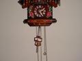
Composition: Very strange cropping ;-) You cut the upper and the lower part of the clock which doesn't look good. Unfortunately I can only guess what you wanted to achieve because you didn't enter any details. Probably you wanted to concentrate on the pendulum. If so then I think you should have zoomed in much more. There is a lot of empty space which does not add something to the photo. But I agree with the people from previous comments that a portrait format would look better here.
Also try a different angle. I think a photo from the side would have been much more interesting.
Lighting/Colours: I personally don't like the lighting. Using the camera built-in flash directly at the subject makes the photo look a quite dull. Also, because of the straight on angle you used you don't see much shadows. This makes the photo look very flat and removes and depth from it.
Switch off the (probably automatically used) flash and use lighting from the side. Maybe a lamp you place there. You proobably will have to use a tripod then because you'll need a longer exposure time.
Focus: Most people used a motion blur effect to actually show the motion. A longer exposure time would have helped with that, too.
Art: Well, I think one reason why the photo scored so low is that it doesn't convey motion very good. In my opinion a motion blur on the pendulum would have looked good here. Maybe you'll try to reshoot the photo?
Stephan