|
|
| Image |
Comment |
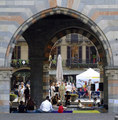
| 06/14/2006 07:40:11 PM | Duomo of Como, Italyby alexvoloComment: You have certainly framed this well with the stunning archway, but the subject(s) itself is too busy, I'm not sure what I'm meant to be looking at... The juggler, the building behind, the people watching? 5 |
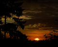
| 06/14/2006 05:51:01 AM | Our Sunby bcobleComment: Ilike this, but can't help thinking that cropping it from the top and right sides a bit would make it better.. You've framed the sun with the two trees, and the darker clouds, but there is too much sky above for my liking, and the sun is a bit near the center.
Good work, and great to see a dark 'ansel-ish' landscape on DPC in a general challenge. Nice technique. |  Photographer found comment helpful. Photographer found comment helpful. |
| 05/12/2006 05:40:10 AM | | | Photographer found comment helpful. |
| 04/07/2006 05:44:59 AM | |
| 02/22/2006 10:13:19 PM | _I Feel Pretty..._by ArtysteComment: Oh-My-God. :-)...
I just poped into the challenge to take a look while waiting for something to run on my main PC at work... I nearly spit my coffee across the table looking at the thumbnail, and the full image didn't disapoint.
Great stuff, thanks for the laugh Glen.. | | Photographer found comment helpful. |
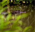
| 01/02/2006 05:37:20 PM | Mr. Agrizoophobia (In the wild, not taken in a zoo)by terjeComment: Greetings from the Critique Club...
First impressions.. A really cool pic, and rather you than me! :-).
The greens are wonderful, and the lines of the branches reflected, along with the OOF forground leaves lead into the subject so well.
Technically you've got the focus right where it's needed on the face, and exposure looks right on the money.
This realy is a well executed image, and the only thing I think might be improved is the crop, to remove the distracting detailed leaves at the top of the frame.
They compete a little with the croc for attention, and because they have a full dynamic range (light to dark tones) they are equally attractive to the eye, pulling me away from the main subject.
Having said that, I'm playing around with some bits of paper over the screen and I really can't see how I would crop for better effect, but I still find the leaves distracting all the same.
Wonderful image, thankyou for sharing it with us... | | Photographer found comment helpful. |
| 01/02/2006 05:54:34 AM | colorsby eggfoxComment: Greetings from the Critique club...
Every now and then there's an image on this website that defies the normal run of the mill, and proves that users here do know what a good photo looks like..
You've entered an almost abstract image into a technical challenge, and come out with a very respectable score. I think that's simply cool...
The commenters during the challenge have almost all said that they can't see where the focus point is, and although the challenge didn't say you absolutely had to have something in focus, it would probably improved your score.
Outside the context of the challenge itself this is a very strong abstract image. The center is on a thirds line, and you have leading lines from every area of the image into that center focus point.
Often people will complain that leading lines in a photo should actualy lead somewhere. In this case you have nothing, an empty space that dosn't hold the attention of the viewer. I think in this case it's great! Because my eyes don't 'stick' at the dark center I can get back out and follow another one of the lines back into the center.. Your eyes literally explore the photo.
The subtle rim of the glass holding the straws re-enforces the center point, and links the photo back to a real world object that we can all understand.
The only distraction I find is the small highlights on the rim of the glass. Otherwise this is a wonderful photo.
Cheers, Chris H. | | Photographer found comment helpful. |
| 01/02/2006 05:34:35 AM | Frosty's Flakesby TransitComment: Greetings from the critique club...
What a fun image!
No problem with meeting the challenge here, so I wont even talk about that.
First impressions.. My eyes went up the line of snowmen, then straight to the distracting dark blobs on the right hand side of the frame. I would have liked to see this almost cropped square, getting rid of the disractions on the right, and reducing the amount of distracting detail on the left. (footprint?)
Technically this image is great. You've done well with a difficult exposure and focus is just right on the front chap.
Going back to the cropping, I'm sitting here holding up bits of paper on the screen.. Feel free to do the same. :-). Negative space (Blank area in a picture) works really well if your subject or object is interacting with the space. A portrait with the subject looking into the blank space, or walking towards the 'blank' side of the image. In this case where you have a group of 'people' staring straight at the camera the open space around the characters dosn't add anything. This is obviously a gross generalisation, but in this case I think it stands true.
Interestingly, to my mind the strongest element in this shot is actually the least in focus. The chap at the back, pearing around the next in line is a wonderful touch. It's almost like he's trying to upstage the other snowmen.
Again, a wonderful, fun image which I think would have done better in DPC voting cropped a little tighter. In the real world this would make a stunning Christmas card image, or post card... Great work and well visualised.
Cheers, Chris H. | | Photographer found comment helpful. |
| 12/07/2005 01:30:59 AM | | | Photographer found comment helpful. |
| 11/12/2005 03:59:52 AM | |
Home -
Challenges -
Community -
League -
Photos -
Cameras -
Lenses -
Learn -
Help -
Terms of Use -
Privacy -
Top ^
DPChallenge, and website content and design, Copyright © 2001-2025 Challenging Technologies, LLC.
All digital photo copyrights belong to the photographers and may not be used without permission.
Current Server Time: 08/01/2025 03:39:16 AM EDT.
|