| Image |
Comment |
| 08/02/2006 01:12:11 AM |
Soft Focussby sacredspiritComment: Even though I like borders I find this one just way too big and too distracting for such a soft image. |
 Photographer found comment helpful. Photographer found comment helpful. |
| 08/01/2006 01:55:32 PM |
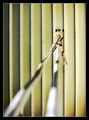
llndry llne(s)by sanxComment: * Greetings from the Critique Club *
Hi Sandy.
Well, the main thing that bothers me with this photo is the rope of the clothes line. It just doesn't seem to sit right in the scheme of the photo. You came up with a great idea but maybe it just wasn't executed the right way to please all the voters. I guess it's a tricky one because you either base it on the lines of the rope or the lines of the wood in the background. Either way it meets the challenge.
I personally don't like the clothes line being blurred so much. I would of preferred to have seen the pegs brought more forward into the picture so they are a little more dominant. This may of helped getting the line working better in the foreground of the photo. I realise that your camera doesn't have any manual controls in regards to aperture settings but it was this which helped throw out the line in the foreground. Having those pegs moved forward and focussing on those would of focused the line more, blurred the background a bit and made those pegs pop out.
I think the lighting has worked well and is nicely balanced and the colours sit nicely. Some people may not of liked the border being so thick and could of marked you down a bit for that. I like borders but I find this one slightly too thick.
Not one of your best entries but a solid one none the less. Keep at it and best of luck with future challenges.
Neil |
| Photographer found comment helpful. |
| 08/01/2006 08:35:15 AM |
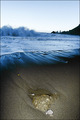
Waves comming inby TUBORGComment: * Greetings from the Critique Club *
Hi Arnthor. Looks like the voters were relatively happy with this photo but there were a few with criticisms amonst the comments.
It is to me a photo of two halves. With the fill flash fired out front it makes the lower half seem like night time whilst the waves and the hillside indicate early morning in the top half. It just doesn't seem balanced in that regard. Maybe you could of cut the flash back a stop?
The scene itself I think is fantastic but the horizon is leaning to the right. The patterns in the sand and the water along the shore add a lot of character to the shot. You've used a nice depth of field to keep the focus throughout the photo and it looks crisp and sharp.
Overall you did a nice job on this but the horizon, as I have learnt, will always get criticised if it's slightly skewiff and will cost votes. You've got some amazing photos in your portfolio and even though this finished below your average it's still a great effort. Well done and best of luck with future challenges.
Neil |
| Photographer found comment helpful. |
| 08/01/2006 05:26:18 AM |
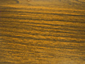
Grainsby cryingdragonComment: * Greetings from the Critique Club *
Hi Mike. Ok, let's be honest here. Why didn't this photo work with the voters? Pretty much for several reasons. I think what you were going for was a good idea, no problems there. A wooden desk is a surface with lines running through the texture. It was all in the way you executed the photo.
The main thing, focus focus focus! I'll be honest and say I'm not too familiar with the camera that you are using. I know there are some users with this camera (SJCarter for instance) who produce some great work. It's all to do with knowing how to get the most out of your camera. There are two ways you could of gone about shooting this. You could of used the cameras macro mode setting to get in relatively close to the desk to capture it's detail. A standard P&S camera will operate from about 10 cms from the subject so it would of worked well. Alternatively, you could of pulled back a bit to allow the camera to self focus properly and then cropped it in tight to just show the desk. Either way, you've missed one of the main components of a photo here, which is the focus.
You'll also notice with your crop of the photo there is a little light spot right at the top in the centre. If you were after just the grain of the desk make sure you crop the image to remove things like this as some people will see it as a distraction.
Reading through your portfolio I see you're pretty new to all this. You've come to a great place to learn. It's good to see that you are experimenting with different ideas (looking at your portfolio) which ultimately is the best way to learn. It's amazing what you'll pick up by looking through other peoples photos and reading their comments on how they have done it. You mention in your bio that you're not very experienced with photo editing. Once again, this is a great sight to learn on. Look through the tutorials and try different things and see the results that you get. Keep at it, ask questions, experiment. It'll all come together. Best of luck with your future entries!
Neil |
| Photographer found comment helpful. |
| 08/01/2006 04:41:03 AM |
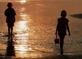
Brother and Sisterby GT350Comment: * Greetings from the Critique Club *
Hi Gerry. What a nice candid capture you have taken here. It's definately a nice beach silhouette shot and the golden colour reflecting off the water indicates late afternoon.
The main thing that bothers me about this photo is where the 'brother' is positioned in relation to the frame. It's very hard to tell if you could of used another crop without seeing the original photo but I find that he's just too close to the edge of the frame. Someone even mentioned cropping him out altogether. That was another possibility perhaps?
You've used a nice depth of field to keep the water nicely in focus across the whole photo which has worked well. As I mentioned earlier, the colour of the sun reflecting on the water is fantastic.
It's always hard to say why a photo scores what it does. I've always believed that a photo gets voted what the people think it deserves. You've done well with this shot and should be proud of it. Best of luck with your future challenges!
Neil |
| Photographer found comment helpful. |
| 07/31/2006 09:50:11 PM |
Thomp094147.jpgby rjksteschComment: Nice work with the aperture here to keep everything nicely focused through the whole photo. It's a shame he wasn't looking at the camera or looking at his wife. |
| Photographer found comment helpful. |
| 07/31/2006 09:48:36 PM |
Thomp-084041.jpgby rjksteschComment: This is fantastic! You've worked the reflection really well and having the ducks in there just finishes it off. I would love to see this with a slight bit of softening to give it that dreamy sort of feel! Excellent work Rebecca! |
| Photographer found comment helpful. |
| 07/31/2006 09:46:57 PM |
|
| Photographer found comment helpful. |
| 07/31/2006 09:46:04 PM |
DeedeeBridal114626d.jpgby rjksteschComment: It is always difficult getting the lighting right in these outdoor tye shots with filtered sunlight but there's not really any major blown highlights so it's worked well. I would of maybe tried shooting from a slightly higher angle so the fence in the background filled the frame more instead of having stop around her head. It may of made for a slightly more pleasant background. Good work. |
| Photographer found comment helpful. |
| 07/31/2006 09:43:10 PM |
Roseby rjksteschComment: Now I find this photo very interesting. It's great to see an alternative style crop in a wedding photo. I would of maybe saturated the colours in the rose slightly just to make it really stand out. I guess you could even do some slight dodging to help impact it. Great idea and very well done! |
| Photographer found comment helpful. |
Home -
Challenges -
Community -
League -
Photos -
Cameras -
Lenses -
Learn -
Help -
Terms of Use -
Privacy -
Top ^
DPChallenge, and website content and design, Copyright © 2001-2025 Challenging Technologies, LLC.
All digital photo copyrights belong to the photographers and may not be used without permission.
Current Server Time: 08/14/2025 01:49:49 PM EDT.