| Author | Thread |
|
|
09/03/2006 07:07:26 PM |
|
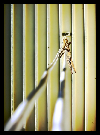
Very nice sandy! Wish you had more DOF on the clothesline, but nothing you can do riight? and it's all up to the voter right? anywho very nice shot! |
|
 Photographer found comment helpful. Photographer found comment helpful. |
|
|
08/01/2006 01:55:32 PM |
* Greetings from the Critique Club *
Hi Sandy.
Well, the main thing that bothers me with this photo is the rope of the clothes line. It just doesn't seem to sit right in the scheme of the photo. You came up with a great idea but maybe it just wasn't executed the right way to please all the voters. I guess it's a tricky one because you either base it on the lines of the rope or the lines of the wood in the background. Either way it meets the challenge.
I personally don't like the clothes line being blurred so much. I would of preferred to have seen the pegs brought more forward into the picture so they are a little more dominant. This may of helped getting the line working better in the foreground of the photo. I realise that your camera doesn't have any manual controls in regards to aperture settings but it was this which helped throw out the line in the foreground. Having those pegs moved forward and focussing on those would of focused the line more, blurred the background a bit and made those pegs pop out.
I think the lighting has worked well and is nicely balanced and the colours sit nicely. Some people may not of liked the border being so thick and could of marked you down a bit for that. I like borders but I find this one slightly too thick.
Not one of your best entries but a solid one none the less. Keep at it and best of luck with future challenges.
Neil |
|
| Photographer found comment helpful. |
|
|
07/28/2006 06:29:05 AM |
|
I think this shot works really well, the lighting is really nice... as are the colors. I think I'd have to disagree with you though, you look like an artist to me. |
|
| Photographer found comment helpful. |
|
|
07/26/2006 10:41:27 AM |
|
Nice abstract! You were an artist when you took this shot. I gave it a 7. |
|
| Photographer found comment helpful. |
Comments Made During the Challenge  |
|
|
07/23/2006 03:09:21 PM |
|
Nice colors. Not sure about the front part of the line being out of focus. I'd have preferred it sharper, but that's probably just me. |
|
| Photographer found comment helpful. |
|
|
07/22/2006 09:03:05 PM |
|
| Photographer found comment helpful. |
|
|
07/20/2006 03:03:21 PM |
|
A good idea and I like the colours but perhaps too much lack of focus for the foreground of the photo, making this a bit distracting |
|
| Photographer found comment helpful. |
Home -
Challenges -
Community -
League -
Photos -
Cameras -
Lenses -
Learn -
Help -
Terms of Use -
Privacy -
Top ^
DPChallenge, and website content and design, Copyright © 2001-2026 Challenging Technologies, LLC.
All digital photo copyrights belong to the photographers and may not be used without permission.
Current Server Time: 06/30/2026 01:13:13 AM EDT.