| Image |
Comment |
| 08/19/2002 02:22:00 PM |
|
| 08/05/2002 02:03:00 PM |
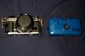
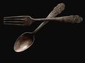
pre-digitalby queen 91Comment: Idea is good. I'm going to be frank: Not sharp enough/or too pixelated; I don't like seeing the black cloth and the wrinkles; the setup does not do anything - What I see: a black cloth with 2 cameras placed side by side, taken with a camera with the flash on. I think the idea is there, but the lighting and exposure needs improvement - when using a backdrop - especially black, you need to have the exposure just right as to not see it in the photo. I think the arrangement of the cameras needs to be changed - perhaps at angles. Overall, I'm sorry to say, but this photo is poor - but I think that with some more practice and continued participation here at dpc, skills will improve. Ruthann - 2 |
| 08/10/2002 05:34:00 PM |
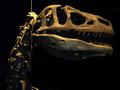
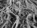
Old Bonesby wargloryComment: I like this! I like the lighting and its direction. At first I scored this a 7, but I have taken a 2nd and 3rd look - each time liking it more. There is great photo quality here. I'm taking it to a 9. Great work. Ruthann |
| 08/12/2002 11:33:00 AM |
|
| 08/05/2002 06:46:00 PM |
Stopped In It's Tracks by timj351Comment: I gave 4 10s this week, this is one of them. Despite that the parking lot on the right is visible, I love this. I like how the sky is dark on one side. The angle is great as well as the clarity. Great Job. Ruthann |
| 08/05/2002 07:28:00 PM |
Another Year Olderby CoreyComment: I'm being very frank in my comments - not to offend. This photo is for the family photo album - not much for 'photography'. I do like the idea and how he's blowing out the candles, but the flash is harmful for this photo. Although there isn't a lot of post-processing aloud here, there is still a lot that can be done. I think the main flaw is the flash/lighting. Also, try different angles. This is only my opinion - take it as you will. Keep working though. 4 Ruthann |
| 08/06/2002 11:02:00 PM |
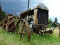
Antiquated Arrangementby Gene L.Comment: A Nice collage of old objects. I'm being frank in my comments - not to offend. For me: I would change the angle and the cropping, sometimes not all of the subject/objects have to be completely visible...that could lend the viewer to look again. I do like that the objects are not just flat. Good work 6 Ruthann |
| 08/05/2002 10:24:00 PM |
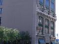
Seventh Street Grilleby mcrochipComment: Unfortunately, I'm not sure what I'm looking at. Is it the building or the sign. I'm being very frank in my comments - not to offend. The don't think the tilt is working with this photo. It's hard to comment on something I don't understand. What is the main subject of the photo - the sign. the building structure, the restaurant.. There should be on object in which the photo will guide the eye to. Too much guess work for me. The color is good and the focus. Just my opinion - not to offend. 4 Ruthann |
| 08/05/2002 10:37:00 PM |
Steamboat Willieby BAMartinComment: Very nicely done. Exposure is very effective - the composition is as effective. Nice use of space. Great Job 9 Ruthann |
 Photographer found comment helpful. Photographer found comment helpful. |
| 08/05/2002 10:41:00 PM |
The Foundation of Lifeby RoninComment: This is just great. When I first starting getting interested in photography, I wanted to do shots just like this (I still need some practice). I like the b/w - you'll have to post an outtake of the color version, if possible. Great work!! 9 Ruthann |
Home -
Challenges -
Community -
League -
Photos -
Cameras -
Lenses -
Learn -
Help -
Terms of Use -
Privacy -
Top ^
DPChallenge, and website content and design, Copyright © 2001-2025 Challenging Technologies, LLC.
All digital photo copyrights belong to the photographers and may not be used without permission.
Current Server Time: 08/20/2025 11:58:30 PM EDT.