| Image |
Comment |
| 05/18/2004 04:56:16 PM |
Natural / UnNaturalby gpiersonComment: Normally I'm a devoted fan of B&W's and Sepias. In this instance, though, especially using a model with such vivid and striking eyes, I feel that color would have been your best tool to show the "opposites". Having the rich reds of the lipstick, the blue or green of a heavy eyeshadow, and the other richness that color would have lent the piece would have most likely made a significant difference. |
 Photographer found comment helpful. Photographer found comment helpful. |
| 05/18/2004 04:53:11 PM |
Opposing Colors Harmonizeby nikon_girlComment: The concept is stong, and I'm also fond of the angle. In my opinion, though, the shot would have been better served by a much tighter crop, and less of an overall gradient in the lighting (the keys in the foreground are too washed out, while the keys in the background are too dark). A crop encompassing, say, F# through C would have probably served you better. |
| Photographer found comment helpful. |
| 05/18/2004 04:48:48 PM |
Opposites Attractby gajmajComment: I enjoy the concept, and I think this shot makes a good statement. But at the same time, it lacks.... something. I really couldn't say what, but it just doesn't jump out at me. Maybe a different background color to offset the cold tone of the metal? Maybe a more simplistic metal (say, one ring instead of three?) to streamline the angles a bit more? I'm really not sure. |
| Photographer found comment helpful. |
| 05/18/2004 04:45:54 PM |
where opposites meet : the sky and the seaby Jamie2772Comment: for a title of "Sea & Sky", this shot encompasses far too much land. The bridge, too, becomes a primary focus that required me to look at the title to discover what opposite was being struck here. And I while I will certainly grant that trying to get rich, opposing colors out of water and sky can be next to impossible, having the only bold color statement in a picture thus entitled be the green of the grass completely defeats any other color statement that could have been made here. |
| Photographer found comment helpful. |
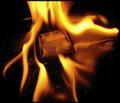
| 05/18/2004 04:42:50 PM |
Fire & Iceby kaenmeyComment: I can honestly say that I have now looked at more "Fire & Ice" shots than I ever care to again, and I have rated only one above a three. The focus lines in this piece are very ambiguous, and the ice is underplayed to the point of detrimental to the shot. I just don't think it emphasises the ice enough to reach a very bold statement of "opposites". |
| 05/18/2004 04:39:05 PM |
Different as Black and Whiteby sailracer_98Comment: GREAT statement! It actually takes a moment's thought, and I love that in an artistic rendering! While there does appear to be just a bit of noise, and possibly a little lens dust involved, it doesn't significantly detract from the shot. Also, I'm noticing a fair bit of moire in the background, but I'm willing to lay odds that's simply a matter of downsampling for submission -- it probably doesn't appear in the original. All in all, I'm very fond of this one! |
| Photographer found comment helpful. |
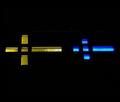
| 05/18/2004 04:36:11 PM |
The Exorcistby labudsComment: Both the iconography and the angles of this shot capture my attention right from the start. Conceptually, this is among the best shots I've seen in this contest (opposites). I think the statement may have been more strongly served by baffling your lights such that no red fell on the cross, and no blue fell on the pentagram. The edging on the pentagram is faint enough to ignore, but the red edge on the cross is so noticeable as to confuse the sense of color involved in your statement. |
| 05/14/2004 01:05:45 AM |
Young and Oldby NeuferlandComment: Great concept. Watching the photographer in the mirror is a bit too distracting. This is a rare instance, also, that I think you could have achieved a better B&W by stripping out two of the RGB channels instead of just desaturating the shot. Of course, that may be in a very grey area (pun almost intended) of the editing rules. |
| Photographer found comment helpful. |
| 05/14/2004 01:02:52 AM |
|
| 05/14/2004 01:01:56 AM |
Opposing Forcesby dahvedComment: Personally, I think the topic was too easily struck-at on this shot, and I think it fell short. On the technical side, I feel that overall the shot is too bright without enough contrast. More color saturation would have elicited more of a reaction out of me. |
| Photographer found comment helpful. |
Home -
Challenges -
Community -
League -
Photos -
Cameras -
Lenses -
Learn -
Help -
Terms of Use -
Privacy -
Top ^
DPChallenge, and website content and design, Copyright © 2001-2025 Challenging Technologies, LLC.
All digital photo copyrights belong to the photographers and may not be used without permission.
Current Server Time: 08/18/2025 10:30:12 AM EDT.