| Image |
Comment |
| 05/18/2004 05:12:43 PM |
Liquid-Solid Blueby ExoticChaosComment: a bit better focus, and I couldn't have asked for more! Still, a solid concept (and the fact that you used ice and didn't feel you had to tie it to fire to get the opposite scores you major bonus points in my world!) |
 Photographer found comment helpful. Photographer found comment helpful. |
| 05/18/2004 05:11:27 PM |
Coming and Goingby candycornComment: I like the concept, but there's too much of a grey cast to the shot and not nearly enough color to embolden the statement enough to get it past a 4. |
| Photographer found comment helpful. |
| 05/18/2004 05:10:16 PM |
The Gameby MrZedComment: the reflections in general, and the "light bath" of the right side of the board detract from this shot far too much for my tastes. |
| Photographer found comment helpful. |
| 05/18/2004 05:08:47 PM |
Fire and Iceby Chilly0999Comment: I can honestly say that the number of "Fire & Ice" shots in this competition has been relatively obscene, but this is also only the second that I have scored over a 2! Very nicely done, regardless of the predictable topic. |
| Photographer found comment helpful. |
| 05/18/2004 05:07:00 PM |
Bright Sky - Dark Beachby jkarsgaardComment: for a beach/sky picture, there's just too much middle ground. Also, all of your movement is happenning in that middle ground, and that will draw my eye every time. |
| 05/18/2004 05:05:13 PM |
|
| Photographer found comment helpful. |
| 05/18/2004 05:03:43 PM |
Family Reunion?by photomComment: (while I realize this isn't a terribly helpful comment, I can't come up with anything else...)
huh?! |
| Photographer found comment helpful. |
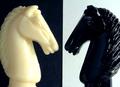
| 05/18/2004 05:02:25 PM |
Faceoffby paynekjComment: Overall, I love this piece! My only criticisms, and I should mention that they are VERY minor ones, are that I would have prefered to see the same texture in the white background as I see in the black, and you may have been better served by shifting the image to a true B&W to eliviate the tonal differences between the "white" knight and the "white" background" -- I do find each of those just the slightest bit distracting. |
| Photographer found comment helpful. |
| 05/18/2004 04:59:56 PM |
OldCurves, NewLinesby banmornComment: good topic, great angle, and the lighting's pretty darned good, too! I especially enjoy the modern-esque reflections in the windows, helping to embolden the statement. |
| Photographer found comment helpful. |
| 05/18/2004 04:58:33 PM |
Opposite Worldsby the-O-sterComment: Great concept, fantastic angle, and the blur of moving person in the foreground opposed to the still figure in the background all lend this shot a good number. But since your main focus is on the text in the picture, a greater depth of field would have been appreciated, creating a greater legibility of "downtown". |
| Photographer found comment helpful. |
Home -
Challenges -
Community -
League -
Photos -
Cameras -
Lenses -
Learn -
Help -
Terms of Use -
Privacy -
Top ^
DPChallenge, and website content and design, Copyright © 2001-2025 Challenging Technologies, LLC.
All digital photo copyrights belong to the photographers and may not be used without permission.
Current Server Time: 08/18/2025 10:27:10 AM EDT.