| Image |
Comment |
| 05/18/2005 12:41:45 AM |
|
 Photographer found comment helpful. Photographer found comment helpful. |
| 05/09/2005 11:07:25 AM |
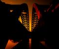
GLORIOUS........humbledby glad2badadComment: Sorry my friend, only after you pointed it out did the formation near the bottom resemeble what could be a cross to me. Each mind (especially around these parts) sees things differently. You seen a cross in the shot and the photo took on a certain personal meaning for you. Maybe a play on words in the title would have directed the view that area you wished them to see.
IMO...The quick viewers (<2 seconds) probably passed this off as an underexposed attempt at a sunset...
For me... The formation that you wish us to pick out, takes backseat to Dark Clouds on top, Hot center Point of the Photo, Rays of the Sun and very dark horizon, my eyes are quickly drawn to any of these emphasised areas and I completely over looked what you perceived to be a cross.
Now this would have worked for me if the cross was more prominent. My mental image of a Cross is that the vertical needs to be longer on the bottom than top or it becomes a plus "+" sign... I am not seeing that here although the bottom portion of the cross could be hidden by that large tree my minds eye did not put that together. Perhaps a tighter crop on top and less on the bottom would help the illusion that combined with a title that steered us that direction (without telling us what exactly we were looking for) might have helped more see the idea behind your shot.
Andy |
| Photographer found comment helpful. |
| 05/09/2005 12:45:48 AM |
|
| Photographer found comment helpful. |
| 04/29/2005 01:07:35 AM |
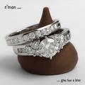
a diamond is forever by hopperComment: I think you have got the most (best) detail of the jewelry of the entire bunch here. Very nice sharp shot. Simple and effective. Nice lighting and just that itty bitty reflection on the upper right of the lower ring. Great shot. |
| Photographer found comment helpful. |
| 04/29/2005 01:03:28 AM |
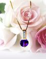
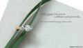
Speak Her Language!by SunnieeComment: Excellent, no text needed here. Nice soft background and the subject is nice and sharp. I can't think of any thing that I would do differently here. It does get a little hot on the petals in the upper left but still not a serious problem. Great job. |
| Photographer found comment helpful. |
| 04/29/2005 01:00:43 AM |
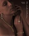
The Links Collectionby EddyGComment: Very nice shot, I give it high marks. Personally I think with the excellent toning that you did to background/secondary subject here that the shot may have had even more impact with maybe just the ring or the ring and the necklace. Great shot, excellent post processing but for me just feels like too much bling bling to look at. Still one of my tops. Fonts are fine, still undecided about the vertical text. |
| Photographer found comment helpful. |
| 04/29/2005 12:51:11 AM |
Writing a Love Poemby admart01Comment: Very well presented with a very nice layout, nice subtle colors. Excellent choice for font to fit the mood...I do find the first two lines a little crowded but doesn't detract from the shot too much. Excellent job. |
| Photographer found comment helpful. |
| 04/29/2005 12:48:12 AM |
CGby whiteroomComment: Excellent advertising shot. The tones are wonderful . Well thought out. The whole presentation is very nice. The only thing that I would like to see different is a tad bit more detail on the ring. Possibly if the tones on the hand was closer to the tones of the face would be enough to bring out those edges of the ring that seem to disappear. Very Good shot. One of my top picks. |
| Photographer found comment helpful. |
| 04/29/2005 12:41:58 AM |
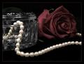
Simple Eleganceby ShannonComment: And you did an elegant job, pearls are hard to shoot. Any less light and we would lose detail of the other items in the shot any more light and the pearls would be completely blown out. Excellent job...the only thing that I would like to see different is those pearls on the bottom near the front a little sharper. high marks. |
| Photographer found comment helpful. |
| 04/29/2005 12:35:04 AM |
OUTBACKby DrJOnesComment: I really like this shot. Even though the watch is not the center of focus you definately know its there. The lighting is superb, excellent profile. One of my top picks. I am still un-decided about the crop, I'm thinking I would like to see it not so tight on the top...but do understand that in a 640x640 challenge that if you cropped it any less that the watch would become smaller and you might lose people around DPC. |
| Photographer found comment helpful. |
Home -
Challenges -
Community -
League -
Photos -
Cameras -
Lenses -
Learn -
Help -
Terms of Use -
Privacy -
Top ^
DPChallenge, and website content and design, Copyright © 2001-2025 Challenging Technologies, LLC.
All digital photo copyrights belong to the photographers and may not be used without permission.
Current Server Time: 08/06/2025 02:42:43 AM EDT.