| Image |
Comment |
| 08/25/2005 03:51:04 AM |
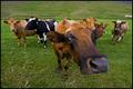
Say What!? by arnitComment: Maybe one of the best cow pics that I've found in this challenge. It's humourous, fun and tehnically a great shot as well. The colours are great, the matt green of the grass and yet the saturated browns of the cows create a great contrast. And of course what produces the best effect is the wide angle, and you've managed to successfully focus on the cow's eyes...hm... Did he lick your camera? :P The only advice I could have given you was either to somehow avoid the ranch in the far right, or to just crop it off in photoshop, but if you don't want to loose the balance by cutting that cow's butt, then well you can just clone it out after the challenge. |
 Photographer found comment helpful. Photographer found comment helpful. |
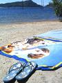
| 08/25/2005 03:35:52 AM |
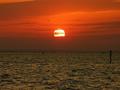
Sun Setby Khalid-MsdComment: I'm cracking up! I have to give this good points just because you mayde me spill my drink.
"There's a sunset shot in everychallenge!" Even in dairy. |
| 08/10/2005 05:07:17 AM |
Affluence?by maxlevayComment: This should have done much much better, it was my highest scored image :( |
| 08/07/2005 09:28:49 AM |
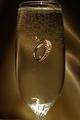
Champagne Wishesby YoungerComment: Classic idea, yet there weren't any in this challenge that caught my eye. It's a great catch but I think there are some things you could improove like the lighting, though you did not get any glares on the glass, there are some on the bottom part, wish that had been avoided has it catches the eye of viewer but it's just a minor detail. The bubbles on the glass, there was some way you could avoid it as well but I can't really remember, I think it was boiling the water or something. Anyway I love the background as well, the highlights on the ripples, the color, that was a really good choice. |
| Photographer found comment helpful. |
| 08/07/2005 07:31:46 AM |
Richesby digidoriComment: To be honest I see your point of affluence but it just doesn't make sense, make a couple of dirty towels would make more sense, this is just something everyone has and can get. I don't know how to explain this but I think you wanted to say that some people only have these as their precious things, but the objects you have chosen don't really stick with that idea. I do like the composition, with the rule oh thirds being used but the color and the lighting is really harsh. Cutting off the mountains and the trees would have really helped and maybe avoiding the harsh highlights. |
| 08/07/2005 07:24:16 AM |
no trunk without leaves of vineby kenboComment: Quite interesting idea I really do like it. The colors are marvelous the set up is nice with the trees just showing a little bit of the sky in the background. The only thing that really annoys me is the trunk in the middle with is out of focus, it just captures the attention of the viewer and just makes the picture quite uneasy. |
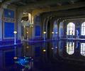
| 08/07/2005 07:18:33 AM |
24kt dipby beafliesComment: The picture seems somewhat tilted, there is no real point of interest which is actually normal because this is an architectural shot. But it's really an abused way of showing affluence but I do like the blue. |
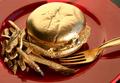
| 08/03/2005 03:34:10 PM |
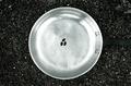
Starving Midas : Unfortunate affluenceby manuraoComment: Aluminium foil painted gold? Great idea! But not a great set up. The lighting is too harsh, softening or diffusing it would have been much better. And the composition is quite confusing and not flattering, I think either the whole plate should have been shown a better angle could have been chosen to avoid the bits of table on the corners. |
| 08/03/2005 03:30:04 PM |
Material Wealthby mesmerajComment: I absolutly love it, how cute :P Really clever idea and a good portrayal of the challenge my only advice would have been to make the DOF bigger so that more could be seen and the viewer ould immediatly understand the humour in the picture. 9 |
| Photographer found comment helpful. |
| 08/03/2005 03:23:29 PM |
Affluence?by maxlevayComment: I really like it. Awfully creative. One man's poverty is another man's affluence. That should have been the title.
I like everything here, the lighting, composition, the use of the number three and the desaturation. Perfect. |
Home -
Challenges -
Community -
League -
Photos -
Cameras -
Lenses -
Learn -
Help -
Terms of Use -
Privacy -
Top ^
DPChallenge, and website content and design, Copyright © 2001-2025 Challenging Technologies, LLC.
All digital photo copyrights belong to the photographers and may not be used without permission.
Current Server Time: 08/28/2025 01:34:48 AM EDT.