| Image |
Comment |
| 04/30/2006 03:12:12 PM |
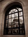
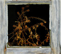
Medieval Viewby AlexSaberiComment: Bravo...very nice, great complimentary lines and shapes. Really do like the black and white, with a touch of nice tones. I give you tops. |
 Photographer found comment helpful. Photographer found comment helpful. |
| 04/30/2006 03:06:36 PM |
|
| 04/30/2006 02:27:57 PM |
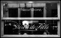
Désiré de Lilleby hannekeComment: For me the window signs take away from whats really going on in the photo and I think its more about what the people are doing. |
| Photographer found comment helpful. |
| 04/30/2006 02:20:25 PM |
Nikkiby facesastheycomeComment: Your file size is way to small you lost a lot in the image, max is 150k and yours is 48k, I really like the high key b&w here. |
| Photographer found comment helpful. |
| 04/30/2006 02:08:22 PM |
out of the frameby redpandaComment: My cats do this, and one day he jumped out and I thought he will run off for sure. But since they never go outside he was trying to claw his way back in, I should have taken a picture of the cry baby. |
| Photographer found comment helpful. |
| 04/30/2006 02:05:36 PM |
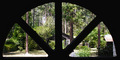
beautiful dayby Jaded_HousewifeComment: A little more contrast and try to keep your file size up 150k.
But you have some nice line also 3 trees and 3 frames of the window and the line compliment the buildings roof top. |
| Photographer found comment helpful. |
| 04/30/2006 02:00:16 PM |
Window on Dreams gone Byby yetiComment: Since really your mirror is more in focus and there is some great spring scenery, you could have cropped away all of the trucks window and this would have got rid of the purple fringing also. This put your mirror on a third. I pull your picture up and play with some ideals to make it better to me.
So I did channel mixer, then painted back all but the mirror.
Still had some fringing so I just hue and saturation remove the magenta and some blue, these two colors tend to show up in shadows, Then I used selective color to bring on some more color and went to hue and saturation to make it pop some more.
So now when I look at your picture I go right to the mirror and then I look at the shape of it and see the nice lines that compliment the shapes of the building as my eyes wonder around I also see the nice color it has, this just my opinion. |
| Photographer found comment helpful. |
| 04/30/2006 01:21:01 PM |
|
| Photographer found comment helpful. |
| 04/30/2006 01:19:37 PM |
|
| Photographer found comment helpful. |
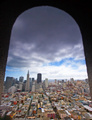
| 04/30/2006 01:10:46 PM |
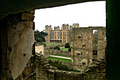
San Franciscoby bryanbrazilComment: To bad there were not more complimentary lines to go with your shape of your window, there are a few, but not many. I do like your perspective. |
| Photographer found comment helpful. |
Home -
Challenges -
Community -
League -
Photos -
Cameras -
Lenses -
Learn -
Help -
Terms of Use -
Privacy -
Top ^
DPChallenge, and website content and design, Copyright © 2001-2025 Challenging Technologies, LLC.
All digital photo copyrights belong to the photographers and may not be used without permission.
Current Server Time: 08/02/2025 01:26:44 AM EDT.