| Image |
Comment |
| 11/13/2003 04:01:43 PM |
Akula the Black Birdby jab119Comment: I can't make out much of the face, especially compared to the beak. I do like the choice of a black background and your using it for negative space. 7 |
 Photographer found comment helpful. Photographer found comment helpful. |
| 11/13/2003 03:58:01 PM |
Crossroads of Twilight (By Robert Jordan)by guobinComment: Well this certainly has nothing at all to do with the book (is that series *ever* going to end?), but it definitely fits for this challenge. I like the contrast of the cars sitting with the motion suggested by the headlights. I like the crop, too. 7 |
| Photographer found comment helpful. |
| 11/13/2003 03:54:47 PM |
microserfsby space amoebaComment: Very good idea. I like the composition, though the shadows are a bit too much. The smile on the serf's face is hilarious. (BTW, I wish I could have come up with something for "Shampoo Planet.") 7 |
| Photographer found comment helpful. |
| 11/13/2003 03:50:04 PM |
The Unlit Lamp (Radclyffe Hall)by CatherineComment: I really like what you've done here. It took me a second or two to figure it out, but it was worth it. Nice color and composition. I also like the texture that's here. 9 |
| Photographer found comment helpful. |
| 11/13/2003 10:35:25 AM |
|
| Photographer found comment helpful. |
| 10/29/2003 03:06:55 PM |
Heaven's Graceby dcanoComment: My eyes keep getting drawn to the black in the center of the circle, but I don't think that's what you were going for. Maybe show more of the statue? I like the duotone and the light on the statue's head. And now I'll go visit a shrink and try to find out why I'm drawn to the darkness . . . |
| Photographer found comment helpful. |
| 10/29/2003 03:02:27 PM |
Natures Graceby melkingComment: Cool idea. I think the DOF is too shallow, though. Maybe have the entire top leaf in focus with the one(s) behind blurry. Good composition and nice color. |
| Photographer found comment helpful. |
| 10/29/2003 03:01:05 PM |
A Gathering of Dewby e301Comment: This is an interesting idea, but I'm not sure it comes off. The colors (even the greens) seem dull or muted somehow. |
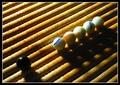
| 10/27/2003 04:03:05 PM |
Racismby csokaComment: Interesting idea. I'm not sure I like the lighting, though - perhaps eliminate the shadows. I like the contrast of the round marbles with the diagonals. Is that matzah?! |
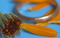
| 10/27/2003 03:59:41 PM |
Loves me notby robsmithComment: The ring keeps distracting me, actually. Seems like there's too much stuff in the background. I'd rather look at the wonderful detail on the flower and enjoy your color choices. |
| Photographer found comment helpful. |
Home -
Challenges -
Community -
League -
Photos -
Cameras -
Lenses -
Learn -
Help -
Terms of Use -
Privacy -
Top ^
DPChallenge, and website content and design, Copyright © 2001-2025 Challenging Technologies, LLC.
All digital photo copyrights belong to the photographers and may not be used without permission.
Current Server Time: 08/24/2025 11:48:04 AM EDT.