| Image |
Comment |
| 01/18/2006 01:39:30 PM |
Faith Aloneby muur88Comment: I'd rather see your subject left of center instead of right. I like how the background color helps to frame him. You've captured a great look on his face, too. |
 Photographer found comment helpful. Photographer found comment helpful. |
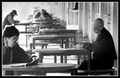
| 01/18/2006 01:36:52 PM |
Handicapping the Poniesby mpetersComment: great minimalist approach. I might have liked to have more room on the left for balance; I like you gave your subject space. |
| Photographer found comment helpful. |
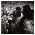
| 01/18/2006 01:35:10 PM |
Line of Sightby JPRComment: It's great that everyone in the foreground is looking toward that one kid. But what is everyone else looking at? B&W is a good choice to remove clutter and help focus the viewer. |
| Photographer found comment helpful. |
| 01/18/2006 01:32:45 PM |
|
| Photographer found comment helpful. |
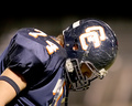
| 11/28/2005 12:29:19 PM |
Seventy-Fourby moviemanComment: I like the square shape, but I'd move the crop down so his head is closer to the top and there's more space below. |
| Photographer found comment helpful. |
| 11/20/2005 05:37:05 PM |
BDDS8584.jpgby KevinRiggsComment: It's the full beard. Gets 'em every time.
...and there seems to be a couple of people missing from this shot. |
| Photographer found comment helpful. |
| 11/14/2005 03:16:36 PM |
|
| Photographer found comment helpful. |
| 11/14/2005 03:14:51 PM |
5 Cent Cans?by alihComment: I don't understand why you played around so much with the colors. I guess blue isn't as "loud" as red, but then you desaturated pretty much everything else. I bet straight b&w would have been a better choice. |
| 11/14/2005 03:12:50 PM |
Throw away societyby fredandaudComment: The clutter is great, but I don't think the added grain adds to the photo. I do like the muted tones, though. |
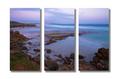
| 11/14/2005 12:43:29 PM |
Evening at Sleafordby John WhiteComment: The drop shadows can't ruin a beautiful photo, but they sure try. I like the rich colors, especially standing out against the white background. The white bars in between really help make the frames pop. |
Home -
Challenges -
Community -
League -
Photos -
Cameras -
Lenses -
Learn -
Help -
Terms of Use -
Privacy -
Top ^
DPChallenge, and website content and design, Copyright © 2001-2025 Challenging Technologies, LLC.
All digital photo copyrights belong to the photographers and may not be used without permission.
Current Server Time: 08/24/2025 07:39:35 PM EDT.