| Image |
Comment |
| 01/24/2006 06:19:20 PM |
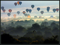
Flight by jemisonComment: The bird is either really distracting or an excellent touch. I'm leaning towards the former because the photo is great without it and it draws my eyes away from the wonderful balloons. |
 Photographer found comment helpful. Photographer found comment helpful. |
| 01/24/2006 06:16:21 PM |
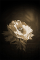
Peonyby ernielComment: Looks like the post editing may have muddied this up a bit; the flower petals don't seem as crisply in focus as the leaves (especially to the left of center). I love the hint of the railing and posts in the background. |
| Photographer found comment helpful. |
| 01/24/2006 04:16:33 PM |
You Think You Know Me.by MPRPROComment: I didn't leave a comment during voting because I couldn't articulate why I gave it a 7. Still can't, really. It's very good without being great; I don't think it's at the level of the Top 10 in this challenge.
This challenge was brutal to those of us who didn't follow its details to the letter. Though the model could stand to be in sharper focus, too shallow a DOF would have hurt this shot � I agree with your choice there. I like the crowd in silhouette; the effect really isolates the model as the only identifiable person in the shot � she's somehow more vulnerable and stronger this way.
Your 5.685 is a good score for DPC, as you know by now, even though it deserved better. Expect a nude shot to be marked down for content; throw in the DNMC evangelists, and this shot was in trouble, score-wise, from the get-go.
As for the ridiculous disparity in views and votes, I think "masochist" is the wrong word. "Voyeur," maybe. "Pervert," perhaps. "Teenager" is also probably accurate. Take a look at the site's most viewed and you'll see a similar pattern. |
| Photographer found comment helpful. |
| 01/23/2006 03:15:31 PM |
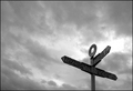
This way, please...by nessnajComment: I think this is a case where the border actually hurts the photo, especially where it meets the letters "s" and "a". Taking away the lower left quarter of the border might be more interesting (though not allowed in a basic challenge). |
| Photographer found comment helpful. |
| 01/23/2006 02:14:12 PM |
|
| Photographer found comment helpful. |
| 01/23/2006 01:48:48 PM |
|
| Photographer found comment helpful. |
| 01/23/2006 01:41:48 PM |
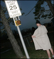
Observe The Flashersby jrjrComment: The tilt on this is great. Cutting off the feet is a bit distracting. And how would this look black & white, like a police evidence photo? |
| Photographer found comment helpful. |
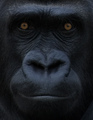
| 01/20/2006 09:02:06 PM |
Grinby dahkotaComment: Needs more light, but this is a great crop of a wonderful face. |
| Photographer found comment helpful. |
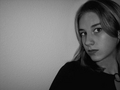
| 01/20/2006 03:13:31 PM |
Strikingby ChilibeanComment: I like the pose and the cut-off crop, but the focus is too soft to really be effective. |
| Photographer found comment helpful. |
| 01/20/2006 03:12:37 PM |
|
| Photographer found comment helpful. |
Home -
Challenges -
Community -
League -
Photos -
Cameras -
Lenses -
Learn -
Help -
Terms of Use -
Privacy -
Top ^
DPChallenge, and website content and design, Copyright © 2001-2025 Challenging Technologies, LLC.
All digital photo copyrights belong to the photographers and may not be used without permission.
Current Server Time: 08/24/2025 03:07:54 PM EDT.