| Image |
Comment |
| 06/22/2004 08:18:39 PM |
|
| 06/22/2004 07:38:31 PM |
Bloomby AleciaComment: The lighting is unbelievable on this. What a beautiful shot. |
 Photographer found comment helpful. Photographer found comment helpful. |
| 06/22/2004 05:57:11 PM |
|
| Photographer found comment helpful. |
| 06/22/2004 05:56:10 PM |
The Road Aheadby PaulMdxComment: What a shot. I love this sort of photography, and you do it the justice it deserves. |
| Photographer found comment helpful. |
| 06/22/2004 05:55:26 PM |
|
| Photographer found comment helpful. |
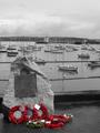
| 06/22/2004 04:46:05 PM |
Launching place of the raid on St. Nazaire. 28th March 1942by cbonsallComment: Good, original idea. The color brings you to what is "important". The focal point (the color) seems just a little too far down and to the left within the composition. It would have been very nice to have had a little more tonal range in the B & W, but have no idea if this is even possible or perhaps you wanted to keep a more "overcast" look for your subject matter. Focus is not very crisp, which will probably affect the scores you see overal. |
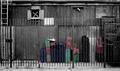
| 06/22/2004 04:42:51 PM |
Abandonedby nathankComment: I lke this rustic take on the challenge. Very good composition and that you thought of how to use this shot. I could use a tad more brightness/saturation/boldness of the colors. I doubt there is a way to do this with the shot you could get, but it would be nice if there were a bit more light tones to bring out a crisper contrast. |
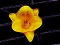
| 06/22/2004 04:40:30 PM |
Yellow Day Lilyby Crafty SueComment: I like the colors and the background interplay. The flower looks somewhat detached and floating, however. The background doesn't appear de-saturated, but more like a digital art type thing -- but of course, I don't know what I am actually seeing -- just how it "looks". The pistals in the flower show sharp outlines, as does parts of the flower, making it appear a little harsh. The shape of the flower itself and the placement aren't "great", but just an opinion. I like the hints of tangerine very much. |
| Photographer found comment helpful. |
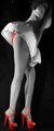
| 06/22/2004 04:36:13 PM |
Not in Kansas Anymoreby neilmwilsonComment: I like the set-up and flavor of this a lot. The things I might like to see done differently (which may or may not work) is the cropping seems extreme on the vertical to horizontal relation; the shoes look "stretched" - maybe not such a high platform, and perhaps cropping the top right at the shoulders. Very nit-pic comment: On my monitor, the color appears neon orange-red; I think I would prefer a deep, saturated red. Just an opinion based on how I am seeing it on my display. |
| Photographer found comment helpful. |
| 06/22/2004 04:28:58 PM |
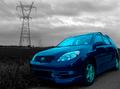
Don't it make your brown eyes blueby fstopopenComment: Good perspective and unusual location. I think the blue may look at bit too "electric" and almost glowing. The car appears to be disjointed from the rest of the picture, perhaps due to this striking contrast. Completely personal and not part of my score -- I don't find "new" cars very interesting, but enjoy pictures of classics and customs more for photography. |
| Photographer found comment helpful. |
Home -
Challenges -
Community -
League -
Photos -
Cameras -
Lenses -
Learn -
Help -
Terms of Use -
Privacy -
Top ^
DPChallenge, and website content and design, Copyright © 2001-2025 Challenging Technologies, LLC.
All digital photo copyrights belong to the photographers and may not be used without permission.
Current Server Time: 08/07/2025 09:11:25 AM EDT.