| Image |
Comment |
| 08/30/2004 09:29:33 AM |
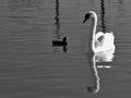
The Ugly Ducklingby BradComment: Nice reflection work. The image feels a bit underexposed overall, yet overexposed severely on the swan's side to the point of loosing detail. |
 Photographer found comment helpful. Photographer found comment helpful. |
| 08/30/2004 09:27:59 AM |
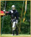
Knight in Shining Armorby KevinRiggsComment: One common suggestion in composition is to never have objects leading your eye out of the photo. In this case the background flag is a significant subject, yet its partial presence in the frame becomes distracting. Similarly, the red/yellow corner of the tent to the knight's side makes us wonder where the rest of it is rather then focusing on the more intricate details of the knight's armor. I certainly don't suggest blindly following rules in photography, but in this case I believe they would help you to compose a stronger image. |
| Photographer found comment helpful. |
| 08/30/2004 09:25:00 AM |
|
| Photographer found comment helpful. |
| 08/30/2004 09:23:39 AM |
|
| 08/24/2004 09:56:21 AM |
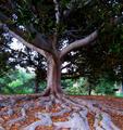
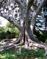
Standing Proudby KylieComment: Great choice of perspective in this shot. Emphasizing the roots with the wider angle makes a great dramatic effect. If you could recompose the shot such that the background picnic bench were behind the trunk it would remove a distraction from the shot. It also looks like this shot was hand-held vs. taken from a tripod as there is consistent blurring throughout the image. Also seems to be a slight blue color cast which could be from having the wrong white balance setting, or a confused auto WB sensor. You can usually clean this up in the levels/curves tool of your editor. |
| Photographer found comment helpful. |
| 08/24/2004 09:52:51 AM |
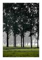
Biking in Yosemiteby KylieComment: Beautiful shot! If I were to make a suggestion it would be to either fully include the road on the left, or recompose the shot entirely such that your left border was the wood fence. Having it half in, half out is somewhat distracting. I love the colors in this - well done! |
| Photographer found comment helpful. |
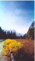
| 08/24/2004 09:50:19 AM |
Secretsby KylieComment: If you could re-take this image when the sun was bit lower in the sky you could avoid some of the minor blown-out highlights in the sky and on the trunk. The gate in the left is also an interesting subject which could be more complimentary if the perspecitve shifted it slightly to be more visible. Great subject - I bet many people would walk right by without thinking to stop and capture this tree. |
| Photographer found comment helpful. |
| 08/23/2004 09:53:20 AM |
populus balsamiferaby RemieComment: Wish this had scored higher - it was one of my favorites! If I were you, I'd put this up on DPC Prints - it's a great piece I'm sure would sell! |
| 08/23/2004 09:41:05 AM |
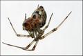
spideyDSC04266.jpgby redpandaComment: I like the clean background you've created, but I think you've got a potential lighting problem in that I'm not catching much texture (smooth or otherwise) in the underside of the spider. I also think you should bump the aperture to f/16+ on macros like this to ensure the whole thing is sharp. In this case you've got the legs, but the "head" of the spider isn't sharp. |
| 08/23/2004 09:36:15 AM |
Bed Headby ElemmennopeComment: The lighting in this image is fantastic. I like the pose as well. The only thing I might change would be cloning out the bedpost in the background as it doesn't rea;;y add to the image. Might even try taking the image a second time with a different angle the gets it out of the frame. Excellent work! |
| Photographer found comment helpful. |
Home -
Challenges -
Community -
League -
Photos -
Cameras -
Lenses -
Learn -
Help -
Terms of Use -
Privacy -
Top ^
DPChallenge, and website content and design, Copyright © 2001-2025 Challenging Technologies, LLC.
All digital photo copyrights belong to the photographers and may not be used without permission.
Current Server Time: 08/21/2025 05:27:55 AM EDT.