|
|
|
Showing 541 - 550 of ~1461 |
| Image |
Comment |
| 09/28/2005 08:29:25 PM | Voting, Update Buttons, Submitting, Photos....NO MORE!!!!!!!by JudiComment: Greetings from the Critique Club
by strangeghost
COMPOSITION
Wow. Quite a strong photo with a great concept to grab DPCers' attention! I love the "in your face" centeredness because the photo is all about her being in your face. I might have considered a slightly closer crop, but I'm sure you considered that too, and went with your actual crop for good reason. The costume, the face paint and facial expression, the pose, open mouth rage, and angry sky background all make for a very compelling and strong composition. Good job.
TECHNIQUE
Very well lit with strong, sharp contrasty colors. Excellent job on the dodging and burning of the sky (is it a sky?). Technically a very strong shot.
OVERALL IMPACT
This is quite a high impact shot, IMO. So why didn't it do better (though 5.6 is a respectable score)? Like most people shots, it might have scored better if you had gotten tighter on the face, but this would clearly have made it very difficult to retain the other elements. I like it though, and hope you're happy with your work.
|  Photographer found comment helpful. Photographer found comment helpful. |
| 09/27/2005 10:33:39 PM | Fade to Greyby sumpComment: Greetings from the Critique Club
by strangeghost
COMPOSITION
There are a couple of things that don't sit right with me about your composition. First, the background is very oddly tilted, which tends to make the whole shot feel vaguely unbalanced or somehow just "wrong." I think this is true of just about any horizon, but maybe especially so for water shots. Maybe it subconsciously makes me feel like something is going to spill out of the right side of the photo. I think that unless there is a compelling reason to tilt the horizon, it's better off straight. Now, having said all that, this is a Perspective challenge, so unusual and different perspectives are to be celebrated and prized, right? Well, maybe. Again, it doesn't seem to me to work in this photo. My second compositional gripe is the way the flower/subject is framed. It's cropped (which is fine, I like tight shots on the subject), and it's a bit of an odd angle - not straight on but just a little tilted and off to the side. Again, I grant that this could have been a deliberate choice on your part in composing the shot, and I grant that it's not bad, but it (along with the horizon tilt) gives a very off balance feel the shot which is mildly disconcerting. I'll also mention that you've captured the edge of what seems to be a path or something in the upper right. This could have been cropped out with no loss to your composition, and probably a gain, keeping just the flower and lilly pads. I think there are some real compositional strengths here too. I like the fact that the flower is not centered, but sits at the bottom and side of your canvass. It's an interesting shot.
TECHNIQUE
The most obvious technical point to comment on here is your de-saturation of the background. I think you've pulled it off very well, especially given that it's a basic editing rules challenge. Focus looks great but the image is lacking in contrast somewhat. Did you try to stretch things a bit, brightening up the whites and knocking down the darks? This might have added some pop or initial eye appeal.
OVERALL IMPACT
I spent quite a bit of verbiage in the composition section talking about how your photo impacted me, so I won't rehash that. It's not a shot that has a huge "wow" factor that will make the casual voter spend more than a few seconds, though I fear that if they do, it will be to puzzle over the unbalanced feel that I noticed initially. I hope you're satisfied with your shot and that you will keep experimenting with unusual and interesting compositions in the future.
|
| 09/25/2005 11:26:52 AM | |
| 09/24/2005 10:36:29 PM | |
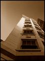
| 09/24/2005 05:58:48 PM | A Legal Perspectiveby kari1Comment: Greetings from the Critique Club
by strangeghost
COMPOSITION
My initial feeling is that, while a decent enough shot, it lacks a clear point of focus to draw my interest. The "school of law" seems to be well placed, but the way it curves out of easy visual range makes it feel like it just fizzles out. Likewise, the interesting windows are arranged in lines that lead the eye to the edge of the photo, but again, lack a balanced or harmonious feel.
TECHNIQUE
The main impression here is of a somewhat monochromatic image, with relatively low contrast. The grays really rule the day. Bumping the contrast up a bit may have paid off. I think the reflections in the lower windows are particularly unfortunate, since they add a bit of additional detail that fails to add any interest. Focus is sharp, but without any key element that draws the eye, it's technical adequacy without emotional impact.
OVERALL IMPACT
Pretty flat, I think. It's an attractive enough building, but I think you didn't find the pleasing angles or lines that would have really made it a 'wow' photo. Keep browsing the architectural photos on this site and others. Watch for how people make dramatic use of light, shadow, angles and perspective to add punch. | | Photographer found comment helpful. |
| 09/24/2005 02:42:19 PM | Bridge into Darknessby nemesise1977Comment: Greetings from the Critique Club
by strangeghost
COMPOSITION
This is certainly a unique perspective. Even after examining it for a full minute, I'm still not entirely sure what I'm looking at. Your photographer's note helps, but I can't tell from what perspective you've shot this bridge. The tree at the top suggests either a 90 or 180 degree rotation, but I'll be darned if I can tell. Enough already! What of the composition? Well, I like the perspective created by the very large elements at the bottom (trusses?) that recede into the distance. The large pipe at right, ditto. There's also a nice contrast throughout the photo that enhances the feel, as you said, of depth. I'm just not sure of your choice of subject. Being unrecognizable is not bad if there's a ton of naked visual appeal, and this photo doesn't hit me that way right out of the gate.
TECHNIQUE
Great sharpness, depth of field and exposure. For the length of your exposure, the light that people commented on is not all that blown, and actually adds a nice bit of interest. Given that the pipe at right is a bit dirty, I wonder what boosting the highlights would have done? Possibly made the lights intolerably blown, so you probably made the right decision.
OVERALL IMPACT
I wonder if others, like me, were confused by the image and then didn't spend enough time really looking at it? Your final score of 5.1 suggests a lot of kneejerk "5 and move on" votes, which is unfortunate. Your image doesn't have that major initial WOW factor, but is a very technically adequate photo.
| | Photographer found comment helpful. |
| 09/24/2005 12:59:08 PM | Spiky buildingby blue_dragonComment: Greetings from the Critique Club
by strangeghost
COMPOSITION
Certainly meets the challenge by showing an unusual building from an interesting perspective. The composition is filled with lines, more lines, still more lines; all forming interesting angles and a treat for the eye to wander around. The single open window near the bottom left adds further interest. It may be been interesting to move this mini focal point to a third and re-compose from there, possibly eliminating the distraction you noted at the upper right. I may also have considered just using the left surface of the building, which has far fewer reflective inconsistencies.
TECHNIQUE
I can't find any fault with the technique at all. Everything is sharp throughout, colors are striking, though mostly a blend of blue tones. Nice job capturing an interesting gradient in the sky too. The area around the hidden sun is subtle. Just perfect, IMO.
OVERALL IMPACT
This is a very nice picture with a lot of instant visual appeal. I'm a little surprised that it finished at 5.8. While a respectable score, I imagine you were a little disappointed that it was not higher. I can't see what part of the football stadium this is. Very interesting choice in subject and excellent job on all fronts.
| | Photographer found comment helpful. |
| 09/23/2005 08:40:12 PM | WINDOWS - 95, 98, ME, 2000, NT and XPby ardnetihComment: Greetings from the Critique Club
by strangeghost
COMPOSITION
An interesting perspective to be sure. You've created an interesting set of lines that lead out of the bottom of the image and converge toward the center/top. There might be a bit too much space at the top, give the pic a bit of a bottom-heavy feel. I like architectural shots a great deal but this one feels a bit blase' to me.
TECHNIQUE
Looks like it might have been a night shot with a long shutter, but I'm not at all sure about that. The muddy tones are unique but also ultimately unsatisfying, IMO. Coupled with the slight softness and noise/grain (especially in the sky), it has a fairly sloppy look to it. Then there's the very blown-out section of the building near the center.
OVERALL IMPACT
This shot doesn't grab me with visual impact. It has a haphazard look and feel that I think turned off many voters, as suggested by your final score of 4.7. Without any photographer's comment from you, it's difficult to critique further. For future reference, anything you can tell about your intent, your methods, or your own feelings about a picture aid immeasurably in the process of a critique. Feel free to let the voters/viewers know what you were angling for in a photo.
| | Photographer found comment helpful. |
| 09/22/2005 05:48:08 PM | Like Her Momby spydrComment: Greetings from the Critique Club
by strangeghost
COMPOSITION
Wow. Though I'm by no means a portrait photographer myself, this photo strikes me as an outstanding composition. I believe you have achieved a perfect crop on her face - not too close, not too far. Lovely detail visible, beautiful facial expression, soft lovely tones, understated background that blends perfectly with the color scheme, etc. I honestly can't think of a single recommendation for change or improvement.
TECHNIQUE
Again, I'm at a loss to be critical. I love your lighting and the exquisite play of shadow and light. Focus looks flawless. Beautiful texture visible in the skin and fabric. An unbelievably well-done job. The predominant opinion (besides loving your photo) was to brighten it up a bit. Taking another look myself, I guess I could agree that lightening _might_ improve, but I was hesitant to recommend that myself because I liked your lighting so much. Maybe an opinion, but I like your judgement on this.
OVERALL IMPACT
As with all well-done portraits, there is considerable impact. This is a beautiful girl captured beautifully. Her face radiates personality and charm. Her smile suggests barely restrained elation or joy. I look at her and am filled with wonder: who is she, what's she thinking, what's her story? Your title (the only clue you give to your own motivation) enhances the wonder. Ah, her mother's daughter. "Like" her mother. Your picture manages to communicate much about family, love, bonds, etc. It's a rare picture that can communicate a connection like that. | | Photographer found comment helpful. |
| 09/21/2005 09:00:58 PM | Onlooking...by jmleliiComment: Greetings from the Critique Club
by strangeghost
COMPOSITION
I think this is a masterful composition. Off-center, perfect sense of how to place your subject in the image, wonderful use of negative space, etc. The whole photo does what all great shots should do, it occupies my mind as well as my senses. The lighting from the left as she looks off to the right is beautiful. I like the low light level and the wonderful interplay of shadow and illumination that is created on her body and the deeply textured wood wall.
TECHNIQUE
I can't find any nits to pick here. You've achieved a wonderfully expressive photo with great detail and texture throughout. I love your lighting and the broad range of tonality. This is a photo that defies technical critique so I'm going to let it speak for itself. Reader, look at the picture!
OVERALL IMPACT
As I hope you've sensed, I like this picture a lot. I think its sheer emotional impact is very high. It's a photo that seems to raise questions and make me wonder who she is, why she looks so somber, what's happening here. In a word, she suggests a story and sets the imagination to work. I'm frankly stymied by your score. Did people think there wasn't enough color (as your photographer's comment suggests)? Did they not think a full body shot qualifies as a portrait?
I figured there would be a lot of complaints about the grain, but IMO, that was a very necessary part of this image. Low light creates mood and the grain really adds to the mood. Correct decision on your part. This was a superb photo Jeremy and I really hope you are still happy with it. Voters come with their own idea of what's good and what's not, but a great photo will stand on its own long after the challenge is forgotten. I thoroughly enjoyed studying this image in detail. | | Photographer found comment helpful. |
|
Showing 541 - 550 of ~1461 |
Home -
Challenges -
Community -
League -
Photos -
Cameras -
Lenses -
Learn -
Help -
Terms of Use -
Privacy -
Top ^
DPChallenge, and website content and design, Copyright © 2001-2025 Challenging Technologies, LLC.
All digital photo copyrights belong to the photographers and may not be used without permission.
Current Server Time: 08/11/2025 01:47:38 PM EDT.
|