Greetings from the Critique Club
by strangeghost
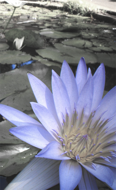
COMPOSITION
There are a couple of things that don't sit right with me about your composition. First, the background is very oddly tilted, which tends to make the whole shot feel vaguely unbalanced or somehow just "wrong." I think this is true of just about any horizon, but maybe especially so for water shots. Maybe it subconsciously makes me feel like something is going to spill out of the right side of the photo. I think that unless there is a compelling reason to tilt the horizon, it's better off straight. Now, having said all that, this is a Perspective challenge, so unusual and different perspectives are to be celebrated and prized, right? Well, maybe. Again, it doesn't seem to me to work in this photo. My second compositional gripe is the way the flower/subject is framed. It's cropped (which is fine, I like tight shots on the subject), and it's a bit of an odd angle - not straight on but just a little tilted and off to the side. Again, I grant that this could have been a deliberate choice on your part in composing the shot, and I grant that it's not bad, but it (along with the horizon tilt) gives a very off balance feel the shot which is mildly disconcerting. I'll also mention that you've captured the edge of what seems to be a path or something in the upper right. This could have been cropped out with no loss to your composition, and probably a gain, keeping just the flower and lilly pads. I think there are some real compositional strengths here too. I like the fact that the flower is not centered, but sits at the bottom and side of your canvass. It's an interesting shot.
TECHNIQUE
The most obvious technical point to comment on here is your de-saturation of the background. I think you've pulled it off very well, especially given that it's a basic editing rules challenge. Focus looks great but the image is lacking in contrast somewhat. Did you try to stretch things a bit, brightening up the whites and knocking down the darks? This might have added some pop or initial eye appeal.
OVERALL IMPACT
I spent quite a bit of verbiage in the composition section talking about how your photo impacted me, so I won't rehash that. It's not a shot that has a huge "wow" factor that will make the casual voter spend more than a few seconds, though I fear that if they do, it will be to puzzle over the unbalanced feel that I noticed initially. I hope you're satisfied with your shot and that you will keep experimenting with unusual and interesting compositions in the future.
|