|
|
|
Showing 431 - 440 of ~1461 |
| Image |
Comment |
| 03/05/2006 02:52:30 PM | Stand Aloneby medoComment: Greetings from the Critique Club
by strangeghost
The first three parts of this critique are written based purely on examination of your photo. "Final thoughts" is written after reviewing your score, photographer's comments, and voter comments.
TECHNIQUE
The first thing that strikes me is how dark the left side of the bud is. If it looks this way on my relatively bright LCD, I bet it was way too dark for some voters using CRTs. The predominantly gray background leaves the image feeling a bit flat to me. Focus is pretty good, though it looks a little soft at the upper right tip. You've preserved good detail throughout most of the image, but there are areas on the darkened side of the bud that are apparently completely black, and the leaf (?) on the lower left side is very dark. It appears as though you were shooting in a very low light situation, with ISO800, 1/45th and a pretty wide open aperture. Is that overcast sky background or is this a studio shot?? I can't tell.
COMPOSITION
I like the off-centered composition, but it feels like that flower is pointed the wrong way. I'm sure it's a very subjective call, but because of the way the bud is leaning to the right, it seems as though the negative space should be on the other side, with the bud angling toward the open area. It's not bad the way it is, but it leaves me with a vaguely unbalanced sense of the image.
EMOTIONAL IMPACT
This photo does not have a lot of punch, IMO. It's technically adequate (except for the very uneven lighting). Its overall gray appearance feels a bit flat. I wonder if a tighter crop and more attention to the richly textured detail might have helped make it more interesting?
FINAL THOUGHTS
Regrettably, you left no photographer's comment to help me understand how this photo was made. When you request a critique, please help us out by leaving some sense of why you shot the shot, what obstacles did you have to overcome, what were you happy or unhappy with, etc. Your commenters during the challenge were a bit sparse, but they seemed to like your picture very much. Your final score of 5.2 put you right in the middle of a very large pack (huge challenge) but must have been a little disappointing to you. |
| 03/05/2006 02:08:21 PM | Natalieby kellianComment: Absolutely beautiful portrait that looks very spontaneous and natural. |  Photographer found comment helpful. Photographer found comment helpful. |
| 03/05/2006 02:06:11 PM | Flowerby kellianComment: Greetings from the Critique Club
by strangeghost
The first three parts of this critique are written based purely on examination of your photo. "Final thoughts" is written after reviewing your score, photographer's comments, and voter comments.
TECHNIQUE
Lovely duotone here, I think. The brownish earth tone works well as a background to this beautiful flower. The dof leaves the left-most, more distant parts of the flower softly out of focus, which draws the eye back to the petals on the right, which are sharply detailed and wonderfully textured. I also like the way you've controlled the dynamic range to avoid blowing out any of the lighter areas. However, my monitor is fairly bright (an LCD iMac) and I wonder if your details were bright enough for voters who were using CRTs?? I bet this might have looked too dark for some voters, and you might have lost some points in the voting for that. In summary, a beautifully detailed shot that might be a bit dark for some.
COMPOSITION
I love the composition. The de-centered flower, very close crop, and softly bokehed background work very well. The beautiful clarity and balance result in a wonderful study of a flower.
EMOTIONAL IMPACT
If you don't get slammed for being too dark, I think this is a very well-done image, with a nice degree of pop. Just lovely.
FINAL THOUGHTS
Your commenters obviously didn't find it too dark, excellent! Most seemed to like it quite a lot and just gave minor suggestions on composition. Your final score of 5.8 is well above average for this challenge (87th %ile). That strikes me as a bit low (and I wonder if you were disappointed) but this was a very large challenge with lots of attention grabbing shots. In reading your photographer's comments, I was struck by your mention of a border. I went back and did a double-take on the photo and sure enough, there it is! In my estimation, a truly successful border is one that a viewer doesn't notice. Congrats on a perfect border! | | Photographer found comment helpful. |
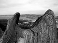
| 03/05/2006 01:51:33 PM | Untitledby nemesise1977Comment: Greetings from the Critique Club
by strangeghost
The first three parts of this critique are written based purely on examination of your photo. "Final thoughts" is written after reviewing your score, photographer's comments, and voter comments.
TECHNIQUE
The subject is sharply focused but the very dark segment on the left is a little distracting. I can't tell if it's due to the light or the actual color of the object. Other clues seem to point to it being part of the color of the object. What is it?? Looks like an old gnarled tree trunk or something, with an overall saddle shape. The sharpness and textures are outstanding, and your dof gives the distant background a softness that draws attention back to the subject. Exposure looks good for the scene and lighting appears to be indirect sunlight from an overcast sky. Nice job on the BW duotone, but I wonder if you really captured the full dynamic range available. That looks like snow or ice at the bottom just left of center. Overall, the image seems to lack any clear highlights (as the snow might have been) other than the distant details on the shoreline of the lake.
COMPOSITION
My inability to tell exactly what I'm looking at makes it tough to evaluate the artistic merits of the composition. The centeredness of the subject implies its importance, but it's not clearly a tree trunk, or a segment of a tree, though I think that's what it is. Comp-wise, maybe a slightly wider take of that object would make it clearer what it is, and possibly de-centering the placement as well. Just on the basis of the image, it's tough to tell what your purpose was in making this particular picture. Is it the interest of the object itself? Its placement with respect to the surrounding landscape?? Not clear to me.
EMOTIONAL IMPACT
Emotional impact is a vital element for a truly great image. Does this image have it? I'd have to say not. There's nothing here that strikes me as memorable, and no element of the photo that pops out and grabs my eye. It looks more like a study of some type, but again, I have very little idea what it is I'm looking at. This, I think, is an example of a photo where technical adequacy does not rise above the ambivalence of the subject matter. It's not a bad photo at all, it's just not a terribly memorable one.
FINAL THOUGHTS
Your commenters were also wondering what it was, though it seems as though most who commented liked the image overall. I appreciate that in your photographer's comment, you confirmed that this was an old tree on the summit of the mountain. I doubly think that a wider field would have helped this shot as it would have given the voters a clear frame of reference: a cool gnarled tree is more interesting than a small (but interesting!) part of an gnarled tree. Your final score of 5.37 was above average (63rd %ile) for the challenge, but possibly a little disappointing to you. It was a large challenge that had many outstanding and memorable shots, and yours was likely lost in the mix to the harried voters. Keep shooting. I like your eye! | | Photographer found comment helpful. |
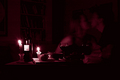
| 03/05/2006 01:08:15 PM | Valentine's Momentby drisComment: Greetings from the Critique Club
by strangeghost
The first three parts of this critique are written based purely on examination of your photo. "Final thoughts" is written after reviewing your score, photographer's comments, and voter comments.
TECHNIQUE
While you were obviously going for the dimly lit ambiance, the result may be a bit too dark. Even on my relatively bright LCD monitor, there are too many areas in the photo that are overly dark, and devoid of any detail. It appears as though the candles were the only sources of illumination. While it creates a lovely effect - and I think it worked well overall - it does leave, for example, the girl's face in shadow, while her upper right arm is the brightest object in the scene other than the candle flames (and objects closest to the candles). When dealing with scenes were lighting is so central, keep in mind the inverse square law of light intensity. An object twice as far from the illumination source will only receive 1/4 as much light. Look, for example, at the near wine glass as opposed to the far one, and the illumination of the near wine glass compared to the man's face. It would have been effective to have had at least one more candle out-of-frame to the right, to add some balance to the lighting, while preserving that soft candlelit ambiance. Focus is sharp and I like the fact that your depth of field is large, preserving the bookcases in the background. Books make beautiful backdrops, in my opinion, for a shot like this. Your choice of a reddish duotone is excellent, and complements the title link to Valentine's day, as well as the red wine.
COMPOSITION
I think the composition is very clean and well balanced. I might have cropped a bit tighter to eliminate some of the dead space along the bottom, but that's relatively minor. Referring again to illumination, and how it impacts here on composition, consider the label on the bottle of wine. Bright white and only inches from the light, it becomes the brightest object in the picture, other than the flames themselves. It looks like you rotated the bottle intentionally to hide the larger label (good thing too), but you probably could've removed the label entirely for better effect. One more minor quibble, the candle flames are tilted slightly to the left. I've tried photographing candles before and I can attest to how damned difficult it is to still the air entirely. From that perspective, you did very well, but the slight tilt is annoying. Straight-up steady flames would be sooo much more pleasing to the eye. Overall, it's a very simple and logical composition.
EMOTIONAL IMPACT
In my view, this photo had the potential to be much more memorable if it had been a bit brighter. I'm guessing most viewers appreciated the artistic merits, but were frustrated at the dimness. Dim photos just can't "pop" the way brightly lit, colorful ones can, making this genre of moody photos very difficult to pull off. In conclusion, I think the impact of your photo was dampened by the darkness - moody candlelit scenes are a challenge to the photographer to find the right balance.
FINAL THOUGHTS
Reading over your comments, it is very clear that my hunch about the overall illumination of the scene was correct. Most computer monitors just didn't do justice to your shot. Nearly every commenter expressed some variation on the "too dark" theme. Your final two commenters during the voting, Yanko and Alecnorman, are using bright LCDs, I'd bet you a bottle of wine! If you are using an LCD monitor (as I am) to edit your shots, make sure you have a chance to preview them on a CRT before submitting. In conclusion, I liked your shot a great deal, but you were doomed from the start by the darkness of the scene, particularly the right half where the subjects are located. Your final score of 4.9 almost certainly reflects this fact, quite apart from strong merits of your concept and composition. | | Photographer found comment helpful. |
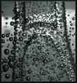
| 03/04/2006 01:27:31 PM | "H"by LucidLotusComment: This image has a very nice three-D feel to it. I like your work with the depth and tones. Very nice job. | | Photographer found comment helpful. |
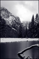
| 03/04/2006 01:15:26 PM | Winter Calmby sgauriaComment: Greetings from the Critique Club
by strangeghost
The first three parts of this critique are written based purely on examination of your photo. "Final thoughts" is written after reviewing your score, photographer's comments, and voter comments.
TECHNIQUE
A beautifully clear and contrasty photo. Your duotone of predominantly gray tones works well with the cloudy, foggy appearance of the sky and mountain tops. Nice clarity and sharpness throughout. Focus is spot on. Very nice job of keeping the details in the snow - not an easy job in a photo with so may dark areas as well. Technically a superb job of handling a wide range of brightness. Too bad it was a basic editing challenge. Otherwise, I bet you'd have liked to bring out a bit more drama in the sky?
COMPOSITION
I like the portrait crop and I love the inclusion of the tree branch in the water on the right. It adds just the right touch of foreground interest, and contributes to the moody loneliness otherwise radiated in the photo.
EMOTIONAL IMPACT
As suggested by my comments above, I really like the feel of this photo. It conveys a sense of isolation and solemnity, as well as majesty. And, also as mentioned above, the single tree branch disappearing into the water really adds an element of punctuation to the shot. Your title completes the pictures, a perfect fit.
FINAL THOUGHTS
I'll start off by observing that you should always include a photographer's comment, especially when you're requesting a critique. In addition to not doing that, you provided no technical details (shutter, aperture, ISO). Those elements make it much easier for a CC critique to relate specific comments to your technique.
Those who bothered to comment obviously like it. So, why didn't it score higher? A 5.7 is a perfectly respectable score, above average (79th %ile for the challenge), but I bet you were disappointed. A technically excellent, well composed, but only 5.7? Most likely, it just got lost in a huge challenge, with lots of outstanding entries. | | Photographer found comment helpful. |
| 03/04/2006 09:36:26 AM | Night Sky Reflectionsby MacDonaldComment: Greetings from the Critique Club
by strangeghost
The first three parts of this critique are written based purely on examination of your photo. I don't read your photographer's comments, or your voter comments, until I've finished the first three sections. "Final thoughts" is written with your score, comments, and voter reaction in mind.
TECHNIQUE
I find this a very difficult photo to critique. I studied it for a full minute or two and still couldn't tell exactly what I was looking at, even after reading your description. It wasn't until I copied it to a picture viewer and rotated it 180 deg that I had my "ah ha" moment. I could tell, of course, that those were clouds but couldn't interpret the reflected creek part that was at the top. Technical issues? Well, much of the photo is completely dark, and the illuminated parts have significant overexposure. That's a lot of dramatic contrast in an image that is otherwise difficult to decipher. It makes for a bit of an abstract, which I'm guessing the average voter, like me, was left a bit stymied.
COMPOSITION
Now having had some time to really look at this photo, I can't understand why you rotated it. The instant recognition that it conveys unrotated - it's clearly a small channel of very calm water reflecting a dramatic sky - becomes confusing and unclear upside down. Given that you named your photo "night sky reflections" it seems you might have shot yourself in the foot by rotating it. Maybe others didn't have the difficulty I did recognizing the scene, but I was quite thrown off by it. If your purpose was abstract, than you probably would have chosen a different title, no?
EMOTIONAL IMPACT
As you've probably guessed, my primary response to this photo was more one of confusion than emotion. I had the benefit of studying it for a critique; I wonder if the typical voter gave it enough time to really "see" it. In a challenge of 600 plus, I'd think not.
FINAL THOUGHTS
Let me say first of all that I hugely appreciate the fact that you left a photographer's comment initially, and then came back and left a more detailed "post-mortem" comment after the challenge. Reading your comments now - as well as the voters comments - helps me to understand your motivation. Your original, unrotated and unprocessed image contains significant detail in the sand that was lost in the final edit. In your post-processing (curves??) I would have tried to preserve some of that detail. Clearly your commenters liked the image more if they appreciated its abstract nature, and less if they were confused by the orientation or context. Your final score of 5.4 doubtless reflects that confusion in their minds. I agree with those who thought it would have scored better unrotated. Still, I admire your experimentalism. Keep shooting, this was an interesting photo and I enjoyed studying it for this critique!!
| | Photographer found comment helpful. |
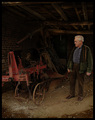
| 02/25/2006 01:15:26 PM | Pensionableby messerschmittComment: Greetings from the Critique Club
by strangeghost
TECHNIQUE
My only technical quibble is that it appears a bit dark, even on my Usually-Too-Bright LCD monitor. I probably looks a bit darker still on most CRTs. Not bad mind you, there's detail in all the darker areas, and the dark tones give it a great earthy feel that goes well with the composition. Focus is excellent, great depth, colors muted earth-tones. I can't tell for sure how it was lit (and unfortunately, you've left no photographer's comment at all to help me out) but the subject and the machinery are well lit.
COMPOSITION
I've studied this image for several minutes now and I really like your composition, though I feel it could have been stronger. You've captured the wonderful textures of the building: the timbers in the ceiling, the dirty/rocky floor, the brick wall, farm machinery, even the rust on the wheels. Likewise, the man - from his lined, character-filled face to his jacket, shirt, pants and shoes - looks like he was born to pose this shot. The shot has a very balanced look too, but I think you might have angled for a closer crop. Maybe just one or two steps in. A little less floor and ceiling, though keep enough to save that delicious flavor of barn or farm workshop. In my imaginable mind's eye, I even see a closer aspect on his face, with your room composition in the background. Still, I hope you're getting the impression that I liked this composition, because I did; very much!
EMOTIONAL IMPACT
Quite a great picture, to be sure. Your title suggests that we have two aging derelicts, put out to pasture. As suggested above, I'd have liked to seen a more aggressive emphasis on the man. As cool as the machinery is, HE is the subject. His face is the subject. What's he thinking about. What mood and emotion are you trying to evoke? A tighter shot on his lined and pained face might have made for a whopper of a pic. As it is, it's good, but falls short of that timeless quality that pokes and prods at the viewer.
Final Thoughts
Looking over your score and comments, it seems as though those who bothered to comment liked the shot (though one did mention the darkness). Your post results commenter (Joey) seemed to love the shot as much as I did. Your final score of nearly 6 is respectable, but perhaps would have been driven higher had your subject been prominent enough to forge that emotional connection. I repeat that it is very helpful for the critiquer if you leave some of your own thoughts and comments on the picture as well. IMO, there is simply no reason not to, especially if you are asking for a critique. Likewise the technical info. I'd have loved to know, when looking at the technical elements of your photo, what shutter speed and aperture you used.
This is an amazing shot and I'm honored to have had a chance to study it closely. Well done!
| | Photographer found comment helpful. |
| 02/24/2006 01:42:18 PM | The walkerby TUBORGComment: Greetings from the Critique Club
by strangeghost
TECHNIQUE
Focus is excellent with a very deep depth that landscapes demand. There is a harshness to the man (especially his face) that seems almost oversharpened, but it lends a sense of unreality to the image. The lighting and exposure are excellent. The colors are a bit muted, other than the golden hue of the grass and mountains. The blue-gray of the sky is outstanding. Technically excellent other than the possibility of a bit too much USM.
COMPOSITION
I love the composition. The landscape itself is very nicely done - misty and foreboding. The man and the broken down building add a sense of mystique to the image, as does the more distant building. The foreground grass is almost close enough to touch, and the distant mountains are partially shrouded in mist. An excellent composition.
EMOTIONAL IMPACT
Overall, I'd say it's an image that makes a significant impact. It raised many questions in my mind and begs my eyes to go over and over again, looking for additional hints. It does not disappoint. As I study it, I keep finding elements I hadn't noticed before (it was a full minute before I noticed the second building in the distance). Truly a memorable picture.
As always in photos like this, I'm enormously disappointed that you did not include a photographer's comment. It is much easier to critique an image if one is given a glimpse of the photographer's intent. Absent that, I see that most commenters really liked your pic, as I did, though many commented on "over processing" or too much USM. Your final score of 5.7 feels a little disappointing to me, and must have to you also. It likely would have scored higher if it didn't have that too-sharp feel.
Nicely done. I enjoyed the chance to study this image closely. | | Photographer found comment helpful. |
|
Showing 431 - 440 of ~1461 |
Home -
Challenges -
Community -
League -
Photos -
Cameras -
Lenses -
Learn -
Help -
Terms of Use -
Privacy -
Top ^
DPChallenge, and website content and design, Copyright © 2001-2025 Challenging Technologies, LLC.
All digital photo copyrights belong to the photographers and may not be used without permission.
Current Server Time: 08/10/2025 10:44:58 AM EDT.
|