|
|
|
Showing 331 - 340 of ~1461 |
| Image |
Comment |
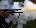
| 08/27/2006 10:01:41 AM | Birth of a Fireby freakin_hilariousComment: Greetings from the Critique Club
by strangeghost
The first three parts of this critique are written based purely on examination of your photo. "Final thoughts" is written after reviewing your score, photographer's comments, and voter comments.
TECHNIQUE
Good job capturing the spark in this torch lighter. There is detail present down to very tiny sparks and trails in the interior. The longest spark trail pointing off to the right looks a little jaggy though. Controlling exposure must have been tough for a shot like this, and I think you handled it very well.
COMPOSITION
The problem with a shot like this is that the sparks are really all you have. You've chosen to leave in considerable negative space, which I think aids in the composition, but also leaves you vulnerable to voter criticism if your subject is not dynamic and interesting enough. I like the way the metal prongs lead off into nothingness out of the left side of the frame.
EMOTIONAL IMPACT
Though it's a technically well-done and well composed photo, it probably doesn't have enough "wow" factor to excite a high score on DPC. It is different though, and that was probably good enough to lift your score by a half-point or so. Does it excite the viewer and grab the attention? Probably not.
FINAL THOUGHTS
Your commenters certainly liked it well enough. Your final score of 5.4 is about what I would have predicted. I'm even more impressed now that I see you pulled this off with a P&S camera, I had expected some sort of SLR. Very well done! |  Photographer found comment helpful. Photographer found comment helpful. |
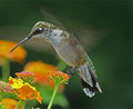
| 08/21/2006 01:31:33 PM | Hummingbirdby JOHNBOY1970Comment: Amazing juxtaposition between the sharpness of the body and the frenetic blur of the wings. Well captured! | | Photographer found comment helpful. |
| 08/21/2006 12:48:08 AM | | | Photographer found comment helpful. |
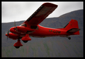
| 08/19/2006 03:31:44 PM | Low but not so slowby Ragga2000Comment: Greetings from the Critique Club
by strangeghost
The first three parts of this critique are written based purely on examination of your photo. "Final thoughts" is written after reviewing your score, photographer's comments, and voter comments.
TECHNIQUE
Focus is good. Nice clean image overall. LIghting is adequate and, though no detail is lost in the shadows on the underside of the wings and fuselage, it does appear a bit too dark. While the plane itself seems well exposed, the sky and mountain look a little funny. The greenish smudges on the mountain look almost as if they could be an artifact of processing. The sky has a slightly burned look to it. The red of the airplane is nicely handled. Bright red is a problematic color and you've avoided letting it become too saturated. I'm impressed with the detail visible at the forward end of the plane - around the windshield, engines, and wheels.
COMPOSITION
Nice crop on the plane but you're left with a relatively static looking shot of something that cries out for drama and action. For purposes of the challenge, you've clearly frozen the plane but it might have had more impact if you had frozen the props too (is that even possible?? I don't know). Definitely not a bad shot but not one that will inspire much emotion or reaction in the typical viewer. A different angle, for instance with the plan coming more straight on toward the camera, would have added drama.
EMOTIONAL IMPACT
As stated above, not terribly dramatic or provocative. It's a serviceable image and would make a nice stock shot of an airplane. A bit too usual or ordinary.
FINAL THOUGHTS
Your final score of about 5.3 is where I would have predicted. It's a shot that nails the technicals, but lacks the drama or dynamism necessary for a higher scoring challenge shot. | | Photographer found comment helpful. |
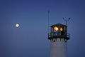
| 08/10/2006 09:49:38 PM | Full Moon, Sunrise, Chatham Lightby Bear_MusicComment: Two suggestions: try to bump the exposure for the moon down a bit. Probably very difficult under the light you've got since any less would woefully underexpose the lighthouse. (but hey, work your RAW magic Robert!). Second, pop your 70-200 on and get a larger moon and a tighter comp with the lighthouse. The photo will increase in appeal as the angular size of the moon increases.
My kind of shot! | | Photographer found comment helpful. |
| 08/09/2006 12:09:27 PM | Dude! by zardozComment: Exquisite shot! Congrats on your first challenge and first ribbon! | | Photographer found comment helpful. |
| 08/09/2006 09:50:50 AM | Falling apartby hannekeComment: Absolutely wonderful shot. A great concept executed to perfection. Congrats!! | | Photographer found comment helpful. |
| 08/08/2006 10:14:15 PM | Milk and Eggsby coronamvComment: Greetings from the Critique Club
by strangeghost
The first three parts of this critique are written based purely on examination of your photo. "Final thoughts" is written after reviewing your score, photographer's comments, and voter comments.
TECHNIQUE
Though you want to have shadows in this image for texture and relief, it seems to me you've under-lit the scene rather badly, losing all detail in the bowl and cup. This low key effect can work in some images but I think your white surface works against you. If the surface had been black, and the dark cup and bowl just blended in with the background, leaving only the cream and eggs as white, it may have worked better. As shot, it just feels like an inadequately lit scene. There's some odd texture in the negative space at top right and elsewhere as well.
COMPOSITION
I like the placement of the subjects, forming a nice diagonal arrangement. Good crop too.· BALANCE: Is the image aligned correctly or is it crooked? Your shallow depth of field leaves the cup of cream slightly defocused. I'm not sure this is a good thing since your title seems to give them both equal weight in the composition. It's a nice still life arrangement, very clean and simple, but the technicals leave it feeling deficient.
EMOTIONAL IMPACT
Had you supplied more detail for the eye to feast upon (textures in the eggs and bowl/cup, or alternatively, gone with the low key effect, I think the image would have been more impactful. As shot, I don't think it grabs at the imagination or draws the viewer in to its world.
FINAL THOUGHTS
Your commenters pretty much stayed with the lighting and liked the comp, as did I. I think your final score of 5.7 is about right for this shot, though I have to say I didn't participate in this challenge, nor did I do much voting, so I don't know how others interpreted the theme. I like your image, but think it could have been much stronger with a more thought out lighting strategy. | | Photographer found comment helpful. |
| 08/02/2006 01:11:08 AM | | | Photographer found comment helpful. |
| 07/08/2006 04:24:23 PM | Through the Foliageby L1Comment: Sweet. Very nice play of light an shadow. Awesome technical elements (lighting, focus, etc.). Well done! | | Photographer found comment helpful. |
|
Showing 331 - 340 of ~1461 |
Home -
Challenges -
Community -
League -
Photos -
Cameras -
Lenses -
Learn -
Help -
Terms of Use -
Privacy -
Top ^
DPChallenge, and website content and design, Copyright © 2001-2025 Challenging Technologies, LLC.
All digital photo copyrights belong to the photographers and may not be used without permission.
Current Server Time: 08/05/2025 10:48:57 PM EDT.
|