| Image |
Comment |
| 09/21/2007 09:34:48 AM |
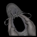
Too Much Munch-y Businessby raishComment: Compared to the original, you have too much of the shoe showing. The original had the perfect angle, that cause you to have to take a second look to ealize that it was a shoe. And the lighting? Unfortuantely you have too much. |
 Photographer found comment helpful. Photographer found comment helpful. |
| 09/21/2007 09:32:19 AM |
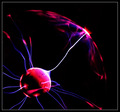
Keeping "In Touch"by _DaveA_Comment: I like that you caught the red flare just like the original. Not quite a crisp as the orinal, but not a bad shot overall. |
| Photographer found comment helpful. |
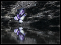
| 09/21/2007 09:30:16 AM |
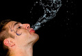
Fountain of Youthby spinnerComment: To me, there's too much blur in the water. I'd prefer to see it much sharper. And the tattoo on the face is distracting. |
| 09/21/2007 09:27:24 AM |
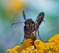
Smiling Right At Youby NobodyComment: Not a bad photo, but I wouldn't say it truely emulates the original. I mean, we're dealing with two completely different insects here.
I do like your use of colors though, and your shallow DOF. |
| Photographer found comment helpful. |
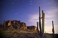
| 09/21/2007 09:23:44 AM |
Monte de Espuma - Second Viewingby Rob OComment: A very good shot with thh star trails. Not as much color or as wide of a view as the original (both of which are what makes it good to me), but not a bad shot in it's own right. |
| Photographer found comment helpful. |
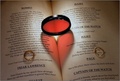
| 09/21/2007 09:20:13 AM |
Take Your Pickby MWittComment: I like your title, since there are so many ribbons of the same subject. No need to go searching to THE original.
I really like sharpness and the lighting. The almost perfect symmetry is the crowning touch. |
| Photographer found comment helpful. |
| 09/21/2007 09:18:49 AM |
Triple Glass Refraction 2by gg3rdComment: I think I like your's better. I certainly like your color selection, and to my eye, it's just a tad sharper. Well done! |
| Photographer found comment helpful. |
| 09/21/2007 09:17:27 AM |
|
| Photographer found comment helpful. |
| 09/20/2007 05:26:02 PM |
|
| Photographer found comment helpful. |
| 09/20/2007 05:24:58 PM |
Do not disturbby DigiFotoBuddyComment: Removing the fact that this is a copy of the "Abstract Macro" ribbon winner (becasue it's not, and as far as I'm concerned it wasn't an abstract either, but I digress....), I like this better. Much softer and more evenly toned. Nicely done. |
| Photographer found comment helpful. |
Home -
Challenges -
Community -
League -
Photos -
Cameras -
Lenses -
Learn -
Help -
Terms of Use -
Privacy -
Top ^
DPChallenge, and website content and design, Copyright © 2001-2025 Challenging Technologies, LLC.
All digital photo copyrights belong to the photographers and may not be used without permission.
Current Server Time: 08/26/2025 08:29:09 PM EDT.