| Image |
Comment |
| 05/07/2004 11:11:58 PM |
|
| 05/07/2004 09:09:15 PM |
|
 Photographer found comment helpful. Photographer found comment helpful. |
| 05/07/2004 10:18:21 AM |
@_@by unikornComment: The composition is too open, the exposure is uneven, and it's just dumb. |
| 05/07/2004 10:12:18 AM |
|
| 05/07/2004 10:06:24 AM |
|
| 05/07/2004 10:05:25 AM |
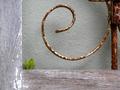
Out of orderby alfredComment: This is so tiny, it's hard to see what it is. Also, that white thing on the left is a bright distraction. A different angle or cropping would have fixed that. |
| 05/07/2004 09:56:45 AM |
|
| Photographer found comment helpful. |
| 05/07/2004 09:52:22 AM |
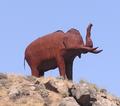
Agedby RandomAoKComment: You've got Tantor smack dab in the center of the image. This is very static. A more horizontal composition, with some space to the right for Tantor to look off into, would be more dynamic, even if it was just empty sky. |
| Photographer found comment helpful. |
| 05/07/2004 09:46:24 AM |
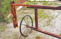
Rusted Gate Wheelby TommyMoe21Comment: This seems a bit over-sharpened. Also, the lighting is very flat. (have you been using a flash outdoors again?) The composition is good, but the other considerations keep it from being a winner. |
| Photographer found comment helpful. |
| 05/07/2004 09:41:27 AM |
Chains To Nowhereby jonrComment: I would have liked this better with either more depth of field, or more of the blurry part cropped off at the top. As it is, the perspective effect you seem to have been going for is lost with the focus. Just cropping off the white blurs at the top improves the composition greatly. (they are a bright distraction) |
Home -
Challenges -
Community -
League -
Photos -
Cameras -
Lenses -
Learn -
Help -
Terms of Use -
Privacy -
Top ^
DPChallenge, and website content and design, Copyright © 2001-2025 Challenging Technologies, LLC.
All digital photo copyrights belong to the photographers and may not be used without permission.
Current Server Time: 08/18/2025 05:50:42 AM EDT.