| Image |
Comment |
| 05/14/2004 09:40:24 AM |
|
 Photographer found comment helpful. Photographer found comment helpful. |
| 05/13/2004 10:20:30 AM |
Sweet & Sourby Brooklyn513Comment: Good idea. Unfortunately, sugar looks just like salt. (salt and lemons are a favorite snack around here) Maybe honey would have been more dramatic? |
| Photographer found comment helpful. |
| 05/13/2004 10:16:02 AM |
Natural v. Man-Madeby alisasaurComment: Great idea! Why not in color, though? I think color would have made the difference more striking. You'll probably get some complaints about the unusual composition, but I like it. |
| Photographer found comment helpful. |
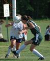
| 05/13/2004 10:01:46 AM |
oppositeheadersby rrp1Comment: This is such a good action shot.. if only it were in focus! You've got the hard part down. (which is pointing the camera in the right direction, it's amazing how many people never seem to get that) Now you just need to get the technical details sorted out. |
| 05/13/2004 09:57:30 AM |
|
| Photographer found comment helpful. |
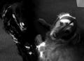
| 05/13/2004 09:47:36 AM |
Good Dog ~ Bad Dogby ladpupmoeComment: The photo is a bit unclear. The light colored dog is blurry, and the dark one is so much blended with the shadows that, without the reference of another dog and the title, it would be very difficult to tell what it is. Good idea, though! The blonde one looks like a swell dog, too. |
| Photographer found comment helpful. |
| 05/13/2004 09:44:06 AM |
Dragby JesuispeureComment: I don't know exactly what opposites you were aiming for. He's such a convincing woman that, without the title, most people would not see it. Very nice portrait. |
| Photographer found comment helpful. |
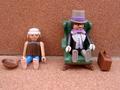
| 05/13/2004 09:38:47 AM |
Poor & Richby trunkiComment: If it was in focus, it would be good. You could also crop closer on the bottom. |
| 05/13/2004 09:35:44 AM |
Simple Choiceby FirstyComment: Great idea for the challenge, but why is it all blue? Grey or sepia tones look like deliberate limiting of color, but this blue just looks like you didn't balance the color. Good composotion and focus. |
| Photographer found comment helpful. |
| 05/13/2004 12:11:24 AM |
|
| Photographer found comment helpful. |
Home -
Challenges -
Community -
League -
Photos -
Cameras -
Lenses -
Learn -
Help -
Terms of Use -
Privacy -
Top ^
DPChallenge, and website content and design, Copyright © 2001-2025 Challenging Technologies, LLC.
All digital photo copyrights belong to the photographers and may not be used without permission.
Current Server Time: 08/18/2025 10:55:27 AM EDT.