| Image |
Comment |
| 07/30/2004 09:26:51 AM |
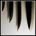
Meat is murderby cycloxslugComment: Good idea and composition, just needs a little more punch on the lighting .What this lacks is some light on the edges of the knives, to give them a glint of sharpness. As it is, they could almost be paper cutouts. Really stark lighting would accent your idea. |
 Photographer found comment helpful. Photographer found comment helpful. |
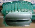
| 07/30/2004 09:23:50 AM |
Ordinary Toiletby pottersclay75Comment: Nice paint job! I don't know how I would feel about having Bart looking over my shoulder while I was on the throne, though. :) |
| Photographer found comment helpful. |
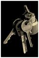
| 07/30/2004 09:21:59 AM |
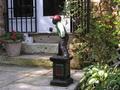
Reminderby OricComment: Not such an "everyday" object anymore, is it? Interesting choice. The composition lacks interest, maybe framing the shot with the jockey more to the right, so he has some space to look into, and more of the front walk is visible. |
| Photographer found comment helpful. |
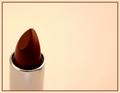
| 07/30/2004 09:18:03 AM |
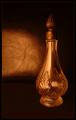
Perfumeby sherComment: Nice idea, but it seems to have lost some detail in processing. |
| Photographer found comment helpful. |
| 07/29/2004 09:35:07 AM |
Screw Itby rorysinclairComment: You needed just a tad more depth of field to make this work. I would like to see a closer crop, maybe making a vertical image. Also, since you are using a wood surface, a wood screw would have been a better choice.
The point on a wood screw would have made for a more exciting image. |
| Photographer found comment helpful. |
| 07/29/2004 09:29:56 AM |
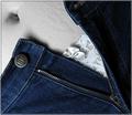
The Zipby KiwiChrisComment: Abstractly, this image has a great composition and use of color. On a more gut level, the grey skin is disturbing. Without background images as a color reference, the effect is that the skin really is grey. Still, I'll give it an 8 |
| Photographer found comment helpful. |
| 07/29/2004 09:15:03 AM |
|
| Photographer found comment helpful. |
| 07/29/2004 09:10:44 AM |
|
| Photographer found comment helpful. |
| 07/28/2004 09:24:01 AM |
|
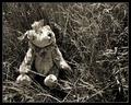
| 07/28/2004 09:06:22 AM |
Lost Childhoodby mocabelaComment: The nostaligic quality would be accented if there was a little less contrast. |
| Photographer found comment helpful. |
Home -
Challenges -
Community -
League -
Photos -
Cameras -
Lenses -
Learn -
Help -
Terms of Use -
Privacy -
Top ^
DPChallenge, and website content and design, Copyright © 2001-2025 Challenging Technologies, LLC.
All digital photo copyrights belong to the photographers and may not be used without permission.
Current Server Time: 08/21/2025 05:10:03 AM EDT.