DPChallenge: A Digital Photography Contest You are not logged in. (log in or register
 
Browse Settings
Currently viewing:
Registered Userbeckettboots

Show comments:

Per page:

Order:

Comments:


Comments Made by beckettboots
Pages:   ... ... [63]
Showing 401 - 410 of ~629
Image Comment
lay down your tracks
05/17/2004 12:29:44 PM
lay down your tracks
by Pixelprose

Comment:
Greetings from the Critique Club.

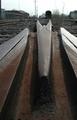
Composition: I like the lines that you've introduced here - they are solid and pleasing, with a generally good composition. The slight off-centered subject could easily be fixed by cropping the left more - or go for a completely off-centered composition (though I would suggest a slightly more exaggerated angle then).

Background: I agree with the other comments about the background. Either it needs to be more neutralized (even shallower DOF) or have more vibrance. The ties and other tracks in the near foreground are excellent and I would love to see them become more a part of the composition.

Camera Work: (Focus/DOF/Exposure): Good focus & DOF, I like your choice of a wide focus on the rails and the bold highlight on the right.

Post Processing: Contrast and color are good.

The Challenge: Very appropriate - you gave a wonderful example of rust and offered a context for it, choosing an interesting angle.

My Opinion: I love trains and tracks. The rail that you found is really wonderful - full of interesting lines and textures. I like the muted, sepia feel of the colors and think that you could have gone full tilt in that direction with your post processing, it would have likely helped with the background issues.

I see that this was your first entry, you scored at the halfway mark, which is admirable. I hope you continue submitting and I look forward to seeing your work from the next challenge.

I hope these comments have been of help to you. Please mark them as helpful if they have, and feel free to PM me if you want to discuss or clarify anything here.

Message edited by author 2004-05-18 20:03:00.
Country Town Originality
05/17/2004 12:45:33 AM
Country Town Originality
by sleekr

Comment:
What a great capture. It fits the challenge will. I love the blues and the texture of the post.
Photographer found comment helpful.
Still Growing
05/17/2004 12:37:03 AM
Still Growing
by mariomel

Comment:
At first I didn't think this fit the opposites challenge, but I kept it up on my screen for a while and now I appreciate it much more. The lines of the figure's body, the position of the arms and contrasted with the boughs of the tree and the framing with the background of the water is very nice. The horizon looks just slightly off a little rotation would fix that.
Photographer found comment helpful.
Opposites O'tats
05/17/2004 12:30:49 AM
Opposites O'tats
by Herblacklist12

Comment:
Interesting caputre. I like the balance of your subject. The shininess of the fabric in the background is a little bit hot - something more neutral or maybe indirect lighting would help.
Photographer found comment helpful.
"Black & White," On The Rocks
05/17/2004 12:29:35 AM
"Black & White," On The Rocks
by whagerbaumer

Comment:
Wonderful idea - the concept of black and white comes across beautifully. The composition and position of the birds within the frame is a little haphazard, and I'm not quite able to follow the lines as well as possible. I think a closer crop with only the right five birds with allowing the diagonal line of the ground to lead the eye might work a bit better.
Photographer found comment helpful.
Fattened Desert Life
05/17/2004 12:27:28 AM
Fattened Desert Life
by mithandor

Comment:
I like the idea of contrasting desert life with water. It's hard to make out the water in teh background because of the dof and exposure length. Great lush colors.
Trois
05/16/2004 03:02:28 AM
Trois3rd Place
by HRoxas

Comment:
Greetings from the Critique Club

Composition: You've done a great job with framing and composition, with the lines leading the eye very well. The textures add to the interest.

Background:n/a

Camera Work: (Focus/DOF/Exposure) The focus is crisp and depth of field is excellent.

Post Processing: the reflections of the metallic surface seems a tad overexposed, but it lends to the abstract quality.

My Opinion: a wonderful capture. You isolation of this most interesting part of the sculpture is a credit to your eye. The piece certainly deserved it's ribbon finish.

If these comments have been of help to you, please let me know by marking them as such. Also, I'm available by PM if you have any questions about this note.
Photographer found comment helpful.
Icy Hot
05/15/2004 01:24:53 AM
Icy Hot
by mom_hood

Comment:
I good capture of flame - I like the angle from above - I'd like to see just a little more light on the ice to highlight what it is, maybe a bit more of an off center composition.
Faceoff
05/15/2004 01:22:24 AM
Faceoff
by paynekj

Comment:
A very nicely executed shot. The contrast and detail on the black horse is lost a little - setting the background further away might help to make the background disappear more. The black knight is cropped a little short on the right side.
Opposite Reflections
05/15/2004 01:16:04 AM
Opposite Reflections
by Donatien

Comment:
Very nice set up, the reflections and monochromatic tone are very nice. I like the composition that you've allowed the reflection in the lower left.
Pages:   ... ... [63]
Showing 401 - 410 of ~629


Home - Challenges - Community - League - Photos - Cameras - Lenses - Learn - Help - Terms of Use - Privacy - Top ^
DPChallenge, and website content and design, Copyright © 2001-2025 Challenging Technologies, LLC.
All digital photo copyrights belong to the photographers and may not be used without permission.
Current Server Time: 08/05/2025 11:53:19 PM EDT.