| Image |
Comment |
| 05/18/2004 11:42:57 PM |
|
 Photographer found comment helpful. Photographer found comment helpful. |
| 05/18/2004 11:41:55 PM |
Fire On Waterby KlyphtonComment: The use of the blue background is very nice. The flame is exposed well but the double/triple border is a little distracting. The curve of the background is a great composition device. |
| Photographer found comment helpful. |
| 05/18/2004 11:40:49 PM |
Predator and Preyby neenee1999Comment: Nicely captured. The exposure on the spider and the web is well cone, the detail is great. The positioning of the spider center frame moving off to the left doesn't creat the best composition - perhaps cropping it so that it's more to the right would be more successful. |
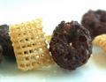
| 05/18/2004 11:39:38 PM |
circles and squaresby binkyat3Comment: A wonderfully executed macro shot - I love how well we can see through the chex and all the way through the donut thing. The composition is a little less than interesting, perhaps more variation in the background or more isolation would have helped. |
| Photographer found comment helpful. |
| 05/18/2004 11:38:28 PM |
Cubs Win! Cubs Lose!by toddheadComment: The expressions are great, as is the framing. It'd be great if the hands were slightly less blurred - double exposures are tough. The background is a little distracting. |
| Photographer found comment helpful. |
| 05/18/2004 11:36:58 PM |
the Big oppositesby mrBlueComment: The composition is interesting - the highlight on the coin overshadows the cross, which is too bad - it's the only religious element in the frame so it should be more of the focus of attention. The focus feels a little soft on the chain and cross as well. |
| Photographer found comment helpful. |
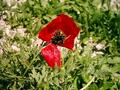
| 05/18/2004 11:35:06 PM |
Red Shaghayeghby balvardiComment: The texture on the petal and center of the flower is really nice - the framing in the center with the spiky leaves pointing to it are very nicely done. |
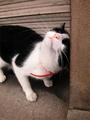
| 05/18/2004 11:29:53 PM |
Crazy Yin-Yangby svellutComment: Good capture, the DOF seems a little off, I get the pillar as the focus and I think it would work better with the cats nose as the center. |
| 05/18/2004 11:29:07 PM |
A Classic Rivalry!by LENWOODBLUZComment: Nicely shot - the lighting and colors are great - they could be abstracted even more to provide a more interesting composition. |
| Photographer found comment helpful. |
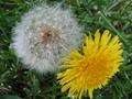
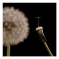
| 05/18/2004 11:28:25 PM |
Socialby AaronComment: Nicely shot. I like the DOF and intricate details captured on the foreground dandelion. Well done. The border is appropriate for this shot and helps to support the composition. |
Home -
Challenges -
Community -
League -
Photos -
Cameras -
Lenses -
Learn -
Help -
Terms of Use -
Privacy -
Top ^
DPChallenge, and website content and design, Copyright © 2001-2025 Challenging Technologies, LLC.
All digital photo copyrights belong to the photographers and may not be used without permission.
Current Server Time: 08/05/2025 08:35:01 AM EDT.