| Image |
Comment |
| 07/17/2007 04:46:02 PM |
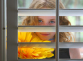
The Me I Can No Longer Reachby noranekoComment: A nice idea with strong colours, although the way the door/slats are structured ends up taking away more from the shot than it ultimately gives. Your composition is a touch too centred and the gap in the doorway on the left is slightly distracting.
6 from me - good luck |
 Photographer found comment helpful. Photographer found comment helpful. |
| 07/17/2007 04:44:27 PM |
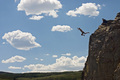
Jumping Dream 1by jrrobinsComment: Exciting, but the position of the hills/land in the background feel somewhat awkward. Perhaps a better perspective would have improved the shot?
You've captured a great moment |
| 07/17/2007 04:42:36 PM |
dream rideby saintaugustComment: Perhaps a wider angle, this close crop is a little claustrophobic and makes the shot slightly awkward |
| Photographer found comment helpful. |
| 09/13/2005 10:47:26 AM |
Summer's End — Sunriseby Bear_MusicComment: Ah no! What a disaster! Hard luck, man - This was a deserving ribbon winner and it's a shame to see it DQed for such a silly mistake after all the hard work had been done! Either way, digital trinket or no, it's an image to be proud of :)
Alex |
| Photographer found comment helpful. |
| 09/13/2005 02:50:33 AM |
Unnur Birnaby LalliSigComment: Simple but obviously effective. Strange effect created by the bokeh on the background and the hair as they amalgamate...it looks cool. Something about her right cheek is a little oversharp, maybe? Anyhow, great shot, nice and simple.
Alex |
| Photographer found comment helpful. |
| 09/13/2005 02:48:49 AM |
happyby melodeeComment: Underexposed and washed out. Looks a bit like a snapshot. Try avoid using the flash when shooting and although you've captured a nice moment here there're just too many distracting elements for me (the dog, the chains, the background). Hopefully you'll receive some more constructive critique and good luck for future shooting.
Alex |
| Photographer found comment helpful. |
| 09/13/2005 02:47:01 AM |
growing strongby rhipsterComment: Would have maybe cropped the bottom left of the shot off - that little bit of background peeping through is slightly distracting...other than that you've executed this shot fantastically well. Don't let his friends at school get hold of this, hehe.
8 |
| Photographer found comment helpful. |
| 09/13/2005 02:45:25 AM |
|
| Photographer found comment helpful. |
| 09/13/2005 02:44:59 AM |
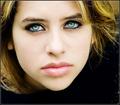
Windows to the Soul by elsapoComment: I find the detached feeling of the head a little disconcerting but it's nothing more than a minor gripe in an otherwise compositionally fantastic shot!
The pretty model, however, doesn't hurt!
The eyes look a little overprocessed as does the skin, but that's how things are done, I guess. A little oversharpened as well. I think your post-processing let you down a little bit because you may have got carried away...the eyes look a little fake. I think with more subtle processing this could have been a 9 or 10 - as it stands, though...a 7 from me.
Good luck
Alex |
| Photographer found comment helpful. |
| 09/13/2005 02:41:47 AM |
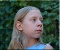
Oliviaby CoolsComment: I find this a little compositionally bland, would have maybe placed her less centrally. You've exposed this perfectly, I'd really like to have seen you bring out the existing colours and tones in this shot in post-processing! A solid portrait - 7
Alex |
| Photographer found comment helpful. |
Home -
Challenges -
Community -
League -
Photos -
Cameras -
Lenses -
Learn -
Help -
Terms of Use -
Privacy -
Top ^
DPChallenge, and website content and design, Copyright © 2001-2025 Challenging Technologies, LLC.
All digital photo copyrights belong to the photographers and may not be used without permission.
Current Server Time: 08/18/2025 12:35:08 AM EDT.