| Image |
Comment |
| 06/11/2005 04:29:38 PM |
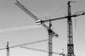
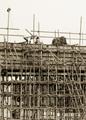
Cranesby sersalComment: I like how the shot is looking up but there is no real wasted space; good crop. It is all a little too gray for me though. Good job |
 Photographer found comment helpful. Photographer found comment helpful. |
| 06/11/2005 04:28:11 PM |
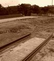
to be continuedby excaliburComment: I like how it is going off into emptiness; but at the same time, there isnt much for the eyes to go to out there. I love the title and the idea. 7 |
| Photographer found comment helpful. |
| 06/11/2005 04:26:50 PM |
|
| Photographer found comment helpful. |
| 06/11/2005 04:25:43 PM |
|
| Photographer found comment helpful. |
| 06/11/2005 04:24:54 PM |
|
| Photographer found comment helpful. |
| 06/11/2005 04:24:01 PM |
|
| Photographer found comment helpful. |
| 06/11/2005 04:22:32 PM |
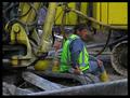
What an effort !!by arpitmittalComment: There isnt anything in the shot that jumps out or catches me. Great job in the processing department though, I like how rustic it feels. |
| Photographer found comment helpful. |
| 06/11/2005 04:18:54 PM |
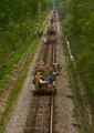
ribbon railby undieyatchComment: I really like this shot. It seems like its from the 20s and maybe sepia would have given it a better feel. |
| 06/11/2005 04:17:08 PM |
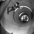
The Oracleby taterbugComment: I like your fulfilment of the theme. Its a little dark though, seems like you could bring more detail out. |
| Photographer found comment helpful. |
| 06/11/2005 04:16:07 PM |
|
| Photographer found comment helpful. |
Home -
Challenges -
Community -
League -
Photos -
Cameras -
Lenses -
Learn -
Help -
Terms of Use -
Privacy -
Top ^
DPChallenge, and website content and design, Copyright © 2001-2025 Challenging Technologies, LLC.
All digital photo copyrights belong to the photographers and may not be used without permission.
Current Server Time: 08/02/2025 06:54:36 AM EDT.