| Image |
Comment |
| 07/10/2006 01:25:40 PM |
whaaat? (Stationary by the flash)by gpalosComment: A cute picture of the squirell but could use a good bump in brightness and contrast. Levels or curves would make a huge difference with this shot. |
 Photographer found comment helpful. Photographer found comment helpful. |
| 07/10/2006 01:18:44 PM |
|
| Photographer found comment helpful. |
| 07/10/2006 01:11:33 PM |
|
| 07/10/2006 01:10:57 PM |
|
| 07/10/2006 01:06:53 PM |
Ordinary Lifeby eggfoxComment: Very nice capture of a mundane but somehow special moment. I like the muted tones but really think the red is too much. The subject is the people standing there more so than the bridge. I think you could have left some red in it as to stand out a little, but as is, its far to bright. 6 |
| Photographer found comment helpful. |
| 07/08/2006 08:39:26 PM |
Two Facedby jpochardComment: The editing on the clock itself works very well. It brings out nice strong texture. Although I think the brightness at the bottom actually detracts attention from the face of the clocks themselves, which should be the point of focus. The color is nice too but I don't like the grain produced in the sky. Overall a well done shot that makes an ordinary subject into something appealing to look at. |
| Photographer found comment helpful. |
| 07/03/2006 09:34:28 PM |
blue grillby KronusComment: I like the shot but the border is way too much. There is already plenty of blue in there so there is no need to have so much on the outside. It would have been fine with just the grey, maybe even thinner than that. |
| Photographer found comment helpful. |
| 07/02/2006 03:43:22 AM |
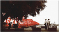
Motorcycle stunt US Flagby PhantomEWOComment: While obviously completely fake, I think this composite works very well. The two pictures are very nice and work together with common themes. Flying freedom or something to that effect. I think this is a a nice choice and better than just having a blue sky for a background. |
| Photographer found comment helpful. |
| 07/01/2006 05:26:03 PM |
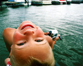
Fishing with Rice Krispie Treatsby veoconComment: This is a really nice shot with a fun creative angle. Unfortunate it had to be used for this particular challenge because it dosen't fit well. Would have done in aweomse in lots of other challenges. |
| Photographer found comment helpful. |
| 06/27/2006 08:28:42 PM |
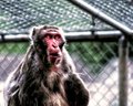
Shock the Monkeyby SJCarterComment: What a hillarious expression. The space on the right is good but I think I would crop a little off the top. The eyes are real powerfull but the red seems a tad too saturated. Lots of the highlights are blown but it dosen't really bother me since its on the edge of the monkey. I can see why you wanted to take the cage out, it makes for an unfortunately distracting and unnatural background. |
| Photographer found comment helpful. |
Home -
Challenges -
Community -
League -
Photos -
Cameras -
Lenses -
Learn -
Help -
Terms of Use -
Privacy -
Top ^
DPChallenge, and website content and design, Copyright © 2001-2025 Challenging Technologies, LLC.
All digital photo copyrights belong to the photographers and may not be used without permission.
Current Server Time: 09/02/2025 03:59:18 PM EDT.