| Image |
Comment |
| 04/06/2005 09:50:04 AM |
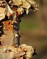
Shaggy Cby glad2badadComment: While the letter is obvious and the color and crispness of the image are good. I feel that the photo lacks interest. It reminds me of the red dot on the white background that sold for thousands. White it may be textbook perfect it just dosn't apeal to me. |
 Photographer found comment helpful. Photographer found comment helpful. |
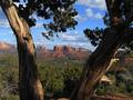
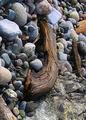
| 04/06/2005 09:30:46 AM |
"V" is Viewby LoudDogComment: Wow nice view! Too nice infact I was so drwn to the view in the background I had to force myself to see your V. I'm not sure if that a bad thing or not. Perhaps some light on the tree would have helped brig out the bright golden tone of the wood. This would have helped the V pop a little better. |
| Photographer found comment helpful. |
| 04/06/2005 09:26:59 AM |
"...V..."by BudComment: VYVYVY might have been a better title. So many lines that this image is almost dizzying. It kind of fun!! I like the colors and lines. The composition dosn't work for me. I don't know why. Perhaps shot from close to the stem and up work have settrled beter with me. The lines are all short and sharp. Not alowing the eyes to follow them. Just feels scattered and chaotic...But still a good image. |
| Photographer found comment helpful. |
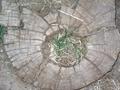
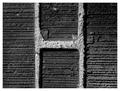
| 04/06/2005 09:22:25 AM |
Tree "O"by annttvldzComment: hmm It looked like bricks at first gglance nice find. This fits the challenge well. However it is to bright and burned out. I would have loved greener grass, and more reds and browns in the wood. The colors of this image are pretty bland. |
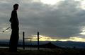
| 04/06/2005 09:19:25 AM |
H? T? none of them?by GrigollyComment: Wonderfill sunset an sliloutte incorperated in the image. I feel the letters are a bit weak, but I feel that it works fairly well with the mood and story of the image. |
| Photographer found comment helpful. |
| 04/06/2005 09:16:52 AM |
H in the Bricksby ShannonComment: Feels pretty stock to me. It fits the challenge and is a good clean image. But it lacks enough interest to stand out from the pack. |
| Photographer found comment helpful. |
| 04/06/2005 09:14:48 AM |
J on the rocksby papasmurfComment: I would have fliped this image so that the J was facing the right direction. The Image also looks a bit over sharpened and grainy. |
| Photographer found comment helpful. |
| 04/06/2005 09:12:46 AM |
Google itby pyroticComment: Does not apear accidental to me.... otherwise. not bad.. could have used a bit more front lighting on the object to make them more identifiable. |
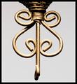
| 04/06/2005 09:09:16 AM |
e is for Elegantby mamaesmeComment: I wan't more focus on the top. Lots of little details lines and curls. But it to hazy to enjoy them. Otherwise good capture. |
| Photographer found comment helpful. |
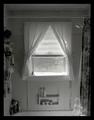
| 04/06/2005 09:07:16 AM |
"A" lluminationby RKTComment: The tilted line of the tub is bothersome. I am also not very fornd of a photo of a bathroom. I do however like the lighting and the letter. Perhaps if this had been cropped down to just a litle around the window this would have sat better with me.. Good image just unapealing to me. |
| Photographer found comment helpful. |
Home -
Challenges -
Community -
League -
Photos -
Cameras -
Lenses -
Learn -
Help -
Terms of Use -
Privacy -
Top ^
DPChallenge, and website content and design, Copyright © 2001-2025 Challenging Technologies, LLC.
All digital photo copyrights belong to the photographers and may not be used without permission.
Current Server Time: 08/21/2025 07:50:21 AM EDT.