|
|
|
Showing 201 - 210 of ~640 |
| Image |
Comment |
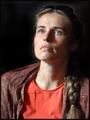
| 07/03/2004 05:19:00 AM | Captain George Highlighted.by graphicfunkComment: Lighting: The lighting is amoung the best in the challenge, although I would have liked to see it a bit more diffused to try and counter the shine on some parts of his skin. The catchlight in his eyes is just barely noticable, just enough to subtly do its job.
Pose: The pose is good. It and his expression communicate a lot.
Background: The black works well with this and is well done. |  Photographer found comment helpful. Photographer found comment helpful. |
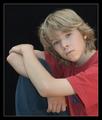
| 07/03/2004 05:14:29 AM | Funny Girl (my first portrait attempt)by BassieComment: Lighting: Nicely done, although the shadow on the nose may be a bit strong.
Pose: Her expression is the shot, so a tighter framing around her face and shoulders would have made this a much stronger portrait of her. Other than that, I would have prefered the camera angle to have been a bit above her eye level.
Background: The background is great. It compliments her shirt nicely. | | Photographer found comment helpful. |
| 07/03/2004 03:21:58 AM | Concentrationby scribeComment: Lighting: The catchlight adds depth to her expression, but her left side would have benefitted from some fill light.
Pose: Well posed, although I believe it would have been captured better from slightly higher than eye level.
Background: The black background was done well. |
| 07/03/2004 03:17:08 AM | Mr. Mattby postoakinversionComment: Lighting: Well balanced with good catchlight.
Pose: Pose is good, expression is a bit odd for a portrait. The DOF was a bit short, the right shoulder is blurred slightly.
Background: Very licely done black. | | Photographer found comment helpful. |
| 07/03/2004 03:14:18 AM | The Journalistby ImagineerComment: Lighting: Too bright, and could use a fill light on his left. There are several hot spots.
Pose: Well posed.
Background: works well. | | Photographer found comment helpful. |
| 07/03/2004 03:06:55 AM | Samby rhipsterComment: Lighting: Very nicely done. The only comment I have on it is the position of the catch-light, in conjuction with the dead-center gaze, is unsettling. It does however pull the attention to the eyes very well, but hold it without letting it wonder the image.
Pose: The pose is great. The lines of the body and legs, together with the space created by the arms, serve to pull the eye to the bottom of the face, where the tilt of the head moves it on to the eyes. As I mentioned, the catchlight and gaze work well to hold the eye, but I am think moving one slightly off center of the other would have directed the eye to wonder the image a bit more, only to be pulled back in. I can't help but think, if the captivatingness of the eyes was your intent, if a tighter crop (cutting the left arm on the bottom and right) would prevent me from feeling like I am missing part of the image by being stuck in the eyes.
Background: Black works very well with this. Just so someone says so, I like the white border, it works well to do what a border is suppose to do - support the image. the large black border around the white border I could do without, but the white works. | | Photographer found comment helpful. |
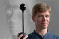
| 07/03/2004 02:50:37 AM | Self-Portrait in the Age of Web-Cams and Digital Projectorsby magnusComment: Lighting: The window light is great, and works well.
Pose: The tilt of the head is nearly perfect to make full use of the available light and expression.
Background: The use of the negative projection of your portrait as taken is a novel idea. The neutral grey works well, without over-powering any aspect of the image. The use of a negative projection of your portrait as it is being taken is a novel idea, kudos for originality in the challenge. However, it would have made a much better portrait of you if the projector and cam were not in the frame. As it is, it showcases the technology more than it does you. IMHO, technology is at its best when invisible. | | Photographer found comment helpful. |
| 07/03/2004 02:38:34 AM | Where's the Party?by photomComment: Lighting: The lighting is even, without any harsh shadows, and the eyes sparkle with the catchlight, but the whitebalance seems a bit off. With the light directly overhead, as opposed to the side, the face loses much of its features, but with this face that is not a problem. I do not care for the extreme vignetting, not that I do not like the effect at all, just not this extreme. IMHO, if you wanted the area of the image to be such a small area in the center, why not just crop it smaller to begin with?
Pose: The pose is classic baby, time honored and well accepted; nothing to say about it. However, with his head tiled up so much, I think I would have raised the level of the camera to just above his eye level.
Background: The background is a very nice touch. The soft neutral tones complement the subject very well. | | Photographer found comment helpful. |
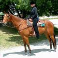
| 07/03/2004 02:16:31 AM | Samantha's Challengeby NeuferlandComment: Lighting: The natural light is nice, but the heavy shadows, especially across the eyes detracts greatly from the photo. The shadows and the lack of a catchlight hide the expressiveness of the eyes.
Pose: The rider and horse are both posed well, but the image needed to be rotated clockwise a bit. As it is they look as if they are about to pitch forward.
Background: The background does not appear to have been planned for a studio portrait, ranging from too dark to decern detail and very hot bright areas. | | Photographer found comment helpful. |
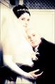
| 07/02/2004 02:14:56 AM | Elevator in my studio, long exposure w/ flash, PS for cross-processed lookby dimitriiComment: Lighting: Fabulous. The obviously intenional brightness on the dress conveys well the inner glow of their affection. The details in the faces and indeed the entire image are incredible considering the small range of very bright colors you limited yourself to. The only thing I find even slightly distracting is the shadow of his nose -- a minor distraction to be sure, but still there for me.
Pose: From the positioning of their bodies to the expressions on their faces, I am definitely intruding on them as they bask in the glow.
Background: A private place. It matches the tone of the image perfectly.
I would love to hear more about the wrokflow you mention in the title after the challenge. | | Photographer found comment helpful. |
|
Showing 201 - 210 of ~640 |
Home -
Challenges -
Community -
League -
Photos -
Cameras -
Lenses -
Learn -
Help -
Terms of Use -
Privacy -
Top ^
DPChallenge, and website content and design, Copyright © 2001-2025 Challenging Technologies, LLC.
All digital photo copyrights belong to the photographers and may not be used without permission.
Current Server Time: 08/05/2025 07:32:44 AM EDT.
|