| Image |
Comment |
| 02/03/2003 06:26:12 PM |
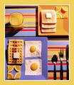
Three Square Meals a Dayby ClubJuggleComment: One of my tens this week! I'm sorry I didn't get to comment on it, but I voted fairly quickly. I was very impressed with the obvious effort you made to make a square of four squares, etc.. makes me hungry too. |
 Photographer found comment helpful. Photographer found comment helpful. |
| 02/03/2003 06:24:07 PM |
Krabby magnetic9999Comment: Definitely one of my favorites, and one of the few ten's I gave out last week. I just love how simple this photo is :) well done. |
| 02/03/2003 02:23:37 AM |
|
| 01/27/2003 09:01:12 AM |
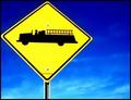
The Fire Engine Signby AnnidaComment: It's amazing. I couldn't see all the artifacting on my other computer! I'm on the laptop now, and it's so evident... maybe I should check on both from now on :p
Thank you for your helpful comments everybody :) |
| 01/27/2003 12:20:03 AM |
|
| 01/26/2003 07:55:19 PM |
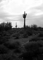
Stenocereus Thurberiby AnnidaComment: Hehe, thanks everybody!
I'd like to say the most important reason why this shot didn't really work, and well, it might sound like whining.. but...
It had rained recently, and the ground was really soft, and every step I took closer to the cactii, I sunk deeper and deeper into the ground! So, I just took three or four shots of what I thought would work, and ran! As soon as I got into the car, the second storm started, and driving home was interesting in that we could hardly see 10 feet in front of the car! It was insane :)
I am my biggest critic! I have flogged myself over and over for posting an inferior (in my eyes) shot. |
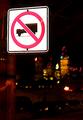
| 01/22/2003 11:54:03 PM |
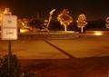
Twilight Sculptureby MrsTurboComment: I am not sure about this photograph. I like the circular feel. What I think you should have done was concentrate more on the sign. it looks at the moment as if it was an after thought. -Annida |
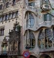
| 01/22/2003 11:50:17 PM |
Signs by Antoni Gaudiby bcncrazyComment: I love the building in this photograph :) it's a very different structure. It just looks like the sign was thrown in as an afterthought.I think if maybe you had been able to concentrate more on the sign and maybe the windows above it, it may have been a much more successful photograph -Annida |
| 01/22/2003 11:45:16 PM |
Untitledby hartlComment: An interesting shot :) It seems a bit over exposed on the sign, and fuzzy in the background. I realize this is probably your intentions though :) It's very eye catching :) Keep up the good work! -Annida |
| 01/22/2003 08:38:09 AM |
cow sex prohibitedby Pep VentosaComment: This is hilariously funny! I love it. The picture is a bit dark though. was that second animal drawn on? hehehe.. funny -Annida |
Home -
Challenges -
Community -
League -
Photos -
Cameras -
Lenses -
Learn -
Help -
Terms of Use -
Privacy -
Top ^
DPChallenge, and website content and design, Copyright © 2001-2025 Challenging Technologies, LLC.
All digital photo copyrights belong to the photographers and may not be used without permission.
Current Server Time: 08/04/2025 08:06:12 PM EDT.