|
|
|
Showing 261 - 270 of ~409 |
| Image |
Comment |
| 02/10/2003 01:36:36 PM | My Angelby indigo997Comment: Gooday from the Critique Club!
First impressions:
This is what I consider a very mellow shot, so the first impression was of serenity, and peace... silence. A little cherub on a bed, it's very beautiful. Belongs in an art gallery.
This is the type of photo that I consider created in an artistic style. Very renaissance, and very in the style of a painter from that genre. I am also very glad that there are no straps or anything holding those wings in place!
Technically:
I think the lighting is great, it's very soft, and fits the mood you wanted to achieve wonderfully. The focus in my opinion is a tiny bit too soft though, and makes the child look blurry in places, while at the same time other bits are pretty in focus, like the torso. I saw your attempts at the black and white, and I did in fact think it worked better, perhaps if you worked with levels to get a more "drawn" effect for the coloured version? I think that would be very cool.
Background:
Well, you know I love dark photos, and the black background for me is superb, it fits with the tone of what you wanted, and it makes the child look even more angelic.
My opinion:
I like it, I scored this photo pretty high because of the artistic merit of it. Well done! |  Photographer found comment helpful. Photographer found comment helpful. |
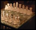
| 02/10/2003 10:00:00 AM | In Shining Armorby inspzilComment: Good Morning from the Critique Club:
First Impressions:
Wow! Cool chess set, I wish I owned it. I think your score shows that a lot of people agreed with me! I also think the lighting is a bit dim for the subject, but could that be avoided? I know inside shots are very difficult to deal with.
The composition seems ok with me, although it seems you may have lost points somewhere because of the background being a bit distracting. The reflections of the pieces on the table are also a tiiiny bit distracting.. a nice dark cloth could have saved you from that.
I like the effects of the sparkles on the closer pieces.. did you try actually setting out a game to make the composition a bit more interesting? I suppose that wouldn't be very cliche though. I think in the end you lost some points because the only chess piece that was mostly in focus was on the corner left, with some sparkle on it. Usually that filter works better if ther's only one sparkle, in my opinion.
My own opinion is that this picture definitely meet the challenge, and I also admit that I liked it, and gave it a high score. Good luck in future challenges, I look forward to seeing more of your work! :) |
| 02/10/2003 12:25:57 AM | |
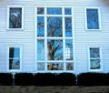
| 02/09/2003 11:55:57 PM | Sudley Church Windowsby 3boyzMomComment: Greetings from the Critique Club!
Composition is pretty good, I like the symmetry very much! What I don't like is how flat it looks. Probably because of the angle you took the photo from. I guess that's ok because you would have ended up in the photo yourself! Did you try more from the side, and up a bit so you could get some more perspective in the shot?
I like how the tree is reflected in the windows. I wouldn't change that. The overall feel of the photo is a bit cold because of the blue'ness of the photo; I will give you the benefit of the doubt and say you were trying to emit how cold it was that day :)
My opinion of the picture is that I like your idea, but a different angle with more perspective would have worked just as well, if not better than straight on. I think your score was very good too! I hope to see many more of your work in the future! Good luck in the next challenges :) |
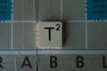
| 02/09/2003 11:26:04 PM | T-Square(d)by RoseytoneComment: Greetings from the Critique Club!
This shot has a lot of potential in my eyes. Unfortunately, the first thing I can tell you is that there is not enough light. It seems like it's in the shadow, did you try a shot with the flash? Or a few lamps around it?
The composition needs some work too. you have a lonely little tile in the middle of a very large ground, did you try some more angled shots, from the side? The other thing about the composition is the crack in the board just between the A and the B which is VERY very distracting; my eyes just keep on going to it and staring at it, because it is so interesting, hehe.
Another weird thing about the presentation is that the Tsquare isn't exactly in line in the square on the board, which is also a bit strange in my eyes. Did you try to get closer to the square?
It certainly fits the challenge, and I look forward to seeing more from you in the future! | | Photographer found comment helpful. |
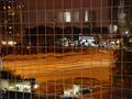
| 02/09/2003 10:51:28 PM | Speeding in Leicester Square £20 fineby PaulkComment: Greetings from the Critique Club!
I'm so happy I got this image to critique! The composition is amazing, and very well put together. Very very clever how you set up so you can read Leicester Square several times in the photo, and you have to strain to see the one little one in the right corner. So Clever.
The colour is superb too, so I wouldn't change anything about that.
The motion is very well done, and I think it makes your eyes read the letters right under the car, which are "Leicester Square"..
I think the only reason your score may have suffered a bit, was because there was no "specific square" element, other than the word "square." Personally, I didn't let that affect my scoring this photo, because it works so well out of the box.
Well done! I like your work, and I hope to see more in the future! | | Photographer found comment helpful. |
| 02/09/2003 10:36:40 PM | Office Windowsby jab119Comment: Hello from the Critique Club!
Composition:
Very good!
Actually, I'm going to drop all the formalities for this one. I Love it. I can't think of anything that you could have done better, or anything which is specifically wrong. The colour is a tiny bit dull cause of the night lights, but you can't do anything about that. Did you try a picture during the day? I bet you would have just gotten a load of glare on the glass, so it's just as well you took it at night.
Your score obviously reflects that nicely :) I'm glad you posted this pictured! good luck in the future; if this is any indication of your work, I wouldn't be surprised if you walk off with a ribbon soon! |
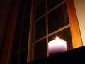
| 02/09/2003 09:21:25 PM | Midnight Squareby fsieradzkiComment: Hello from the Critique Club!
Composition:
I really like the composition in this shot! I like the fact that the candle is inside a square panel, perspective wise. What I don't like is that you can see the walls on the sides of the door frames, which are a bit distracting to the eye. Without those I think it would be better.
Background:
As I stated a bit earlier, I think the door frames are a bit distracting with the bright walls. the Squares which are in the background are pretty good, and fit the challenge. You got a bit of artifacting in the window pane right behind the candle, which is also a bit distracting.
I think this fits the challenge very well, and that your score is a decent one and reflects that most did as well. I think you over exposed the flame of the candle a bit, which is hard to deal with for any photographer. Well done, I look forward to seeing more of your work in the future! |
| 02/09/2003 09:07:33 PM | mmmh..yummy squares.... getting less with every shot!by miss parkerComment: Hello from the Critique Club!
Subject:
YUMBO! This picture just makes me drool, you wouldn't believe how much; I'm a chocoholic, which means I can appreciate this shot a lot.
Composition:
I like it, I think if you had cropped it a bit closer to the packaging, you may have had a much tighter job there. Other than that, good job!
Background:
White, obviously. Not much more I can add there. It's not over exposed, it seems just right. The lighting is nice, and brings out the brownishness of the chocolate, and it's packaging.
I like the border, I think it fits. You also got a very decent score! The only fault I can find is that the focus is a bit fuzzy, maybe if you'd tried a touch closer or just a touch further away to get a better focus. A very yummy idea, very well executed! Thanks for submitting it. | | Photographer found comment helpful. |
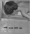
| 02/09/2003 07:48:28 PM | Dry Docked on the Bathroom Floorby PHOTOCHlXComment: Greetings from the Critique Club:
Composition:
This in my opinion is a great candid shot of a child leaning over the bathtub with his boats lined up. It's fairly cool in that respect. The way the child is looking down forces you to look there too, so the focus of the photograph is definitely on the boats. I think to make the composition better you could have moved over a bit to the right, so you didn't have the wall on the left side.
Background:
The bathtub, and the tiles. The tiles are over exposed a bit from the light above. I'm not sure if you used the flash or not. The tiles also seem to get lost under the water and the boats. The bathtub line could have been level to show different depths of the photograph. What is distracting is the wall on the left of the childs head.
Technical Processing:
I like the black and white, but I think that maybe you lose a bit of the depth and the the point of the photograph. I like the smooth softer focus of the shot, and the DOF is pretty good. I am very fond of duotone at the moment, did you try that? Maybe some levels and curves to actually bring out your subject matter more?
My opinion:
I like this picture, but I agree with what somebody else in that the subject matter didn't seem to fit, even though there were some square elements in the photo, they didn't seem to stick out. Great photo, I hope to see more from you in the future! |
|
Showing 261 - 270 of ~409 |
Home -
Challenges -
Community -
League -
Photos -
Cameras -
Lenses -
Learn -
Help -
Terms of Use -
Privacy -
Top ^
DPChallenge, and website content and design, Copyright © 2001-2025 Challenging Technologies, LLC.
All digital photo copyrights belong to the photographers and may not be used without permission.
Current Server Time: 08/04/2025 03:47:23 PM EDT.
|