|
|
|
Showing 141 - 150 of ~409 |
| Image |
Comment |
| 04/01/2003 01:47:37 PM | Timelessby DougPazComment: Hello from the critique club!
hi DougPaz!
This is one of the stunning sky shots :) I like it. Unlike some of the comments you received, I like the stark and bright light. I am one who loves the architecture of buildings. I wish you had shown me more of this building. I particularly love anything that looks like a church; don't ask me why, but architects always seem to take more time to be creative with church like buildings. This reminds me of a church building. Did it used to be a church?
I think your choice of aperture setting was great, although it removes the depth from the photo, and it makes it look really flat. I think that's mainly because there are almost no shadows... except for the one which is obvious directly in front. Did you try a shot from the right hand side of the building? or maybe if you'd have gotten more of the building (downward) in the shot, it would have given more actual visual depth to the shot.
I like the colours, the choice of your subject, and I think it goes well with the challenge. Your shots are usually well thought out and you know what you're doing :)
Good luck in future challenges!
-Annida |
| 04/01/2003 01:40:39 PM | Emotional Catalystby lionelmComment: hello from the critique club
Hi lionelm,
This is certainly quite a controversial picture you took. When I saw it, I think I rolled my eyes, and then I thought... wait.. this is a very emotional picture if you read into it.
For instance, take a look at one of the most popular forum threads on DPC rant.
Technically, the shot is near perfect in my eyes. I like the negative space you used, and I LIKE the helicopter above the white house. It adds to the paranoia/suspicion felt in DC at the moment. They are watching everybody/everything. I'm surprised they still allow people to take pictures of the white house. I think it may have been a bit better if you'd have used a higher aperture setting, around 8'ish, to get the white house fully in focus as well.
What's that weird blue thing on the rightish side of the photo? I have no clue what that is, and it seems a bit distracting to me! Other than that, superb idea. Very creative.
-Annida |  Photographer found comment helpful. Photographer found comment helpful. |
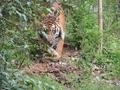
| 04/01/2003 01:30:06 PM | Shere Khanby whitetigerComment: Wow! what a menacing shot. I love it. I think it would be better with a tighter crop :) I love the look on the tiger's face! | | Photographer found comment helpful. |
| 03/30/2003 09:41:14 PM | Nature's Wayby GolferDDSComment: Howdy from the Critique Club:
What a morbid photo! I love it. I think the idea is great, the realization is a bit hard to do with such common colours in the whole thing. Technically, I think you should have possibly tried to get more over the subject. It's hard to comment on the technical part of things. I think if you had compensated a bit with the white balance, it would have been better.
I like the composition, I think it is impeccable. The image starts with the subject in the lower right corner, and it draws you up the subject to the back of the photo.
Did it fit the challenge? it's hard to say that you didn't meet the challenge with somethign which was obviously on the ground :)
Well done, and good luck in the future.
-Annida |
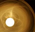
| 03/30/2003 01:59:43 PM | The Kitchen Lightby OneSweetSinComment: Hello from the Critique Club:
Well, my first question is... what is it? My second question is, does it really matter what it is? Then I read the title, and realize what it is and feel silly. lol. I have to say, this picture is kinda freaky, in a good way. Is that smoke swirling around the kitchen light?
I am so glad that the brightness of the lightbulb isn't too overwhelming, and you did well in that face, which means I can view the photo for a long time without going crazy or rubbing my eyes.
As somebody else said, this doesn't really convey a kitchen to me, which is probably why your score doesn't really seem too high. I am a huge fan of abstracts.
Now, things I really like. I love how the lightbulb isn't centered, I love the totally black corners, and I love the swirling lines/smoke around the light, you surely captured that well.
Good luck in the upcoming challenges :)
-da |
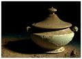
| 03/27/2003 12:32:16 AM | Dusty old soup tureenby GotchyaComment: Hello from the Critique Club!
First impressions: As you can see from the first thing I said in my original comment.. it was eww, I hope the rest of the stuff in your kitchen isn't like this! I love the great dramatic lighting.
I think this is a very great mood shot. The real winner is the lighting, and the total blackness in the background. As somebody in the comments said, the focus is a bit off on the top of the object. I think if you'd changed the aperture toward the range of 5 or 6, that maybe it would have all been in focus. I've just looked at the rest of your photos, and I absolutely love them, and I'm certain that you knew exactly what you were doing anyway!
What else can I say? There's not much. You've captured the mood of that you wanted. You got an excellent score too :) Congrats on a great photo.
-Annida | | Photographer found comment helpful. |
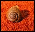
| 03/22/2003 12:50:11 AM | Sitting Sixby kiwinessComment: Welcome to the Critique Club:
YAY! I'm so pleased to be critiqueing this photo, mainly because I LOOOOVE snails. Is this gravel and an aquatic snail? I'm not sure if there's water there, but that's definitely gravel.
This to me is a very strong image, technically and.. on top of that, I find it very appealing in that I like snails. I can understand if others don't find it so appealing, lol.. snails are a bit phobia for some people.
The light in this photo is superb, it's not too bright or to harsh, and it's not too little. The shadow adds to the depth of the photo.
Does it fit the challenge? You can't get a more natural six, hehe. Beautiful photo, beautiful idea. Well done.
-Da | | Photographer found comment helpful. |
| 03/19/2003 12:41:35 PM | Naturally Decaffeinatedby inspzilComment: oh my, I hope you actually have a tank to keep these fish safe after taking the picture. It's a bit ... too full, honestly. Bah, I wish I didn't know this much about fish, but I do, and I have mixed feelings about this photo. I wish I could know that all of the fish are alive and well. |
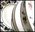
| 03/19/2003 07:44:27 AM | What's your favorite dish?by vjozComment: We know which is your favorite dish! I think this would work better without the other out of focus dishes in the way. nice colours in the focused one! | | Photographer found comment helpful. |
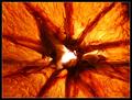
| 03/19/2003 07:43:45 AM | Orange Sliceby mariomelComment: This is not a very appealing image... I mean, not in a bad way.. Is it an orange slice? or something like that? It's great in texture and light. It looks like some kind of microscopic thing... |
|
Showing 141 - 150 of ~409 |
Home -
Challenges -
Community -
League -
Photos -
Cameras -
Lenses -
Learn -
Help -
Terms of Use -
Privacy -
Top ^
DPChallenge, and website content and design, Copyright © 2001-2025 Challenging Technologies, LLC.
All digital photo copyrights belong to the photographers and may not be used without permission.
Current Server Time: 08/04/2025 05:24:17 PM EDT.
|