|
|
| Image |
Comment |
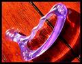
| 06/14/2003 06:33:50 AM | Tool of the tradeby kosmikkreeperComment: Hi, What a .... funny looking object.. it looks a bit rude *wink wink*. I like the fact that the sun shining on it on this object makes the bubbles shine out. Lovely. I don't really like the choice of background. the colours don't seem to mix very nicely. |  Photographer found comment helpful. Photographer found comment helpful. |
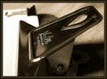
| 06/14/2003 06:32:43 AM | Bouill, LAby GotchyaComment: Sepia is in these days! hehe, I like the angle you took the picture from. Very original point of view. Very nice! | | Photographer found comment helpful. |
| 06/14/2003 06:31:00 AM | |
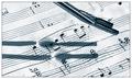
| 06/10/2003 11:23:13 PM | Perfect Pitchby welcherComment: Hello from the critique club!
Hi Welcher!
I'm SOOOOOOOOOOOOOO happy to get this picture. SO happy! I loved this picture the minute I saw it. I'm gonna say this, it was one of my favorites in the sound challenge.
What I liked about it was that it was so unique, and you actually managed, even though not really, to get the sound waves going (even though it's a pan), and that's what really counts.
This looks like an orchestral score, am I right? I love this photo, and I'm adding it to my favorites. It hits a spot in my places, including my heart, which is where music is.
PERFECT!
-Annida | | Photographer found comment helpful. |
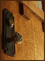
| 06/04/2003 07:37:44 PM | Family Valuesby autoolComment: Hi, from the Critique Club:
Hi autool:
The most fascinating thing about this picture is the story. I just wish sometimes that we could see the blurb during voting, but then it wouldn't be fair :) Ah well..
About the photograph: I think the tones of the wood, and the texture have been captured superbly. I like the lighting on the door knob, which brings out the markings on it to perfection. I also think the "oldness" of the door knob, and the door adds beautifully to the picture. Personally, I think the top right hand corner detracts from the picture greatly. I think if you had cropped that section out, the picture would have much more impact.
Does this Photograph fit the challenge? Yes, it does. It fits nicely. Congratulations :)
-Annida
| | Photographer found comment helpful. |
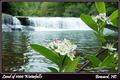
| 05/14/2003 06:17:41 AM | Land of 1000 Waterfallsby karmatComment: Greetings from the critique club!
Hi there Karmat! Time to repay you for all your critiques! hehe...
Let me start with this. It certainly fits the challenge nicely. I cannot fault it for that at all.
After reading your notes on the subject, I understand a bit more. FOr a hand held shot, this is great! It would have been 100% better if you had your tripod with you. That's just the focus though, and well, I know about focus problems. they can be a real pain in the butt.
The composition: I like the idea of the flower sitting in front of the waterfalls.. what I don't like is the fact that the one flower is cut off on the side. I know that's nitpicky, but I'd have liked to see more.
I like the choice of border, I think it works very well. I don't think you can really go wrong with black and white. I think if you had just the falls in this picture, you would have had an even better score! Not that you need a better score, lol, 6.1 is so decent, I'd give my left foot for it :D
Take care karmat, great photo, great score!
-Da |
| 05/10/2003 04:34:43 PM | X-ray frames by kiwinessComment: I dreamt that this picture disappeared. I'm glad it's still here. LOL
don't ask. crazy dreams.
-da | | Photographer found comment helpful. |
| 04/30/2003 06:39:04 PM | Grass and a Lazy Dayby sagestudioComment: Greetings from the Critique Club!
Hi sagestudio,
I hope you are well today. I like the feeling of this photo. So laid back and lazy, I like it. I like the composition of this photo, and the little bit of sky, and the grass taking up most of the shot. I would have liked this shot better if the grass in the forefront was more intact.
I like the lighting; it looks like you were there either in early morning or late afternoon which is when the best lighting is available. This isn't the typical flora photo which we saw in this challenge, and that's what makes this shot original. I enjoyed it very much.
I'll be honest and say that I'm not very strong on the technical stuff yet, and had I taken this shot, I wouldn't have used f8.0. That's a personal choice that I'd make. I would have used macro mode, and a F3 or 4... I'd like to discuss with you why you used F8.0? please send me a private message?
Overall, I think this fits the challenge well, and I like it too!
great work!
Annida |
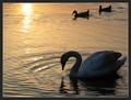
| 04/30/2003 04:21:08 PM | Swan with Two Ducks at Sunsetby auroraComment: Great photo. I didn't have time to vote during the challenge, but I had this pegged as a top 3. I think you were underrated because of all the bird/pond type bird shots in the challenge. I just love this, and it's going into my favorites!
-da |
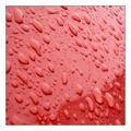
| 04/29/2003 08:49:10 PM | Raindropsby RefractedComment: Hello from the Critique Club!
Hi Refracted!
Red is one of my favorite colours, and I like this photo just for that. Now what can I tell you? The photo is definitely a weather photo; that's definitely shown by the drops of water. What this photo lacks is special amazing wow interest. What the picture is, is a good abstract. You can't tell exactly what it is.
I think the bit of shadow on the bottom right, and the line makes the picture a bit more interesting. I like the clarity of the drops and the focus is superb on them. Technically this photograph is superb, I can't really think of anything else you could play with on that.
I feel that you would have done better point wise, if ... something was reflecting through the drops or something just as impossible. lol.
Great work !
-Annida
| | Photographer found comment helpful. |
Home -
Challenges -
Community -
League -
Photos -
Cameras -
Lenses -
Learn -
Help -
Terms of Use -
Privacy -
Top ^
DPChallenge, and website content and design, Copyright © 2001-2025 Challenging Technologies, LLC.
All digital photo copyrights belong to the photographers and may not be used without permission.
Current Server Time: 08/03/2025 07:34:46 PM EDT.
|