| Image |
Comment |
| 05/14/2004 11:22:01 AM |
Beauty and Tragedyby whatsinanameComment: This photo is very busy. There are a lot of elements demanding attention, and having two different points of interest at different depths makes it difficult to look at. |
| 05/14/2004 11:16:37 AM |
|
 Photographer found comment helpful. Photographer found comment helpful. |
| 05/14/2004 11:13:32 AM |
Not a kindby roger2000Comment: The bright background and unused space at the upper left detract from this photo. Good focus and light on the subjects. |
| Photographer found comment helpful. |
| 05/14/2004 11:12:11 AM |
Focusby katlynComment: I would have preferred to have some light on the flower in the foreground. |
| Photographer found comment helpful. |
| 05/14/2004 11:10:45 AM |
more to the pointby PixelproseComment: The colors look a little washed out on this. Nice DOF. Overall I find the subject of this photo not too interesting. |
| Photographer found comment helpful. |
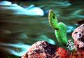
| 05/14/2004 10:45:30 AM |
Fattened Desert Lifeby mithandorComment: There is something about this photo that looks unnatural but I can't quite place it. Maybe it is too much brightness/contrast adjustment. The bright overexposed area on the middle cactus leaf detracts from the overall image. It looks like a finger or something is darkening/obscuring the frame at the left edge. It would probably be better if it were cropped out. |
| 05/14/2004 10:41:40 AM |
Opposite Reflectionsby DonatienComment: I like this photo from a technical standpoint, but the light seems "off" on it. Some white balance adjustment might help compensate for the artificial light. |
| Photographer found comment helpful. |
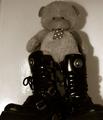
| 05/14/2004 10:39:23 AM |
Hard & Softby kevrobertsonComment: The lighting looks too harsh for this picture. The glare on the left part of the wall around the boots is distracting. The shadow and bright area of the wall on the lower right tries to pull your attention out of the frame. This looks to me like Sepia tones were used to try to make an dull picture more interesting, but I don't think it worked in this case. |
| Photographer found comment helpful. |
| 05/14/2004 10:35:44 AM |
|
| 05/14/2004 10:05:54 AM |
Friendsby Hemant ModhComment: I'm not sure I get the "Opposites" in this photo. Good detail in the picture, but I don't find the subject and overall picture to be that interesting. The colors and "skin tones" seem to be slightly off. Maybe a different white balance setting would fix that. |
Home -
Challenges -
Community -
League -
Photos -
Cameras -
Lenses -
Learn -
Help -
Terms of Use -
Privacy -
Top ^
DPChallenge, and website content and design, Copyright © 2001-2025 Challenging Technologies, LLC.
All digital photo copyrights belong to the photographers and may not be used without permission.
Current Server Time: 08/18/2025 04:17:13 AM EDT.