| Image |
Comment |
| 05/14/2004 04:42:46 PM |
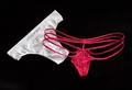
Male & Femaleby BibliophileComment: Nice lighting and focus. Very clean picture. I might have preferred a tighter crop on the subjects and a more square frame. |
 Photographer found comment helpful. Photographer found comment helpful. |
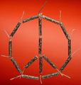
| 05/14/2004 04:39:35 PM |
Peaceful Explosionby peeteComment: Nice focus and background. It feels like something is missing from this photo, but I can't place it. Maybe if the fuses were lit... ;) |
| Photographer found comment helpful. |
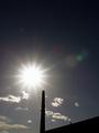
| 05/14/2004 04:32:28 PM |
Glitter and Shadowby ajacoubComment: Nice star effect on the sun and light on the clouds, but the rest of the image is kind of dull. |
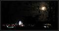
| 05/14/2004 04:31:07 PM |
The Lights at Nightby LenMComment: The lights in this image, aside from the moon, aren't defined well enough to be interesting. A shot zoomed in on the moon through the leaves might have made for a better entry. |
| Photographer found comment helpful. |
| 05/14/2004 04:28:45 PM |
Under The Candle Lightby gambaComment: The composition of this photo bothers me a little. I don't get the point of including the entire right hand side of the photo. It is dark, out of focus and doesn't seem to add much to the image. The border on this is distracting since it is running through the actual image and not a true border. |
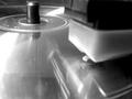
| 05/14/2004 04:24:49 PM |
CD Turntableby utopian mangComment: The focus on the needle looks too soft. I don't know about this being a good representation of "opposites" |
| 05/14/2004 04:22:23 PM |
Moon at Sunsetby lykofosComment: I think the contrast between the bright parts and the dark parts of this picture are too great. Perhaps the light will be a bit softer when it is filtered through the trees a few minutes later (assuming this is sunset). Alternatively, some fill flash might help brighten the monuments. |
| Photographer found comment helpful. |
| 05/14/2004 04:18:57 PM |
the Big oppositesby mrBlueComment: The lighting on this picture looks "off". A different white balance setting may help remove the yellowish tint cast over the image. |
| Photographer found comment helpful. |
| 05/14/2004 04:17:09 PM |
Opposites Attractby gajmajComment: This is a good picture technically. I like the lighting and the DOF. I don't understand what is opposite about the elements in it, though. To me the picture needs something to add some life or soul to it. It feels very cold and clinical. Perhaps that was the intended effect. |
| 05/14/2004 11:25:56 AM |
Smell Dead Freshby frogsComment: This is a pretty ugly subject and idea. I like the photo technically. The focus and DOF are very good. The background color is a good contrast to the rest of the image. Unfortunately, the photo leaves me with a bad taste in my mouth... |
| Photographer found comment helpful. |
Home -
Challenges -
Community -
League -
Photos -
Cameras -
Lenses -
Learn -
Help -
Terms of Use -
Privacy -
Top ^
DPChallenge, and website content and design, Copyright © 2001-2025 Challenging Technologies, LLC.
All digital photo copyrights belong to the photographers and may not be used without permission.
Current Server Time: 08/18/2025 06:04:37 AM EDT.