|
|
|
Showing 581 - 590 of ~778 |
| Image |
Comment |
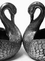
| 09/19/2002 05:16:00 PM | Swansby sulamkComment: I think this is one of the better examples of the use of negative space this week. The space around your subject definitely interests me. It appears to create the shape of a bird in flight, viewed from either directly above or directly below. That's particularly nice to me for two reasons 1) It maintains and furthers the subject matter of the photo, and 2) it forces your eye to an entirely different plane, (by which I mean we view the swans from the side which provides a definite sense of direction; then the neg space creates this bird, which we view from above - creating a different three dimensional plane altogether...) I also saw the shape of a rams head in the neg space, which was equally strong (in fact, my first inclination), but less relevant to the subject matter, so I chose to maintain the first idea described. I only have two constructive tidbits to add: 1) The background appears to be felt, which has a texture of its own (and therefore it's own gradations of color), especially in a shot this close. I would prefer a background that was totally white. Perhaps muslin would work better. 2) The focus and lighting seem to be concentrated on the lower portion of the bird on the right. I would prefer to see it more by the heads and necks of the swans since that's where the eye needs to travel in order to explore your negative space. Great job. 9, just-married |  Photographer found comment helpful. Photographer found comment helpful. |
| 09/19/2002 11:27:00 PM | Shaftby millerComment: Very effective. I'm curious how you managed this shot, but it's very good. 8, just-married |
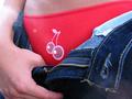
| 09/10/2002 08:08:00 PM | Cherry Pieby drewmediaComment: Provacative. The sunbeam on the left is nice. I the like the framing as well. The colors are quite rich. I think the title is a bit much, but I don't score on title. 8, just-married | | Photographer found comment helpful. |
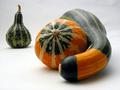
| 09/12/2002 11:52:00 PM | Jealousyby indigo997Comment: I like the organization of this photo. The concept is really carried out well, from the title, down to the shape of the gourds. Very creative. I like the way you chose to focus; though I imagine some might make a case that the focus should be on the jealous gourd in the background. That would be interesting to see as well. Just a different idea -- nothing wrong with what you have here. Only brainstorming. I like this photo, but ultimately it is interest/appeal that keeps it from scoring higher with me. Sounds silly - perhaps I have a squash prejudice. LOL. PS> If you're interested in nitpicks, the blemish just inside the neck of the large hugging gourd distracts me just a bit. 7, just-married | | Photographer found comment helpful. |
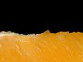
| 09/10/2002 10:16:00 PM | orangeby john22132Comment: Excellent use of negative space. Color is fabulous, as if the lighting. Well done. 8, just-married |
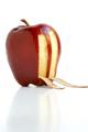
| 09/11/2002 11:27:00 AM | The Big Apple: We will never forget!by chakkobboComment: Okay, I knew this one was coming and I've had a corner of my mind on composing my comment ever since I saw the thumbnail. Generally, I am against using the tragedy of others as an opportunity for gain (say by submitting it to a photo contest to pull on the heartstrings of viewers and receive a higher score). That said, this photo is not only technically very well done, but the symbolism is VERY STRONG; down to the collapsed peels, still lingering, still reminding. Even the shadow contributes. NY: a shadow of its former self. So in the end, I decided to view this photo as a tribute rather than a manipulative go at a better score, but that inclination lingers in me, keeping me from scoring you TOO highly. I hope my honesty here is taken as it's meant: to enlighten you to the reaction of a viewer. I mean no name-calling in this post. 7, just-married |
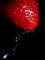
| 09/10/2002 10:28:00 PM | Liquid Strawberryby timj351Comment: This works equally well in this weeks challenge and in next week's challenge. Very nicely done. Beautful color; nice stop motion on the water drop. The texture is terrific. I love the reflection of the strawberry in the water dripping from it. Perfect. 10, just-married |
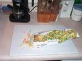
| 09/15/2002 12:10:00 PM | Frostbiteby freetimeComment: Hmmm, ...I think that this photo's concept had some potential. There were some execution choices that hurt it IMO. The objects in the background distract from and aren't necessary to your subkect. I would try for a tighter crop that doesn't include them. Then, I generally like angles in photos, but this one is so slight that it really seems accidental -- I would go for more or less. Lastly, I would play with the way the bag is arranged on the cutting board. Take what you can use from this, disregard the rest. 3, just-married |
| 09/15/2002 12:02:00 PM | monkey foodby Ricky CleaveComment: The lighting really hurt this photo IMO. The framing is nice and it could have been a good shot, but I can't get past the lack of lighting. 3, just-married |
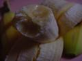
| 09/15/2002 12:22:00 PM | Freckled Chiquitaby discomushroom11Comment: The concept I get, but it seems blurry. I think you should have used a macro setting/lens for this. Or not have gone for such a close-up. 3, just-married |
|
Showing 581 - 590 of ~778 |
Home -
Challenges -
Community -
League -
Photos -
Cameras -
Lenses -
Learn -
Help -
Terms of Use -
Privacy -
Top ^
DPChallenge, and website content and design, Copyright © 2001-2025 Challenging Technologies, LLC.
All digital photo copyrights belong to the photographers and may not be used without permission.
Current Server Time: 08/04/2025 08:04:01 PM EDT.
|