|
|
|
Showing 491 - 500 of ~778 |
| Image |
Comment |
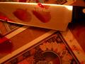
| 11/04/2002 03:36:00 PM | Tarotby KonadorComment: Good concept. I think it would work better without the fake blood, which isn't realistic enough to be convincing. Good luck. 5, just-married |
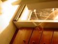
| 11/04/2002 03:35:00 PM | Amityville Weight Control Programby BullwinkleComment: I felt compelled to turn my head to see this in portrait. I wonder, did you rotate it on purpose or not? The concept is good, but I would prefer to see it in portrait orientation. Also, I find it a bit too yellow overall, which detracts from the creepiness I would normally feel about the Amityville Horror. 5, just-married |
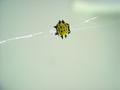
| 10/29/2002 02:28:00 PM | Friend or Foeby jab119Comment: Concept is good. That smiley can be deceptive, huh? The focus is softer here than I think it needs to be. A macro attachment might solve this problem for such close shots. :-) 5, just-married |
| 10/29/2002 02:40:00 PM | |
| 10/17/2002 12:26:00 PM | Fall From Graceby KarenBComment: Everything about the composition of this works for me except the placement of the paper. It doesn't seem placed in such a way that he can be reading it. I thought at first that maybe it was the front page of an open newspaper, but that doesn't appear to be the case. The emotion of what you've depicted is well-represented in his expression and body-language. The thing that most damages my ability to appreciate the photo is the pixellation. There is the school of thought that at times pixellation adds something to the nitty-gritty nature of a photo, but it's a school of thought I have a hard time relating to. Just passing this on so you'll know there are people who probably feel it's beneficial and those who feel it's detrimental. THat said, if it wasn't intentional, you may have been able to avoid SOME pixellation by not compressing so much. Your image can be up to 150K. Take what you can use, disregard the rest, 6, just-married |  Photographer found comment helpful. Photographer found comment helpful. |
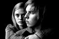
| 10/14/2002 10:12:00 PM | Trust?by arnitComment: This is an absolutely TERRIFIC photograph. I'm not sure what sin you were trying to portray -- pride? I dunno, but you know what, I don't care. It is an incredible photo, one of the best I've seen on this site, one for my favs when the challenge ends. Technically perfect and the faces are so expressive and so well framed. My kudos to you! 10, just-married |
| 10/14/2002 10:01:00 PM | I'm Lust by lmhrComment: I like this photo a LOT. I think the title needs some work (humbly said - I am no title genius myself). I wish the behind the knees weren't so terribly bright, but it doesn't destroy it for me (and it's better than I could do). Good job. 8, just-married |
| 10/14/2002 09:33:00 PM | Pistolby IvanComment: This is framed well and makes good use of negative space. The focus is a hair soft - I think very crisp lines here would better carry the cold emotion in the photo. Still, well done. Initial score: 6; may be updated later. just-married |
| 10/14/2002 09:42:00 PM | Post Glutby justineComment: Good idea. I think it would be more effective if the background were one continuous sheet - i.e., if you didn't see the wall or the floor in the photo. I also think the lighting would be less hot if bouced off a reflective surface. 4, just-married |
| 10/17/2002 12:19:00 PM | Aftermathby HBunchComment: The power of your message and what you've depicted here are really strong. I hope the shot is set up and not something you just had the opportunity to capture. The composition is good. I like the "back against a wall" element. THe focus and the listing are what prevent me from scoring this higher. THe focus seems to be on the texture of the wall rather than her face. Not sure if your camera lets you control the focal point or if it has to be center-weighted, but thought I'd explain my impressions. 6, just-married | | Photographer found comment helpful. |
|
Showing 491 - 500 of ~778 |
Home -
Challenges -
Community -
League -
Photos -
Cameras -
Lenses -
Learn -
Help -
Terms of Use -
Privacy -
Top ^
DPChallenge, and website content and design, Copyright © 2001-2025 Challenging Technologies, LLC.
All digital photo copyrights belong to the photographers and may not be used without permission.
Current Server Time: 08/07/2025 05:05:19 PM EDT.
|