| Image |
Comment |
| 05/26/2005 11:08:23 PM |
Vigilby FirstyComment: The lighting is wonderful. The composition is also quite nice - good use of the rule of thirds. I would like to see the paws in the shot as well, and I think the mane suffers a bit from over-sharpening. |
 Photographer found comment helpful. Photographer found comment helpful. |
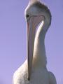
| 05/26/2005 11:06:46 PM |
To the darkness and backby nicklevyComment: I like the unusual dimensions for this shot. I like the fact that the mouth is cropped out as this is also unorthodox (and I imagine you'll probably catch some flak for it). I like the B/W/Sepia conversion. The only thing that bugs me at all is the light on his left eyebrow - not that there is light there, but that it makes such a hard, straight, horizontal line. Still, very well done. 7 |
| Photographer found comment helpful. |
| 05/26/2005 11:04:10 PM |
Suncatcherby megryanComment: The lighting is indeed very nice. The "pose" and framing are also quite good. Two little nitpicks: 1) the fuzzy head is clipped, but not enough to make it look intentional, and 2) the photo seems hazy - this may be intentional, in which case please ignore the rest. If it was inadvertant, there are two ways I can think to unhaze it: 1) boost saturation and contrast, or 2) defog with USM settings roughly 25/60/4. HTH. |
| Photographer found comment helpful. |
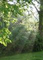
| 05/26/2005 10:49:44 PM |
Morning Breaksby Rachel34Comment: I like the sunrays, as I generally tend to in photos, but the rest of the photos doesn't excite me at all. I don't care for the branches in the foreground and I wish for some subject matter that was caught in the sunrays. Even just a park bench, but I feel that something is needed as a focal point in the image. |
| Photographer found comment helpful. |
| 05/26/2005 10:47:21 PM |
Sanctuaryby shabbychicComment: Very nice. The way the light creates the suggestion of the benches makes this shot for me. |
| Photographer found comment helpful. |
| 05/26/2005 10:45:39 PM |
Bright Smileby msdoubletroubleComment: Neat effect, but it doesn't do enough to make the subject interesting to me. Good composition though and I like the border. |
| Photographer found comment helpful. |
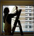
| 05/26/2005 10:44:15 PM |
Killer Lightingby RickHComment: Great title for this image. Good take on the challenge. I like the B/W conversion. My only CC really is that I don't care for the centered composition for this shot. (No I'm not one of those people who hates all centered photos.) Compositionally, I'm more interested in the space (or lack of) to the left of her than the emptiness behind her. Still, it's a small point for me. |
| Photographer found comment helpful. |
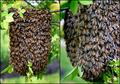
| 05/26/2005 10:26:38 PM |
Bee Swarmby eostylesComment: OMG - I so hope you have a killer zoom because this is giving me the heebeegeeBEES just to look at. wow wow wow. |
| Photographer found comment helpful. |
| 05/23/2005 12:21:42 AM |
painting worksby rhipsterComment: Originally posted by amber:
For me there is too much detail for a silhouette |
And it seems you really suffered for this in the casting of votes. Too bad. If you shot in raw, you could bring the shadows up some and acheive a very natural silhouette, even by purist standards. |
| Photographer found comment helpful. |
| 05/20/2005 10:07:30 PM |
Beta Testby soupComment: Refreshing to see somethign so different from what everyone else has submitted. Very well executed. Love the hues. Lighting is suberb. |
| Photographer found comment helpful. |
Home -
Challenges -
Community -
League -
Photos -
Cameras -
Lenses -
Learn -
Help -
Terms of Use -
Privacy -
Top ^
DPChallenge, and website content and design, Copyright © 2001-2025 Challenging Technologies, LLC.
All digital photo copyrights belong to the photographers and may not be used without permission.
Current Server Time: 08/02/2025 07:39:02 PM EDT.