| Image |
Comment |
| 07/17/2005 06:45:17 PM |
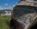
Replaced by the Tucsonby jbsmithanaComment: I believe ths was under-rated by voters. The planks in the hull do a nice job of leading the eye to the Tucson. It's a good example of the technique and ought to have scored a bit higher in my opinion. I gave it a higher score anyway. |
 Photographer found comment helpful. Photographer found comment helpful. |
| 07/15/2005 08:30:23 PM |
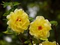
P5090048-(resized).jpgby David.CComment: You've done a good job commenting on exposure, working backwords to determine what you did that yielded those results, and reasoning forward to what you would do differently next time. Note to our mentor group: This is an excellent habit to get into. It will help you improve over time.
On the scale of 1 (bad) to 10 (good) this is closer to 10 than to 1. The under exposed background does no damage at all and makes a nice frame around the subject flowers. You've lost some definition in the flowers you might have preferred to keep. Not terrible but there could have been a marginal improvement.
Your choice of Spot metering was excellent since your subject was significantly brighter than the background and it gives you the best chance for correct exposure. Do you think center weighted average whould have improved or worsened the result? Let me know your thoughts here.
I am curious about your choice of shutter speed and apereture. You indicated it was too bright for your camera. Yet, you used a pretty wide open lens (F/3.4) and a moderate shutterspeed (1/500). Could you have dealt with the brightness with a faster shutter? I suppose you chose F stops to narrow DOF. If not, could you have used a smaller lens opening? Obviously, I am sneaking up on a future topic.
Probably because your neice was shielding the flowers, it isn't obvious where the sun was. Where was the sun relative to you and your subject? Would a different camera angle yielded different exposure results? Message edited by author 2005-07-15 20:32:09. |
| Photographer found comment helpful. |
| 07/15/2005 08:13:30 PM |
P4130033 (resized).jpgby David.CComment: David, firstly thanks for posting your SOOTC original. This is what we need if we are going to work together to achieve predictably good exposure. Secondly I like the photo just as it is (and I have to say I love a quantitative girl!)
I agree with your analysis of the exposure. One of the things I like about this is that it has variety of exposure and good intense and well saturated colors. This will make it an intrinsicly more interesting photo. You can see it in the histogram with multiple spikes. And you can see the exposure bias (left shift) due to your use of a a micro-fibre gray card.
A fine job and a good model of good exposure. |
| Photographer found comment helpful. |
| 07/11/2005 07:14:08 PM |
Paige.jpgby sheapodComment: Laura, I agree you did a nice job on a pretty subject with the exposure here. There is good tonal range. There are some nice clean whites and some nicely saturated blacks. The girls face (obviously the subject) is well exposed with nice defining shadows which allows her personality to shine through. Good job.
If you wanted to tweak it slightly, you could bring up the brightness and contrast just a bit to emphasize the face a little more. In Photoshop try 1) Brightness (+10) / Contrast (+15). It's really not necessary and would be only a marginal improvement.
This appears to have been taken with natural light mostly coming from the right side of the frame and maybe a little above. About the only thing I can think of that would make it better would be some catch lights in her eyes, but I honestly can't think how you would have done it under the circumstances.
Was this taken on automatic? Or did you make adjustments to your camera? If you made adjustments, why did you make the ones you did? If on automatic, why do you think the camera did such a good job all by itself? |
| Photographer found comment helpful. |
| 07/11/2005 12:58:55 AM |
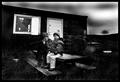
doing your own thingby buzzmomComment: I actually like this quite a lot. I love the lighting. I like the triangular comp (light plus the two people).The focus isn't great but okay enough. Excellent choice of color. Fantastic perspective on the scene. What spoils the image for me is the gradient border. Some may like it, I suppose. But it doesn't resonate with me. |
| Photographer found comment helpful. |
| 07/11/2005 12:54:00 AM |
Where is dad?by garlicComment: This photo has a huge emotional payload I quite like. The stark contrast is very good. Focus is good. DOF is good. I like the woman in the background juxtaposed with the kids in the foreground.I am sorry to see the overly blurred sky and the post processing artifacts along the fence line and the roofline. |
| Photographer found comment helpful. |
| 07/11/2005 12:51:05 AM |
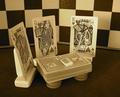
Family Businessby madison461Comment: Excellent photo. Composition is very good. Color saturation, too. Well meets the challenge. Diminished by overly soft focus/DOF. |
| Photographer found comment helpful. |
| 07/11/2005 12:48:59 AM |
|
| Photographer found comment helpful. |
| 07/11/2005 12:47:45 AM |
|
| Photographer found comment helpful. |
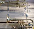
| 07/11/2005 12:46:39 AM |
gone out to playby p2jvrComment: Meets the challenge. Well lit, exposed and focused. I might have cropped it to either get all of or exclude topmost instrument. Nice reflections. Rotating the image diminished it in my opinion. |
| Photographer found comment helpful. |
Home -
Challenges -
Community -
League -
Photos -
Cameras -
Lenses -
Learn -
Help -
Terms of Use -
Privacy -
Top ^
DPChallenge, and website content and design, Copyright © 2001-2025 Challenging Technologies, LLC.
All digital photo copyrights belong to the photographers and may not be used without permission.
Current Server Time: 09/03/2025 05:06:38 PM EDT.