| Image |
Comment |
| 10/13/2005 06:52:45 PM |
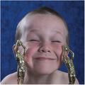
Trophy Boy!by MakkaComment: This really made me smile! That expression is really cute, he really does look pleased with himself LOL.
Reckon just a touch more contrase might have made this one jump out of the screen a little more, but a real good 'un anyway. Nice job! |
 Photographer found comment helpful. Photographer found comment helpful. |
| 10/13/2005 06:50:45 PM |
The Apple of His Eyeby manic35Comment: this has a nice intimate feel to it but I am not sure about the pose of the dad. I do like the close crop though. It may be the conversion whne resized for the web, but it also seems a little soft, particularly on the little one.
Nice image though, i'd like one like this of me with my daughter! |
| Photographer found comment helpful. |
| 10/13/2005 06:46:41 PM |
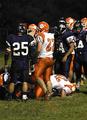
proud to be bigby alayaComment: I think this kind of shot needs to be more symetrical to really work. Also the cloud to the right is really blown out and quite distracting. Nice try anyway though |
| 10/12/2005 03:35:11 AM |
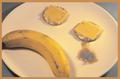
The Sad Breakfastby theantonComment: If the colour, brightness and lack of contrast in this image isn't intentional you really need to calibrate your monitor. This image is really bright which has washed all the colour and contrast out of this image. |
| Photographer found comment helpful. |
| 10/09/2005 11:54:43 AM |
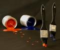
Run!!! Run!!!by TransitComment: Great idea and composition. For me though I find the black background quite distracting. I think a plain white background would have been better, the colours and brushes would have had more impact and stood out better.
Again, well done for coming up with and original idea. |
| Photographer found comment helpful. |
| 10/08/2005 12:29:47 PM |
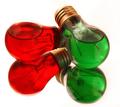
colorful ideaby rwaudioComment: Really do like this mage, I like the composition and the colours here. Its also something different and quite fun to look at. One or two of the highlights are a little blown out on the top edge of the red bulb but it must have been tricky to light so I reckon you got the exposure spot on really. Good luck with this one |
| Photographer found comment helpful. |
| 10/08/2005 12:24:14 PM |
Blue 45 Orange 14by LN13Comment: Although you are relying on the colours being the subject of this image, I think it still really lacks a focal point, and looks a bit to busy. |
| Photographer found comment helpful. |
| 10/07/2005 08:25:57 AM |
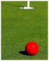
“If you drink don't drive. Don't even putt.”by Marc923Comment: Quite nice, but I think if you had put the ball into the corner a little more and then placed the hole in the opposite corner it might have made it a little more balanced. The detail in the ball is nice, although its a shame its lost some detail towards in the highlights.
Nice image all the same though, well done. |
| Photographer found comment helpful. |
| 10/07/2005 08:20:53 AM |
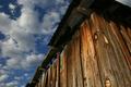
Barnby russbbrinkComment: I quite like this shot, the detail and patterns on the wood are really nice. The sky looks a little muddy when compared to the nice coulours of the wood though and could do with a little more contrast to bring out the blue and the white of the clouds.
Quite a nice shot though, nice job. |
| 10/07/2005 03:00:33 AM |
Children in Sapaby letuananhComment: Beautiful image, and I guess you could argue that the muted colours of the clothing kind of compliment each other. |
| Photographer found comment helpful. |
Home -
Challenges -
Community -
League -
Photos -
Cameras -
Lenses -
Learn -
Help -
Terms of Use -
Privacy -
Top ^
DPChallenge, and website content and design, Copyright © 2001-2025 Challenging Technologies, LLC.
All digital photo copyrights belong to the photographers and may not be used without permission.
Current Server Time: 08/04/2025 08:22:28 AM EDT.