| Image |
Comment |
| 06/17/2015 10:09:34 AM |
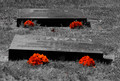
The ENDby PaulG13Comment: Image very centred and the post processing lacks professionalism. The idea could've been better executed. |
| 06/17/2015 10:08:22 AM |
|
 Photographer found comment helpful. Photographer found comment helpful. |
| 06/17/2015 10:06:55 AM |
|
| Photographer found comment helpful. |
| 06/17/2015 10:05:53 AM |
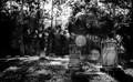
Now Serving Number: 05-02by FraksterComment: Yes, I get the idea of a graveyard, but there are a few issues I have, firstly with the bright spots coming through the trees and the then the tombs are not quite cropped well. You could have dropped the camera even lower and caught more of the foreground tomb. I am also not sure whether the image is a black and white or not. Blacks, greys and whites aren't distinguished enough. Just some constructive criticism. |
| Photographer found comment helpful. |
| 06/17/2015 10:01:08 AM |
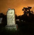
The Churchyardby nidiciComment: Taken at an even lower angle here would have worked even better, time of the day would definitely have an impact as well as this is simply a picture of a few graves with a church in the background. Your whites are too white and a little washed out. I'm not sure whether you actually intended in having the flag in the composition or not!? It is very tightly cropped. |
| Photographer found comment helpful. |
| 06/17/2015 09:52:30 AM |
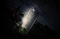
the toombby bmartuchComment: I like the concept and I get the idea with the tomb effect, but a little too blown out and over post-processed. A little too much burn going on. |
| Photographer found comment helpful. |
| 06/17/2015 09:50:30 AM |
All gave some. Some gave all.by ScapeshotsComment: Nice, I like the leading lines. I would've just dropped the exposure a fraction as the image is a little bright and looks a little like a holiday snap. |
| 06/17/2015 09:48:52 AM |
AfterLifeby WaitingsilenceComment: Very nice concept. The idea works very well, but I feel that the tilt affect works better if not tilted too much. This makes me want to hold my laptop at an angle to be able to see what is happening here. Try a little less tilt next time. Otherwise a lovely shot! |
| Photographer found comment helpful. |
| 06/17/2015 09:46:42 AM |
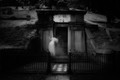
Knock Knockby vawendyComment: Lovely concept and well captured. I just have one concern and that is that the photo is too centred and not adding to the overall value to the shot. |
| Photographer found comment helpful. |
| 06/17/2015 09:45:23 AM |
Mother has visitors.by KMcCComment: It's ok, just not sure whether the graininess works here. I feel that the whites are washed out at the top of the image. otherwise I like the idea that you are portraying |
| Photographer found comment helpful. |
Home -
Challenges -
Community -
League -
Photos -
Cameras -
Lenses -
Learn -
Help -
Terms of Use -
Privacy -
Top ^
DPChallenge, and website content and design, Copyright © 2001-2025 Challenging Technologies, LLC.
All digital photo copyrights belong to the photographers and may not be used without permission.
Current Server Time: 08/21/2025 01:34:05 AM EDT.