|
|
| Image |
Comment |
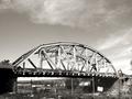
| 06/30/2004 02:09:57 AM | Bridge Demolishion Underwayby OneSweetSinComment: Greetings from the Critque Club!
Composition:
Your composition is good. The large amount of sky doesn't bother me for this photo. Like some people brought out, giving some of the construction equipment a larger part of the frame would've helped spell out that the demolition was actually _underway_. As it is now, there is no action in the shot, which isn't a good thing, since usually demolition's are quite exciting as things come crashing down.
Lighting:
Your lighting is quite nice. There isn't any areas of the photo missing detail (save the shadows, but they belong there in this photo).
Technical:
Your photo is properly exposed, and is in focus etc. I think your settings are pretty good.
Post-processing:
The desaturation works for this shot. I think it's really personal taste for everyone, and tastes vary. It looks to me like it's overly sharpened, I would've liked to see it a tad softer. If you're using unsharp mask, I would suggest easing off on some of the settings just a touch. Don't want it too soft of course, but not this sharp either.
Overall:
I think you did a great job capturing the challenge theme. My recommendations would be more 'action' in the shot. And also a little bit less sharpening in editing, to make it softer.
I look forward to future submissions! |  Photographer found comment helpful. Photographer found comment helpful. |
| 06/29/2004 02:43:34 AM | Favourite choice on the Carouselby xsnrgComment: Greetings from the Critque Club!
Composition:
You chose a fairly unique idea for this challenge. Unfortunately your photo doesn't convey the choice very well. As it is the photo is more about the girl, than it is about the choice. While that's "ok" it didn't help your score. The shot is too "skinny" and too "tall". Since the subject matter is which horse to ride. (I'm assuming) Your crop should've focused on that. Getting perhaps a more profiled photo of your subject on her "chosen" horse. (you see where I'm going with this?)
Lighting:
The lighting is okay. It's nothing spectacular but you really had no control over this. My only recommendation would be to shoot at a different time of day when the light is bolder, and more lush. Again not something you can exactly 'setup' in a shot like this.
Technical:
You didn't list your aperture, but the front of the horses head seems most in focus. The child's face looks a little soft, I can't tell if from motion blur or depth of field since you didn't list your photo settings. Regardless, I think this photo would've improved with a tad deeper depth of field.
Post-Production:
You didn't list any modifications you did to your photo, so I can't comment on that. I can suggest, however, that adjusting the brightness / contrast and or levels would've helped this photo. It can enrich the light and color in sub-par lighting conditions. I'd also recommend using the unsharp mask filter after resizing a photo. Like I said the girl's face is a little soft, and a little sharpening wouldn't hurt.
Again I don't care for the crop. I'd like to see more of the ceiling removed, and more of the horses added for the "choice". Not only that but the image is fairly small for the limitations. Photos must be 640 in largest dimension, and 150KB or less. Your photo is 480 in largest dimension and 44KB. You had plenty of room to work with if you wanted to include more detail in your photo.
Overall:
I like the idea, but the photo doesn't convey the "choice" very strongly. Getting more of the horses would've helped this. Also fine-tuning your light settings in photoshop would've warmed the photo quite a bit. Lastly remember to sharpen photos after resizing them. Very often shrinking them will make them soften and lose some detail. Sharpening usually corrects this.
Good idea, and good submission. I look forward to what you submit in future challenges. |
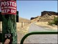
| 06/29/2004 02:16:53 AM | Here or there?by prettyshoes1Comment: Greetings from the Critque Club!
Composition:
Love it! Everything is in balance. The bar, the sign, the road etc all fill their section of the frame without overly imposing on any other part. I picture the choice of this photo not "here or there?" as your title says. But far more significantly "To obey, or rebel". Which is a basic tendancy of human behavior. No one likes to feel repressed, told they can't do something etc. And this photo brings out that on-going inner struggle beautifully.
Lighting:
The lighting is out of your control in this photo, but you captured it well. The colors are bold, and contrast well with each other. Very nicely captured.
Technical:
Your choice of aperture size works well for your photo. The depth of field is spot on where it should be. Leaving the most important foreground in focus, and the trail leading away gradually softened. The photo seems perfectly exposed. I see no overly dark shadows, or overly bright highlights.
Post-production:
Your adjustments were well done. The photo looks very natural. I can't say I'd have done a single thing different. Based on the size of your image I think this is just resized (no cropping). If so very nicely framed. If not, nice choice on cropping. Your border works very well for framing this photo in.
Overall:
This is a great photo. A great idea for this challenge, and honestly should've scored a lot higher. I think your title killed you. For myself I voted this photo a 5, and I think it was the title that made me not impressed. Here or there? Just isn't a compelling choice. Obedience vs law-breaker, and you have a ribboning choice photo. I very strongly recommend giving your titles more thought, or even foregoing a title completely on such a powerful photo.
Keep up the great work. I hope you get a more deserving score next time. |
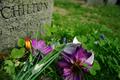
| 06/29/2004 12:45:47 AM | Mayflower Deathby himel412Comment: Greetings from the Critque Club!
Composition:
Your chosen cropping, angle, and subject matter are very nice. No real complaints there. As many people stated, however, the choice is not obvious. Your title is Mayflower Death, I can see the begginning of the word Mayflower on the tombstone, but can't see the significance. Someone commented that perhaps the choice is between artificial and real flowers. Which would work, but isn't exactly something most people fret over for weeks on end, if you get my drift.
Lighting:
Your lighting is great. It brings out the colors nicely, good contrast, and very pleasing to the eye. Even the grey of the tombstone looks good.
Technical:
You chose a very short depth of field, while it's proper depth for the flowers, if that was the subject for the 'choice' then it's fine as it is. If your subject was more to do with the Mayflower, than your depth of field is too short, getting the whole word of "Mayflower" in focus is rather important. Again I have no idea what your subject was supposed to be for the "choice".
Post-processing:
You listed no editing steps, and the photo looks good as it is, so not sure if you did any and they are natural enough to not be seen, or if you took this straight out of the camera with a minor crop. Your photo is about 150 pixels short of the limit of 640, and the size of the file is only 109KB, about 40 short of the size limit. Getting the full size of one or the other (preferably both) will help your photo convey it's message easier. It will look better, and you'll have more room to work with in your cropping.
Overall:
The choice is very hidden, perhaps you can tell us what you were going for. The photo itself looks very nice, but without seeing an obvious choice, suffered greatly in the scoring. Your lighting is superb, as well as the contrast. You might want to choose a more obvious subject in future challenges, or make sure the photo really conveys what you have in your head.
Nice attempt, I look forward to future submissions! |
| 06/29/2004 12:24:51 AM | Rook or Bishop..by agwrightComment: Greetings from the Critque Club!
Composition:
This is a superb composition. The horizontal lines are straight, (crooked is highly distracting of course) The contrast is superb. The black background makes you focus on the chess board, which is where the focus belongs.
The big choice of course is which piece to take, it's fairly self explanitory, save the subtle "best possible" move. This is shown by everyone's comments, which were extremely varied on what to take :) My only complaint is whose turn it is, but that is virtually impossible to show in this context, so no worries there.
Lighting:
The lighting you used looks like it comes from beneath, leaving all pieces glowing (I'm guessing this based on your 'light box' comment). It works very well for this photo.
Techincal:
No problems with your focus etc. At f/16 all pieces are in focus, good for a photo such as this. Your crop leaves enough room on every side to be comfortable, not cramped or unbalanced. Your exposure is good, save a little on the dark side, a little more light or less aperature would've added more contrast on the light side of the spectrum.
Post-processing:
Your border helps this photo. Not sure what you did to the photo regards editing, but whatever it was it's natural enough to not show. Again the light side of the spectrum could've been fine tuned in editing if you didn't want to re-shoot.
Overall:
Nice choice for this theme. Your composition is natural. I'd prefer your lighting be a tad brighter, but it suits this photo good enough. Really the lighting is my only recommendation for 'improving' the photo. Nice work.
And some of you need to hone your chess skills. ;) Message edited by author 2004-06-29 00:28:40. | | Photographer found comment helpful. |
| 06/28/2004 11:43:52 PM | Reading Bible or Magazine? ur choice?by theONE77Comment: Greetings from the Critque Club!
Composition:
Your composition seems a little forced. The photo doesn't appear very natural, more like forced, like you took this shot to fit the challenge. Which doesn't help it. Your background (the blanket?) is slightly distracting, A blank background such as a table, or solid color would've helped this. There isn't much room in any direction except the top. The bottom of the bible is cut off as well as the right side of the magazine. Getting 'the full picture' will help you quite a bit.
It seems like you wanted to hide the title of both subjects. Not sure why. As people commented it is extremely distracting, and I really can't think of why you would need to do that.
Lighting:
It looks like your flash was used for this photo. The flash was too close to the subjects so it wound up adding glare to the bottom of both the bible, and the magazine. I think you'll find much more natural colors using natural light in your house, or moving further away from your subject using flash.
Technical:
Your picture looks to be in focus, no motion blurring or anything like that. The photo seems too bright at the bottom, and too dark at the top. Getting that uniform exposure with natural light will greatly help your photo(s).
Post-Processing:
I can't see much editing done to the photo. It looks like it was cropped and or resized. (see composition) The glare at the bottom can be removed in editing software by adjusting the contrast / brightness etc. This would also help your photo.
Overall:
You chose a nice theme, one I choose very often. Your photo could've been much better carried out, however. Most importantly the composition, both the background and the too tight of crop. The lighting needs work for this photo to be better. I recommend you take a little time to setup your photos better. Think about the end result as you get it ready. Try to picture in your mind not just a photo that matches the challenge of the week, but really is a photograph without the challenge to make it work. Try to take photos you'd be proud to hang in a picture frame on your wall.
I look forward to seeing your future submissions! Message edited by author 2004-06-29 06:20:51. |
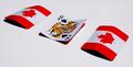
| 06/28/2004 11:25:29 PM | 3 Card Montyby ConcreteDonkeyComment: Greetings from the Critque Club!
Composition:
Very nice. You defined "less is more". Not only that but it's also perfect for the "rule of 1/3rds". The bright reds contrast nicely with the background, as well as differing from the flipped card.
Lighting:
I like this light. While it's extremely bright. It's not overly bright. There aren't any areas of white blown out. (No "blinkies" on the LCD, areas of no discernable data) The shadows are rich and deep. Zero complaints on the lighting.
Technical:
f/25 seems like overkill, but it'll insure the entire photo is focused. Which yours is. The photo is also properly exposed, providing maximum color / contrast.
Post-Production:
You didn't list any steps you took on the photo. But what I can say is that when you resized the photo it suffered from soft focus. Using the unsharp mask filter after resizing will keep the sharp focus that the original has at f/25 ;) I'm going to guess you tweaked the contrast and or levels etc, if so you did a great job. If not, your photography skills are even better. :)
Overall:
Great idea, great implementation. Superb lighting, contrast etc. Only recommendation is a little sharpening after resizing. Excellent work. |
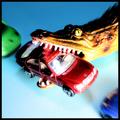
| 06/27/2004 01:08:36 AM | Some Things Are Worse Than Trafficby JesuispeureComment: Greetings from the Critque Club!
Composition:
The red car was stuck in bumper to bumper traffic, when this giant reptile gets hungry and goes for the goods. Very nice. Very original for this challenge. I can't think of anything I'd change in the composition.
Lighting:
The lighting is good for this shot, but like you said it is over exposed. For instance the mercedes left headlight (left in the picture) is completely washed out. As is the alligator's top teeth. It looks like you used flash or some other form of directional light, making the light very bright up front, and darker in the back. I'd like to see it uniformly lit, or perhaps just not so harsh of lighting.
Technical:
Photo is in focus, I like the contrast you did to it. The photo looks grainy for some reason (in the shadows). You used 100 ISO so I'm really not sure what that is from, unless it was the desaturate - resaturate process. I'd really like to see this without the in camera over-exposure, using photoshop more to get the 'poster feel' you are going for. I think this would help bring out the detail, and still allow for the poster look.
Post-processing:
Love what you did with it. The poster feel, the radial blur, and especially the bold contrast. All of it combines very well for the finished look.
Overall:
I like this photo a lot. The humor naturally. But the look and feel seems to work great for this photo. My only recommendation would be the 'normal' exposure doing the adjustment in photoshop instead, to bring out the lost detail is my reason. That and the washed out parts are just too bright, and result in distractions.
Hmmm, what about a little blacktop and dotted line? :D Keep up the creative shots! | | Photographer found comment helpful. |
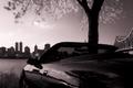
| 06/27/2004 12:52:40 AM | Top Downby d14Comment: Greetings from the Critque Club!
First let me say I'm not a big fan of this genre in general, so please keep that in mind in my critque.
Composition:
I've looked at this photo a long time, and parts I like and parts I don't. As someone mentioned the tree is awkwardly placed, giving the illusion of being in the car. There is too much going on for my tastes, from the reflections in the car, to the skyline, to the tree, to the bridge, all are more or less cut off. It doesn't give me the satisfaction of seeing anything in entirity which is irritating. I can't help but feel your original uncropped is quite a bit better than this version.
What I do like about your composition is the reflection. The tree in the back panel looks as if it could be the tree actually photographed. Which makes for a very cool, surreal "anti-mirror" look.
Lighting:
Your lighting is good. The buildings could be a tad darker, to make them true silohets. Currently part of their details is visible, distracting from your subject (the car). The infared works very well for this photo. It appears normal on first inspection. Only knowing it how you photographed it (and perhaps the tree) give away that it is infared light.
Technical:
Everything is in focus (save movement) due to your aperture. I don't think shortening the depth of field would help any, so I agree with your settings.
Post-processing:
You didn't list any post processing in your comments, so the only thing I can mention is the lighting. Such as the buildings darker for true silohets, or possibly lightening of the car to bring out the detail you know it holds. (for example the mirror is pitch black)
Overall:
This is a pretty good photo, but I can't help but think the original is much better. Perhaps if you chose between the skyline / bridge, and the tree / reflection it would take out some of the distractions. I can just imagine the whole side of the car with reflections on it's shiny paint, and I imagine it'd look good.
All of your other comments enjoyed the photo more than I did, so you must be doing something right :) | | Photographer found comment helpful. |
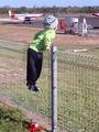
| 06/24/2004 02:09:32 AM | Trains & Planesby biggood53Comment: -Critque Club comment-
Compositon:
I love the composition in this photo. Your eyes move all over the photo just by where you placed everything. For starters you try to look at what the child is looking at. You also look at the child himself, from his (assuming a boy) arms propping him up, but especially down to his feet dangling in the air. Way to capture children's fascination with airplanes. Is that a toy train below him to boot? Nice little addition for a plane, train, challenge :D
Lighting:
The lighting as you said is 'against the light'. It looks a tad overexposed, but nothing you can't fix in editing. Perhaps shooting earlier in the morning while the sun is still rising would give you warmer and softer light. As it is, the light is harsh. A little adjustment of brightness and contrast could make up for that fairly easily.
Technical:
The photo appears to have been in focus when you took it. However, it seems you enlarged(?) a crop of a bigger file, the result is it is extremely pixelated, which is highly distracting. Instead of looking at the dangling feet, you look at the jagged blotches of artifacting in the fence. (more in post-processing)
Post-Processing:
This is where the photo lacks. If you enlarged this from a wider photo, your resizing was either too much for your camera, or the way you resized it made it lose a ton of quality. (looking at your other photos, they look fine in this regard) I'd recommend looking at your resize settings and making sure they are set correctly. Look at this tutorial on resizing for least amount of impact on your photos.
If you have the original file of this, I'd strongly recommend starting over with it and making your adjustments with keeping the quality in mind.
If the artifacting is from saving, remember to save your master in a lossless format such as tagged image file format (tif) or photoshop (psd). Both will allow you to work on your file and save whenever you want without losing quality. When saving a jpeg more than once, parts of the photo is lost each and every save. Eventually resulting in what you have here. Save in jpeg only after all your editing is complete. Also you can usually change the amount of quality lost for jpeg's, check your settings to make sure it isn't too much.
Overall:
You have a superb photo here. It just needs better editing and or quality control. Starting fresh with the original and working to preserve quality, could leave you with a very nice photo indeed. Keep up the excellent work. Message edited by author 2004-06-24 02:13:06. | | Photographer found comment helpful. |
Home -
Challenges -
Community -
League -
Photos -
Cameras -
Lenses -
Learn -
Help -
Terms of Use -
Privacy -
Top ^
DPChallenge, and website content and design, Copyright © 2001-2025 Challenging Technologies, LLC.
All digital photo copyrights belong to the photographers and may not be used without permission.
Current Server Time: 08/01/2025 03:43:50 AM EDT.
|