| Image |
Comment |
| 11/09/2006 10:43:23 PM |
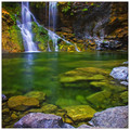
Emeraldby bryanbrazilComment: This is a great shot. Wonderful location and composition. I agree with Brad on the colors though... particularly the blue. Knocking about 2/3 of the saturation out of the blue channel seems to work much better IMO. |
 Photographer found comment helpful. Photographer found comment helpful. |
| 11/09/2006 04:52:50 PM |
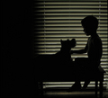
my palby lynnmarieComment: Originally posted by lynnmarie:
My choice to keep the negative space on the left... may have cost me some votes. |
Definitely! You captured a creat moment here with beautiful lighting, but the dark area pulls your eye away from the story IMO. Crop that out and this shot scores over 6.5 easy. |
| Photographer found comment helpful. |
| 11/09/2006 11:47:52 AM |
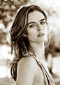
Small Wonderby whiteroomComment: Personally, I prefer your B&W version. The only thing I can find that looks like pixelization is the uneven lower eyelid (but that's just looking too hard). This could almost pass for a Librodo shot... except that he almost always crops down to the forehead. Good job! My only (minor) gripes are the lack of shadow detail and the somewhat blank expression. |
| Photographer found comment helpful. |
| 11/08/2006 04:26:28 PM |
Model Shoot 7by elsapoComment: Geez... good thing you couldn't have two entries in the last challenge! |
| Photographer found comment helpful. |
| 11/08/2006 02:06:21 PM |
The Other Side ofby CutterComment: Maybe not a ribbon, but certainly underrated in this challenge. Should have been top 10. The people behind those 1 votes probably didn't have their blindfolds properly calibrated. |
| Photographer found comment helpful. |
| 11/08/2006 09:29:49 AM |
Harley #6by nsoroma79Comment: I think I like this one better as a portrait, but you certainly nailed Harley in your entry! |
| 11/06/2006 12:05:17 AM |
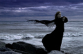
Wind Talking by QartComment: AGAIN?!? Geez, Rudy... forget about giving others a chance. At this point you need to stop ribboning just for variety! |
| Photographer found comment helpful. |
| 11/03/2006 11:51:06 PM |
|
| Photographer found comment helpful. |
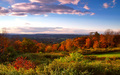
| 11/03/2006 11:06:50 PM |
Autumn falls into winterby Sieruken7Comment: Ouch... not only the wrong challenge, but in a landcape format it doesn't fit the other challenge either. FWIW, the image itself had lots of potential. I'd suggest cropping about 1/2" off the bottom and showing more sky to get the horizon out of the center. Then I'd frame it and display it proudly as one of the prettiest sub-5 entries on DPC. ;-) |
| 11/03/2006 10:56:10 PM |
In My Roomby scarbrdComment: Well above average in this group. If it's a self-portrait, you're probably beating photographers with WAY more experience. Nice lighting and color, but I'd crop off the right side- a face positioned dead center like this usually creates a very static composition. Good job! |
| Photographer found comment helpful. |
Home -
Challenges -
Community -
League -
Photos -
Cameras -
Lenses -
Learn -
Help -
Terms of Use -
Privacy -
Top ^
DPChallenge, and website content and design, Copyright © 2001-2025 Challenging Technologies, LLC.
All digital photo copyrights belong to the photographers and may not be used without permission.
Current Server Time: 08/28/2025 03:03:32 PM EDT.