| Image |
Comment |
| 08/24/2004 08:44:48 PM |
Funnzlesby stupidcatComment: ...
...interesting...
...but... slightly scary...
6 - a respectable score, but only because i'm scared they will haunt my dreams. |
 Photographer found comment helpful. Photographer found comment helpful. |
| 08/24/2004 08:44:01 PM |
Natural Neonby JadeComment: whew! lower the brightness, change the hue so the flower is more red, raise contrast a tad to make the darks a little darker, etc.
although, maybe you did the opposite of that just so a flower would fit the challenge. 3 |
| Photographer found comment helpful. |
| 08/24/2004 08:42:40 PM |
|
| Photographer found comment helpful. |
| 08/24/2004 08:42:04 PM |
For everby sissiComment: kinda cool. Something is off with the colors though, i would like to see the green one closer to the blue one... or something... it's just not bold enough, but i love the blue. 6 |
| Photographer found comment helpful. |
| 08/24/2004 08:40:27 PM |
Neon...by gorkeComment: 1 - and no comment is necessary i think... |
| Photographer found comment helpful. |
| 08/24/2004 08:39:55 PM |
N. Tetraby photomComment: nice... we had so many of those growing up... 7 |
| Photographer found comment helpful. |
| 08/24/2004 08:39:19 PM |
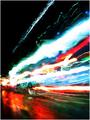
Color Explosionby vaguiloComment: Would be cooler if the dark part was a lot darker. The colors would be way bolder. But cool idea. what the heck is it? :) 7 |
| Photographer found comment helpful. |
| 08/24/2004 08:38:43 PM |
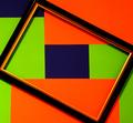
Framed in Colourby HeavyComment: Um... not sure what to think. hmm...
I guess it would be a bit better if the cropping was done so that the corners of the gold part of the frame all touched the edges of the picture itself, at the same point.
did that make sense? 6... |
| Photographer found comment helpful. |
| 08/24/2004 08:36:44 PM |
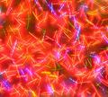
Neon on canvasby nico_blueComment: AWESOME! i'm thinking maybe everyone else doesn't think so, probably because it's so harsh, but I LOVE it! You get a 9 and I don't care what the others say. This looks like moving lights, but also like an abstract painting. Good job. |
| Photographer found comment helpful. |
| 08/24/2004 08:34:59 PM |
Compact Disc Abstractby duncesComment: I actually like this a lot, despite that it was so staged. Would be a little more interesting if all of the lines were pointing in the same direction or something, but i like the balance a lot. Focus is good. 8 for originality and crisp edges. :) |
| Photographer found comment helpful. |
Home -
Challenges -
Community -
League -
Photos -
Cameras -
Lenses -
Learn -
Help -
Terms of Use -
Privacy -
Top ^
DPChallenge, and website content and design, Copyright © 2001-2025 Challenging Technologies, LLC.
All digital photo copyrights belong to the photographers and may not be used without permission.
Current Server Time: 08/24/2025 11:52:23 AM EDT.