| Image |
Comment |
| 07/22/2009 03:22:30 PM |
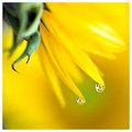
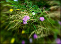
Sunflower Babiesby robineggComment: Greetings from Andi via the Critique Club. Congratulations on a new PB Robin!
First Impression: A nice, soft and vibrant image image, sharp enough where it should be and an above average flower reflection.
Composition: For me the composition is just right.
Tecnical: At first glance the blown out petal was a little annoying but on reflection I think it actually helps the image. The green foliage is a little distracting and it might improve the image if it was in better focus.
Artistic: Yes, its certainly artistic and the colours go really well together. The way the petals merge into that silky soft backround shows a good vision.
Overall thoughts: Even though similar has been done 100's of times at dpc it was submitted to a flower challenge and this is a good example. Well done and all the best for future challenges. |
 Photographer found comment helpful. Photographer found comment helpful. |
| 07/21/2009 06:12:09 PM |
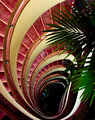
Vertigo by vladoComment: Greetings from Andi via the Critique Club. Let me start by congratulating you on your first ribbon Vlado
First Impression: Fits the challenge well, a nicely framed colourful shot but, its another spiral staircase.
Composition: This is excellent, the frame is full with no wasted space and my eyes are taken on a rollercoaster ride around the image.
Tecnical: Its a basic challenge and think you did an excellent job with the lighting, exposure and focus. some voters might have wanted more detail at the bottom of the stairs but I like the mystery of whats down there.
Artistic: If you had left out the foliage I think you would have suffered in the voting and having it in the shot has added another dimension to the image. For me, the foliage is the difference between a good image and the work of an artist (and of course a runner up and a ribbon winner).
Overall thoughts: If I were able to get you to change one element it would be to have used a flash to bring out the foliage a bit more, I think it would have helped the image but unless I saw a comparison I can only wonder. Its a shot well worth your first ribbon, and hope its the start of good things for you here at dpc. |
| Photographer found comment helpful. |
| 07/21/2009 04:21:56 PM |
He remembers...by SHALIGAComment: Greetings from Andi via the Critique Club and congratulations on your first submission here at DPC.
First Impression: Meets the challenge description well, an unusual and pleasing point of view and the image is enhanced by the lighting and composition though does look a little flat.
Composition: If you had managed to crop to the outer part of the circle this would have had much more impact and sadly as it is it looks a little clumsy to me. Was it your cropping that missed the lines or did you miss it whilst shooting?
Tecnical: I still think this looks a little flat but tbh rather than harming the image I feel it adds a 'mood' to the overall effect. Focus is nice and sharp and I wonder if you had opened the lens up to (say) 5.8 if you'd get a more oof backgound though in honesty I don't think it matters that mush as it works well as is.
Artistic: I think its difficult to be 'Artistic' whilst shooting an image like this. Its a good reproduction of a statue and as the challenge wasn't to make this your work of 'Art' I guess its a mute point.
Overall thoughts: This is something that most people would have overlooked (pun intended) so kudos to you for spotting it. I didn't vote in this challenge but if I did I would probably have skimmed past with a 5 as nothing really screamed at me to stay and view the image. After being here for 10 minutes then it would have been a good 6 vote.
I hope this helps? feel free to get back to me if you have any questions and good look for future challenges Santos. |
| Photographer found comment helpful. |
| 07/21/2009 03:40:13 PM |
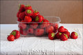
Summer Punnet - Slightly from aboveby glenncComment: Greetings from Andi via the Critique Club.
First Impression: Well, I guess you already know my first thought? ok, it meets the challenge (just) but you were pushing it here. Two other immediate thoughts were the container just doesn't fit in and the background is well, boring.
Composition: Not too happy about the image being cut in half by the foreground/backgound split but do like the idea of the 'triangle' of strawberries.
Tecnical: The lighting and exposure on the strawberries and table cloth are very good and the focus is spot on for me.
Artistic: The layout of the strawberries is good for me however there is nothing else here to move this from a snapshot type shot.
Overall thoughts: A tecnically well taken shot but sadly let down by the plastic pot and background and the biggy is for me it doesn't do the challenge title much justice. that said I do think a 4.1 was a little harsh. |
| 07/21/2009 03:20:13 PM |
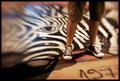
Eye of the Zebraby ZigomarComment: Yup, agree with all the below and certainly think you can do something cool with this set when you run out of ideas but that might (hopefully) take some time. This is another great image and it all goes together so well. |
| Photographer found comment helpful. |
| 07/21/2009 03:15:39 PM |
301_6673-copy.jpgby salmiakkiComment: erm, you pick on me for forgetting which optic I used then 5 minutes later I see you can't remember how you edited this!
That said I'm loving the colours here so you'd best remember girl! Very colourful and blury, my type of shot :) |
| Photographer found comment helpful. |
| 07/21/2009 03:12:20 PM |
Seascapeby GermaineComment: ouch, my eyes! this is just too sharp and colourful for my liking!
hehe, I know how Rina feels and I'd be stoked to take a shot like this, it truly is sublime and a world away from that shadowy street I love to much. Less, they say is more and this speaks volumes.
|
| Photographer found comment helpful. |
| 07/21/2009 02:54:54 PM |
go2 by ZigomarComment: I'm already wondering if you run out of ideas before we get bored of this set and I'm pretty sure you will lose cos I'm loving these, not only are they all good images in their own right but as a set will be even more powerful - very creative! |
| Photographer found comment helpful. |
| 07/21/2009 02:34:49 PM |
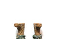
I maybe on to something here...by ben4345Comment: Greetings from Andi via the Critique Club
First Impression: Being a negative space junky the thumb grabbed my attention at once though was a little upset that the feet were not real
Composition: Absolutely love the composition.
Tecnical: I'm guessing the bg wasn't pure white in the original image so thats why you lost the shadow?
Artistic: Not a very DPC friendly shot as the score shows but for me this is a good shot, certainly out of the ordinary here and I like it a lot - it shows a novel flair.
Overall thoughts: In the most part this challenge bored me as footware doesn't really appeal to me and whilst there were plenty of techically better images in this challenge this was easily in my top 10, its fun, bright, different and a pleasure to view. It got a strong 7 from me and if you had sorted the shadow out and used real footwear it would have scored higher and most likely done much better in the challenge.
Thanks for submitting this and good luck for the future.
|
| 07/21/2009 01:06:48 PM |
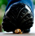
The Last Raceby M4TRIXComment: Greetings from Andi via the Critique Club and congratulations on submitting your first entry here at DPC!
First Impression: The 'footwear' fills the frame nicely and a nice touch adding the snail which adds interest to what could easily be a boring subject.
Composition: The square crop works for me here and the centered snail works well.
Tecnical: The Snail is well lit and the oof backgound works well to keep the viewer looking at the subject. Good focus where it needs to be sharp and I'm loving the in focus line along the ground.
Artistic: The sole of the shoe is a little dark on my monitor however whilst it might have hurt you slightly in the voting the more I view the image the more it works for me, the well lit snail is being encompassed by the darkness of being trod underfoot (thats deep for me).
Overall thoughts A fun take on the challenge theme and a more than competent entry. after viewing this for a while I'm now being drawn to the white space on the right of the image and its distracting me slightly. Gave this a 6 during voting btw.
Feel free to contact me if you'd like to discuss this further André. |
Home -
Challenges -
Community -
League -
Photos -
Cameras -
Lenses -
Learn -
Help -
Terms of Use -
Privacy -
Top ^
DPChallenge, and website content and design, Copyright © 2001-2025 Challenging Technologies, LLC.
All digital photo copyrights belong to the photographers and may not be used without permission.
Current Server Time: 08/10/2025 01:40:38 PM EDT.