| Image |
Comment |
| 07/29/2009 04:17:24 PM |
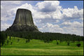
A Tower In The Forestby TommyMoe21Comment: Greetings from Andi via the Critique Club
First Impression: Well, its been said in enough comments so won't go on too much about the challenge description that was sadly overlooked misread. As a shot its clean and simple yet quite a compelling scene, I think it would have done quite a bit better in a free study or correctly themed challenge.
Composition: Excellent composition with the basalt sitting nicely in the rule of thirds. The mix of sky and grassland adds to the overall size of the tower.
Subject: Great subject, I've just come back from holiday and a trip to the Staffa, the basalt Island in the inner hebredes - not a patch on this shot.
Technical: Spot on technically though maybe a little more detail in the woodland would help a little? My monitor is well calibrated but just a touch dark.
Final thoughts: I really like the overall scene and colours, its a great landscape and different from the norm here (thats a good thing btw). Yup, I need to finish on the fact that its a dnmc from me. Feel free to pm me if you want any clarification Tom. |
| 07/29/2009 03:50:17 PM |
|
 Photographer found comment helpful. Photographer found comment helpful. |
| 07/28/2009 07:21:14 PM |
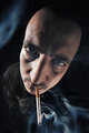
Smoking is bad for you, look what it did to my noseby ArtComment: Greetings from Andi via the Critique Club
First Impression: (without knowing photographer or seeing comments) This is a shot from somebody who understands light and mood and makes the viewer sit and think a while.
Composition: Composition is ok but for more impact I think losing the top third of the image (almost to a square crop) would help.
Subject: Yes, its a strong portrait that meets the challenge well but am thinking the whole smoking idea would have put off a few voters (am a smoker myself).
Technical: The lighting/exposure is spot on with good detail in the smoke and subject, I think it might be better in B&W?
Final thoughts: A strong image but am still not sure if the smoke around the eyes is a good or bad element and the cigarette looks a little odd. I'm still seeing this as a B&W image cropped to a half inch above the right eyebrow. |
| Photographer found comment helpful. |
| 07/28/2009 04:33:10 PM |
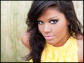
Simple Beautyby jeroweComment: Greetings from Andi via the Critique Club
First Impression: When giving a critique I normally spend up to 30 minutes in the process, constantly viewing the image and must say this will be a pleasure as Christin is simply beautiful.
Composition: I've tried using my cards to see if I can create a better composition but think you have it pretty well spot on here.
Subject: I'm a 50 year old guy so won't comment ;)
Technical: One of your commenters felt the dof was a little off but I dissagree and think the only bit that might have looked better with a slightly deeper dof is her fringe but thats just nitpicking.
Final thoughts: The eye contact between subject and viewer is great, I gave this a 7 during voting, it would have been at least an 8 if we either saw more or none of her right earing and the background was different as it doesn't add anything to the image and is a little distracting even oof. |
| 07/28/2009 02:24:06 PM |
A study in whiteby toskComment: Greetings from Andi via the Critique Club
First Impression: As your first attempt at a high key portrait I think you did well. Not sure about the glass but think I understand why its there - maybe milk would have helped your 'white' theme?
Composition: A strong composition with the subject off centre allowing the white to flow in from the left
Tecnical: Yup, its high key yet you managed to hold detail in the white of his jacket well, loving the catchlight in his eyes.
Artistic: Its not an instant masterpiece but think you handled this shot well and its a good portrait.
Overall thoughts: Am still thinking the water let you down a little as it doesn't lend anything to the image imho. |
| Photographer found comment helpful. |
| 07/28/2009 01:38:18 PM |
Street Fighting Manby Bob_RComment: Greetings from Andi via the Critique Club
First Impression: A strong image and the title explains why he is in the street topless (your comments explain more). Maybe a little more contrast on the subject to make the image more powerful?
Composition: The composition is spot on apart from that one thing! I think the blown out part of the motel sign is what stopped this scoring nearer where it should have done. I'm in my 'artistic' phase these days and rather than detract from the image I felt it added weight to the scene and more natural than contrived. I scrolled the image until the top part of the background was missing and tight on the guys head, even though I like the background this crop might have a little more impact for some.
Tecnical: Focus is nice and sharp where is needs to be and I'm loving the background lights. You were right to convert to B&W however as mentioned I think it could do with a tweak. The catchlight in his eyes finishes this shot off nicely.
Artistic: I think you shot the scene well however, as its an image of a street fighter a fist in the shot might have helped? Did I say I liked the background?
Overall thoughts: No comments and a 4.7??? I truly think there was some misguided voting going on here. ok, its not the best portrait in the world but you were robbed here! If those 13 votes of 3 had voted you a 5 your score would have been 5.8 I enjoyed and voted it a 6 in voting so thanks and I must say your a brave man for walking up to a guy looking for a streetfight and asking to take his photo! |
| Photographer found comment helpful. |
| 07/27/2009 04:37:13 PM |
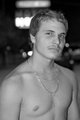
At a lighted tableby bjoernComment: Greetings from Andi via the Critique Club
First Impression: Meets the challenge well, I like the composition and the oof background. Nice sharp focus on the eyes but the rest of his face is a little soft.
Composition: I think you have a strong composition and I quite like the bright light on the bottom left however the yellowish bright spot bottom right is a little offputting for me.
Tecnical: I see you went to a workshop to shoot this and am guessing lighting from below was part of the course? Its not the best angle for lighting a portrait however I think it works quite well here. I think the exposure is a off as (on my monitor) your subject looks a little jaundiced. Some catchlight to bring out his hair detail would help this I think.
Artistic: I think you have approached this portrait shoot well and I like the fact the model is at an angle to the camera yet looking down the lens, it adds interest to the shot.
Overall thoughts: I quite like this shot as a portrait and feel it may be a bit 'run of the mill' for the dpc voters. I think it place about right at just above the challenge average.
|
| Photographer found comment helpful. |
| 07/26/2009 05:41:03 PM |
|
| Photographer found comment helpful. |
| 07/26/2009 05:35:22 PM |
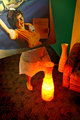
What about a breakfast?by litsaComment: hehe, this is a fun shot that met the challenge well. Not sure about the lamps or chair work well though the lamp does cast a reveling light on your model ;) |
| 07/26/2009 04:39:10 PM |
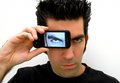
so real you can almost touch it by LutchenkoComment: hmmm, am wondering if the choice of background might give a clue to the fotog? One of the best in the challenge for me as it shows a creative take on the challenge and well executed so bumping +1 |
| Photographer found comment helpful. |
Home -
Challenges -
Community -
League -
Photos -
Cameras -
Lenses -
Learn -
Help -
Terms of Use -
Privacy -
Top ^
DPChallenge, and website content and design, Copyright © 2001-2025 Challenging Technologies, LLC.
All digital photo copyrights belong to the photographers and may not be used without permission.
Current Server Time: 08/09/2025 03:19:57 AM EDT.