| Image |
Comment |
| 08/12/2009 05:49:12 PM |
Callaway Golf Ball, Nike Putterby leematthewsComment: Greetings from Andi via the Critique Club
its got nothing to do with the image nor my critique but I hate (with a passion) titles that so obviously state whats in the image
First Impression: A decent take on the challenge, B&W was they way to show this image.
Composition: I'd have preferred a tighter crop on the left to lose the bright vertical line (doorframe?) and this would have brought the ball more into the rule of thirds.
Subject: I like this and am thinking of an executive taking a break from work and relaxing a little.
Technical: The golfball is a little blown out and nit picking the focus on the carpet is maybe 1/2 inch out to make it perfect. good focus on the ball and the dof on the putter is perfect!
Final thoughts: I like it as a shot for the challenge and feel 5.2 was a little rough though maybe voters thought it was a little boring? |
 Photographer found comment helpful. Photographer found comment helpful. |
| 08/12/2009 05:16:08 PM |
Circle by Mother Natureby Catherine_BComment: Greetings from Andi via the Critique Club
First Impression: ok, I have my 'implied' head on so can just about see a circle!
Composition: The subject is too central for me and whilst the background is almost oof there are too many visible distractions. The viewpoint might give the implied circle but its pretty basic.
Subject: Flowers are deemed cliche at dpc and to score well they have to be unusual and outstanding, sadly this shows neither to my eye.
Technical: Focus on the flower is ok but not pin sharp and the top of the petal is a little overexposed. Your choice of dof blurred the background well but the actual background is still a little distracting
Final thoughts: An average shot of a flower, the composition and busy background with tenuous meeting of the challenge title make me think the final score was about right for this shot. |
| Photographer found comment helpful. |
| 08/12/2009 04:56:07 PM |
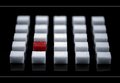
Red²by kingskingdomComment: Greetings from Andi via the Critique Club
First Impression: My first thought was that this was a map of Milton Keynes! Seriously this was one of my highest scoring images and the red cube (not square) bumped it to an 8 from my speed vote of 6.
Composition: Without my set square this is about as perfect as you can get and I'm pretty sure if I'd have thought of this myself the red cube would have been centered and so ruined the overall effect of the shot
Subject: ok, I guess a cube is made up of 6 squares so it meets the challenge many (many) times. For a while I thought you had the cubes sitting in liquid and it was being sucked up but that would be almost impossible, it was then I realised it was a reflection. Simple and beautiful yet complex at the same time.
Technical: Can't fault the technicals here as they are pretty much perfect. there is a lot of blue in the image and whilst I like it I wonder how a selective desaturation would have worked? B&W & Red?
Final thoughts: A great score for a great image with a good place to boot! Time well spent on the shopping and setting up Chris! |
| Photographer found comment helpful. |
| 08/12/2009 04:07:47 PM |
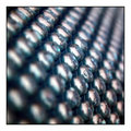
Rows of circlesby StephanieDComment: Greetings from Andi via the Critique Club Stephanie, welcome to dpc and congratulations on a new personal best ;)
First Impression: repetition, repetition, repetition, I love it even though I had no idea what I was voting on (it was a 7 btw).
Composition: The square crop works well for me and the in focus 'things' pull me nicely through the image starting from the bottom right. My only nit pick would to have had a single oof 'thing' in the bottom left to anchor the image a little more.
Subject: If I'm honest, whilst I love looking at flowers and stunning landscapes (I could go on) they do bore me these days so something a little different is most often well received by me and this is one of those times.
Technical: I like the overall exposure but there are quite a few blown out areas and whilst there is a clear line of in focus 'things' nothing is tack sharp. I wonder how this would look in B&W but think the subtle colours in this was the correct choice. The out of focus areas are a bit rough and whilst I prefer this version I think you may have scored a couple of tenths higher by using neatimage (or similar) to soften things a little.
Final thoughts: A great subject for the challenge, well composed and shows a good eye for the unusual subject, I like it and thanks for submitting! |
| Photographer found comment helpful. |
| 08/12/2009 03:25:23 PM |
entertainment old to new (Circles)by AtsugiComment: Greetings from Andi via the Critique Club
First Impression: This seems to be a very busy image and I find my eyes flitting from place to place never really settling on anything in particular apart from the bird droppings.
Composition: Well, you were in a moving tram so you were really stuck for moving around to get a better angle. The main focus is on the front dome but its a little central for my liking and think if you managed to capture the big wheel between the domes things would look a lot better. You could also have cropped out the foreground to where the main dome starts,
Subject: Yes, I can see cirlces (or parts of them) so this meets the challenge but doesn't go further than that for me sorry
Technical: A decent sky and the exposure doesn't have any major issues though the overall image is a little flat, lacking contrast and doesn't 'pop'. I don't think you needed F/22 here nomatter what end of the zoom you were on.
Final thoughts: As a reminder of your day out this is a keeper so if thats what you were aiming to achieve then your work is done :) |
| Photographer found comment helpful. |
| 08/12/2009 01:58:41 PM |
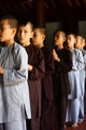
The Young Monkby dewdodesignComment: Greetings from Andi via the Critique Club
First Impression: A nice shot and the isolation works well and as your lone commenter suggests a little more isolation would have made this even better. This appears to be a candid shot and whilst I'd not suggest you staged it if the singled out boy had been in blue with the rest in brown this would have been closer to a 7 than a 6 imho.
Composition: I like the composition and reading your comments makes it all the more poignant.
Subject: Its good to see the boys washed and in clean clothes ready for food even though they are homeless. Its sad but imho if the boys were in rags you'd probably have scored a few tenths higher.
Technical: The light on the boys faces is great and the overall exposure is spot on for me. Great focus/dof
Final thoughts: A great shot, maybe not something that would get hung on a wall but as social history it hits the mark. This got a 7 from me during voting btw. |
| Photographer found comment helpful. |
| 08/11/2009 04:23:41 PM |
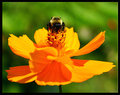
Bee Cosmosby bs-photosComment: Greetings from Andi via the Critique Club
First Impression: A nice sharp colourful shot of a Bee on a flower with a nice green background.
Composition: The central composition works fine here, the flower fille the frame well and the Bee adds that bit of interest. Totally square with more of the background at the top might have helped the overal composition for me.
Subject: At dpc this type of shot is quite common and to really stand out it has to be perfect. Nice colours on the flower and an excellent background help this image and think the 5.2 vote was mainly because there is nothing new here. You should definately have cloned out that spot on the right hand petal and whilst you were probably following Bees round the garden it might have paid off to have removed the front two out of focus petals and waited (and waited) for the Bee to come to you. This would have made the image much better imho.
Technical: A decent exposure, the colours really pop and the focus is spot on where it should be.
Final thoughts: Not a fan of the border and it is stopping me from viewing the image as I'd like to. Overall a well taken shot and for what its worth it should have scored a few tenths higher imho. |
| Photographer found comment helpful. |
| 08/10/2009 05:17:04 PM |
Winner @ the ColorCarnivalby ambakerComment: Greetings from Andi via the Critique Club
First Impression: This is what I'd call a Marmite shot and sadly I fall within the hate it camp. This type of image can be well received in certain quarters and I'm sure many would wonder at its artistic value, heck, am sure it would have faired better if you entered it in the username challenge as it would fit much better there than a FS.
Composition: I think you could have cropped this right down to the peoples heads as for me the top third is image that doesn't add to the 'story'
Subject: A nice shot with movement and direction, its an 'of the moment' candid and the composition works well (would still prefer to lose the top third).
Technical: Can't comment as the cartoonish HDR style is not my cup of tea sorry.
Final thoughts: I've said I don't like this style of editing but yes, it has its place and I'm sure a Fair could use a shot like this to advertise itself and maybe WOW lots of possible punters (using that wasted top third for the text). I too would like to see the original and wonder if I'd prefer it more? |
| Photographer found comment helpful. |
| 08/10/2009 02:17:06 PM |
straws in the sunby oskarakComment: Greetings from Andi via the Critique Club
First Impression: Whilst I understand the reason for the 'straws' in this image if I'm honest I think removing them would make this a better image. Ok, that might have been a bit harsh �skar but the background and lens flair is what grabs my attention here not the main subject.
Composition: The plant is too central for me even though its not dead centre and the sun might have been better coming from the top right hand corner.
Subject: Yes, the union between the sun and growing plant works well but the plant isn't very interesting for me.
Technical: I'm guessing we should remove this section for this shot, there are times when the technical 'must do' 'rules' should be ignored, the overexposed sun and lens flare is what makes this shot interesting and the reason why I bumped this up to a 6. Even at F/6.3 you got some nice bokeh going on.
Final thoughts: An uninteresting subject brought to life by some nice flair. �skar, have you ever looked at a lensbaby? We often have side challenges using it and I do think looking at your porfolio you'd enjoy ignoring the rules sometimes. This is July's Side Challenge. |
| Photographer found comment helpful. |
| 08/10/2009 01:57:08 PM |
The Old Inlet Pumphouseby totaldisComment: Greetings from Andi via the Critique Club. Welcome back Aaron and congratulations on submitting to 50 challenges!
First Impression: Just as Enzo (your sole commenter) says, interesting subject. All the elements seem to work well together but for me there is something missing in order to give this that WOW factor that the voters want (especially in a free study). Its a decent shot and my mind wanders along the water chute wondering where the water might end up.
Composition:A strong composition that allows the water to flow into the water chute thingy.
Subject: Yup, its interesting, it must be a pretty strong pump as swimmers are advised to stay 75 feet away. The two small objects on the horizon are a bit of a distraction for me and as they don't really add to the image think you'd have been safe removing them. I like the pumps reflection and shadow in the water. The sky in amongst the wires seems odd to me, almost as is if a couple of sections have been edited but not all of them? The aged pumphouse looks like a great subject to photograph.
Technical: The exposure is ok but maybe a little flat, is the vignetting from post processing or from the lens at 10mm? Maybe a slightly different angle as the pump house is suffering from a ultra wide angle and looks lob sided and I keep getting drawn to the sky on the right side of the pump.
Final thoughts: Its a decent image (I gave it a 6) and considering it was submitted to a free study think it finished about right and its not a bad score. |
| Photographer found comment helpful. |
Home -
Challenges -
Community -
League -
Photos -
Cameras -
Lenses -
Learn -
Help -
Terms of Use -
Privacy -
Top ^
DPChallenge, and website content and design, Copyright © 2001-2025 Challenging Technologies, LLC.
All digital photo copyrights belong to the photographers and may not be used without permission.
Current Server Time: 08/09/2025 12:12:52 PM EDT.